'26
DeFi has a credibility problem. The category moves fast, but most brands look either too speculative for institutions or too technical for everyone else.
DeFi has a credibility problem. The category moves fast, but most brands look either too speculative for institutions or too technical for everyone else.
/ 1
The Solstice identity was built around a single unifying idea: creating a brand that could feel warm enough for accessibility, structured enough for financial trust, and distinctive enough to stand apart in the crowded DeFi landscape. The logo, colour system and visual language were all designed to express that balance.
The Solstice identity was built around a single unifying idea: creating a brand that could feel warm enough for accessibility, structured enough for financial trust, and distinctive enough to stand apart in the crowded DeFi landscape. The logo, colour system and visual language were all designed to express that balance.
/ 2
Solstice needed to land on every side of that line at once: trust and accessibility for the retail user, stability and security for the institutional investor, and a premium visual showcase that earned a place among the brands setting the agenda for decentralised finance.
Solstice needed to land on every side of that line at once: trust and accessibility for the retail user, stability and security for the institutional investor, and a premium visual showcase that earned a place among the brands setting the agenda for decentralised finance.

Translate complex financial mechanics into something a retail user can grasp in seconds. Give custodians and market makers the gravitas they expect from infrastructure handling real money. Make the promise of Solstice and USX tangible across every touchpoint.
Translate complex financial mechanics into something a retail user can grasp in seconds. Give custodians and market makers the gravitas they expect from infrastructure handling real money. Make the promise of Solstice and USX tangible across every touchpoint.
DeFi has a credibility problem. The category moves fast, but most brands look either too speculative for institutions or too technical for everyone else.
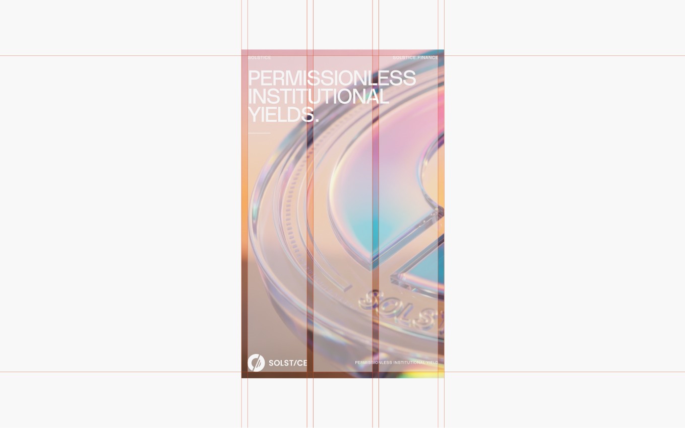
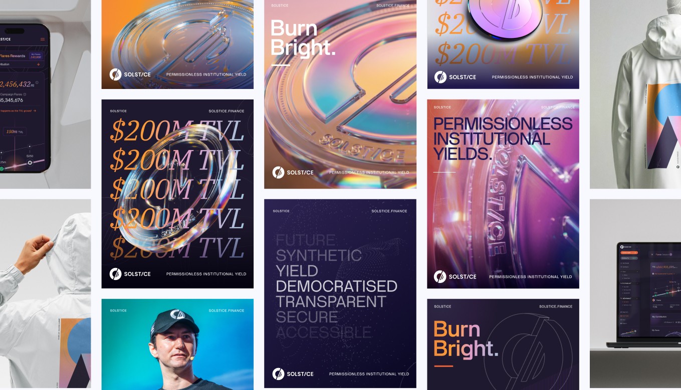
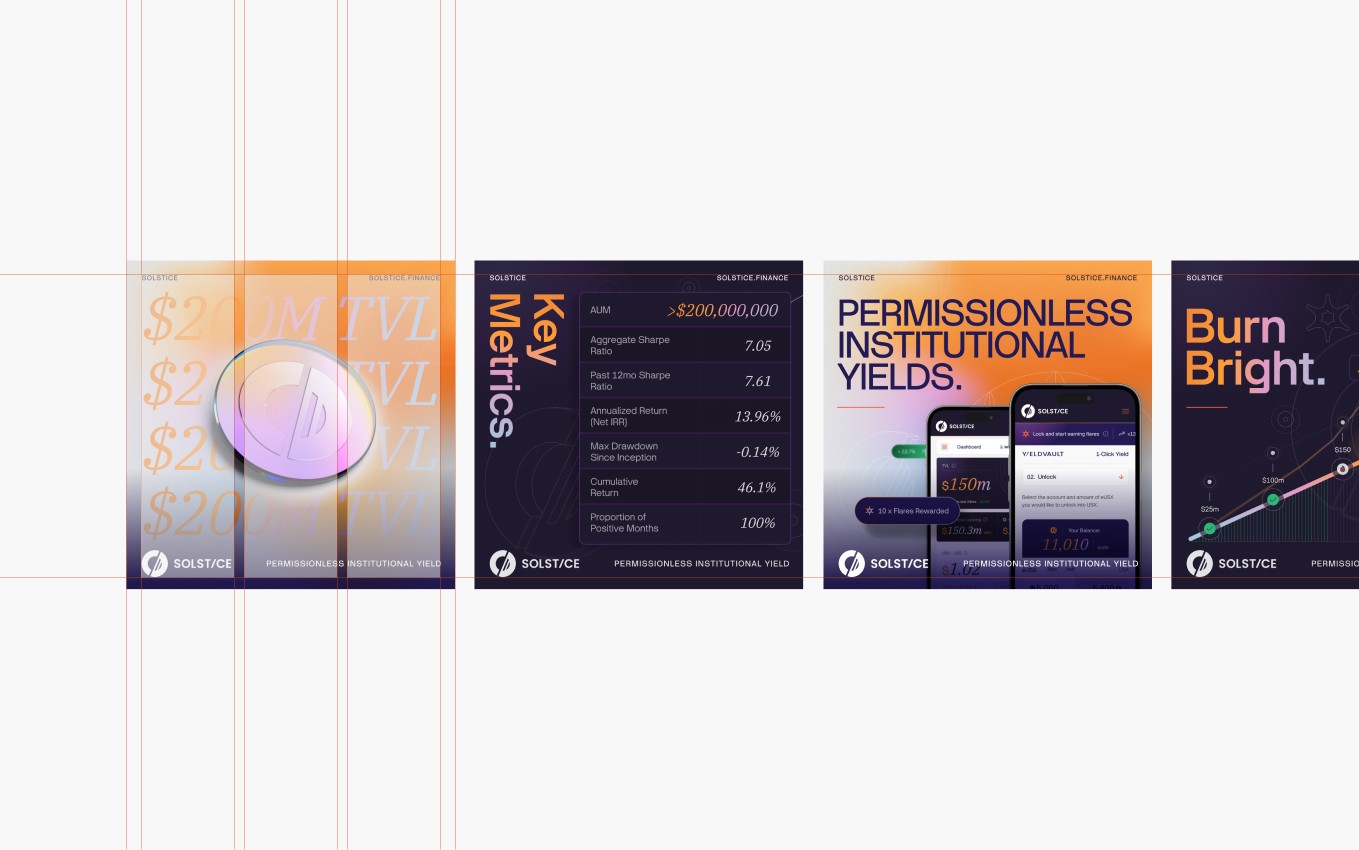
We anchored the work in the astronomical solstice itself. The solstice is the moment, twice a year, when Earth's tilt reaches its extreme: the longest day of the year, the shortest day of the year. Both happen because the planet sits at exactly 23.5° on its axis. Without that tilt, no seasons. No balance. No predictable cycle. That tilt isn't chaos. It's precision and predictability, which is exactly what a stablecoin promises.
We anchored the work in the astronomical solstice itself. The solstice is the moment, twice a year, when Earth's tilt reaches its extreme: the longest day of the year, the shortest day of the year. Both happen because the planet sits at exactly 23.5° on its axis. Without that tilt, no seasons. No balance. No predictable cycle. That tilt isn't chaos. It's precision and predictability, which is exactly what a stablecoin promises.
/ 3

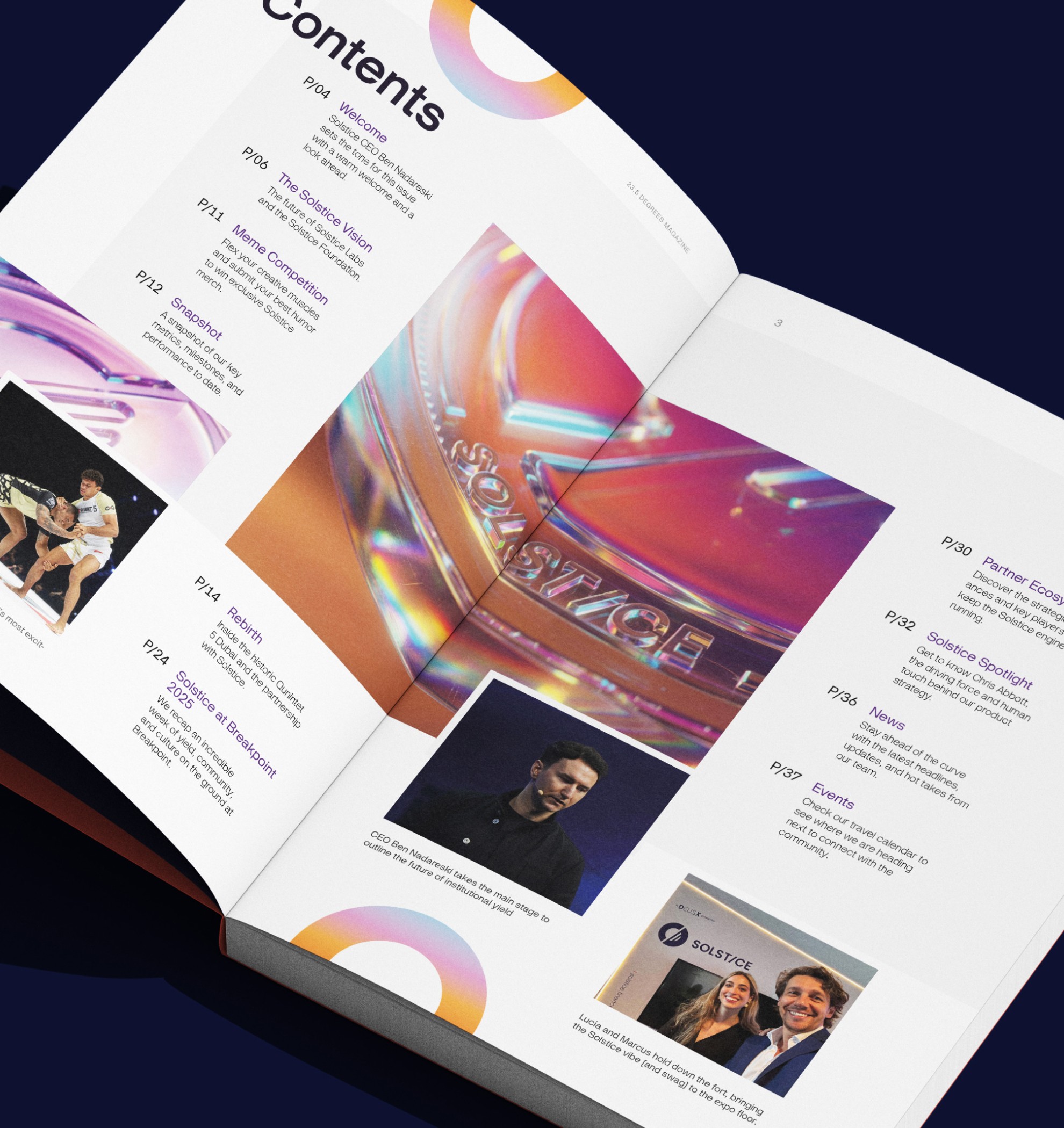

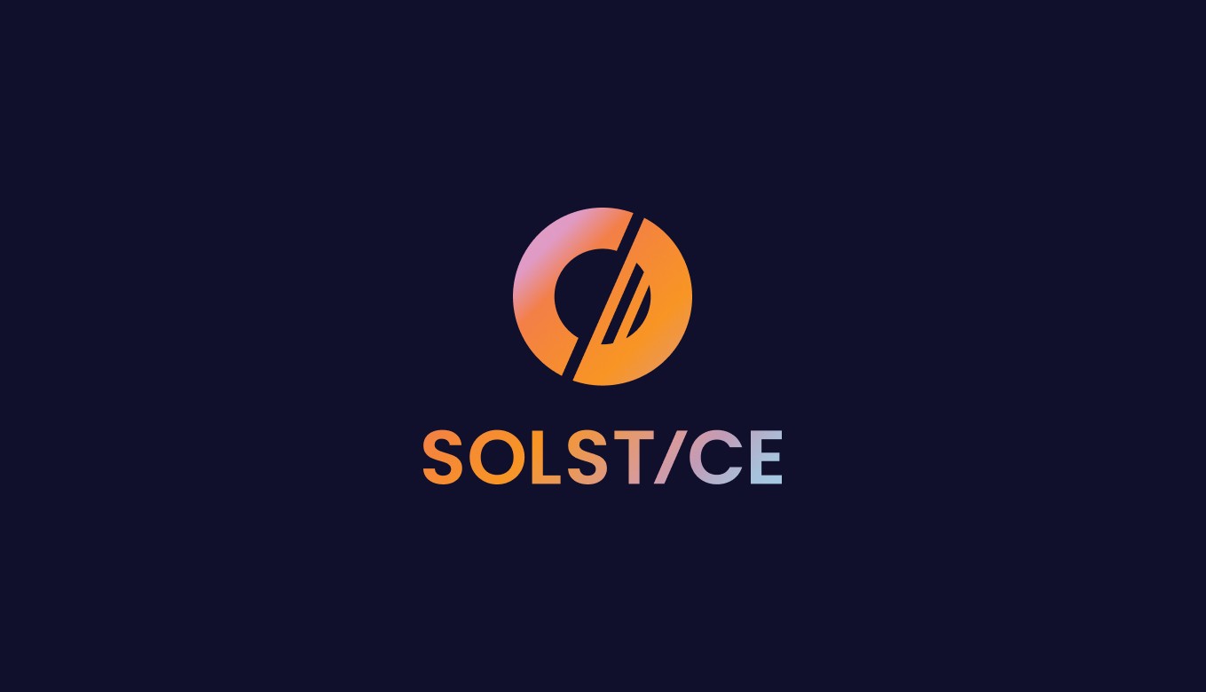
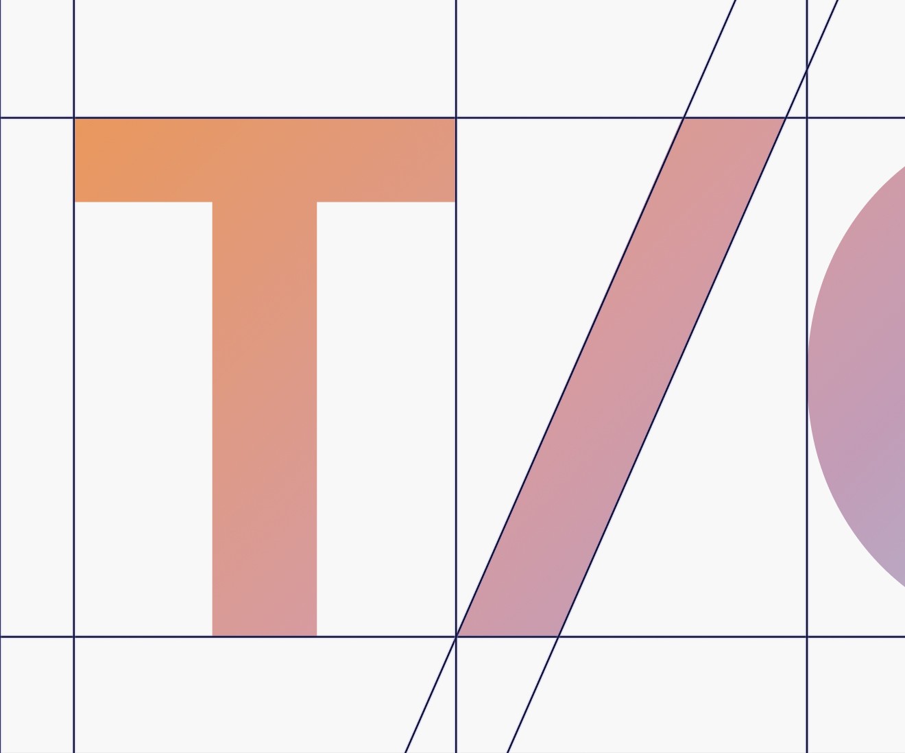
That insight became the brand. The logo mark carries it in a single device: a circle for the sun (balance, unity, optimism, stability), an angled line cutting through it at 23.5° (Earth's axial tilt, the system's central axis), and two further lines reflecting the sunrise (a new era of financial stability and new opportunities).
That insight became the brand. The logo mark carries it in a single device: a circle for the sun (balance, unity, optimism, stability), an angled line cutting through it at 23.5° (Earth's axial tilt, the system's central axis), and two further lines reflecting the sunrise (a new era of financial stability and new opportunities).
/ 4
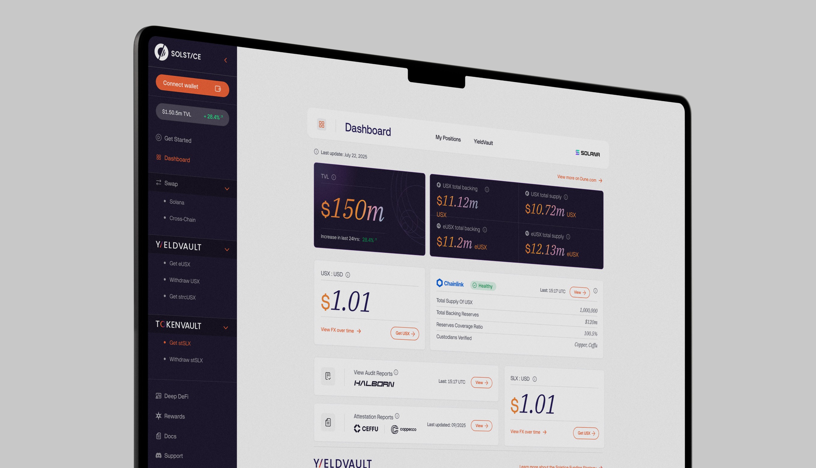
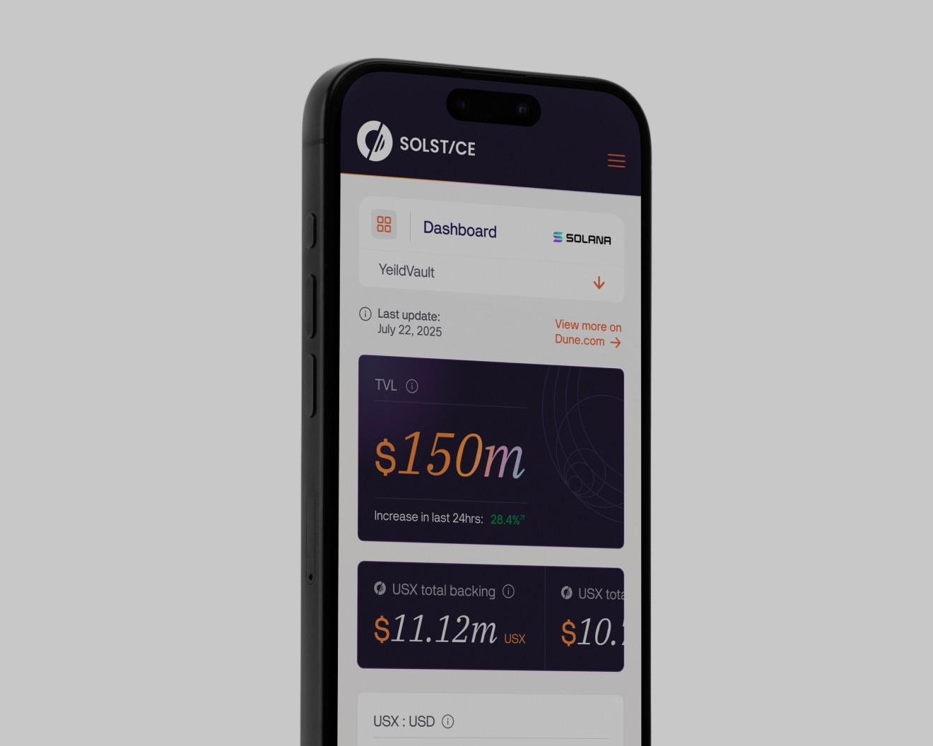
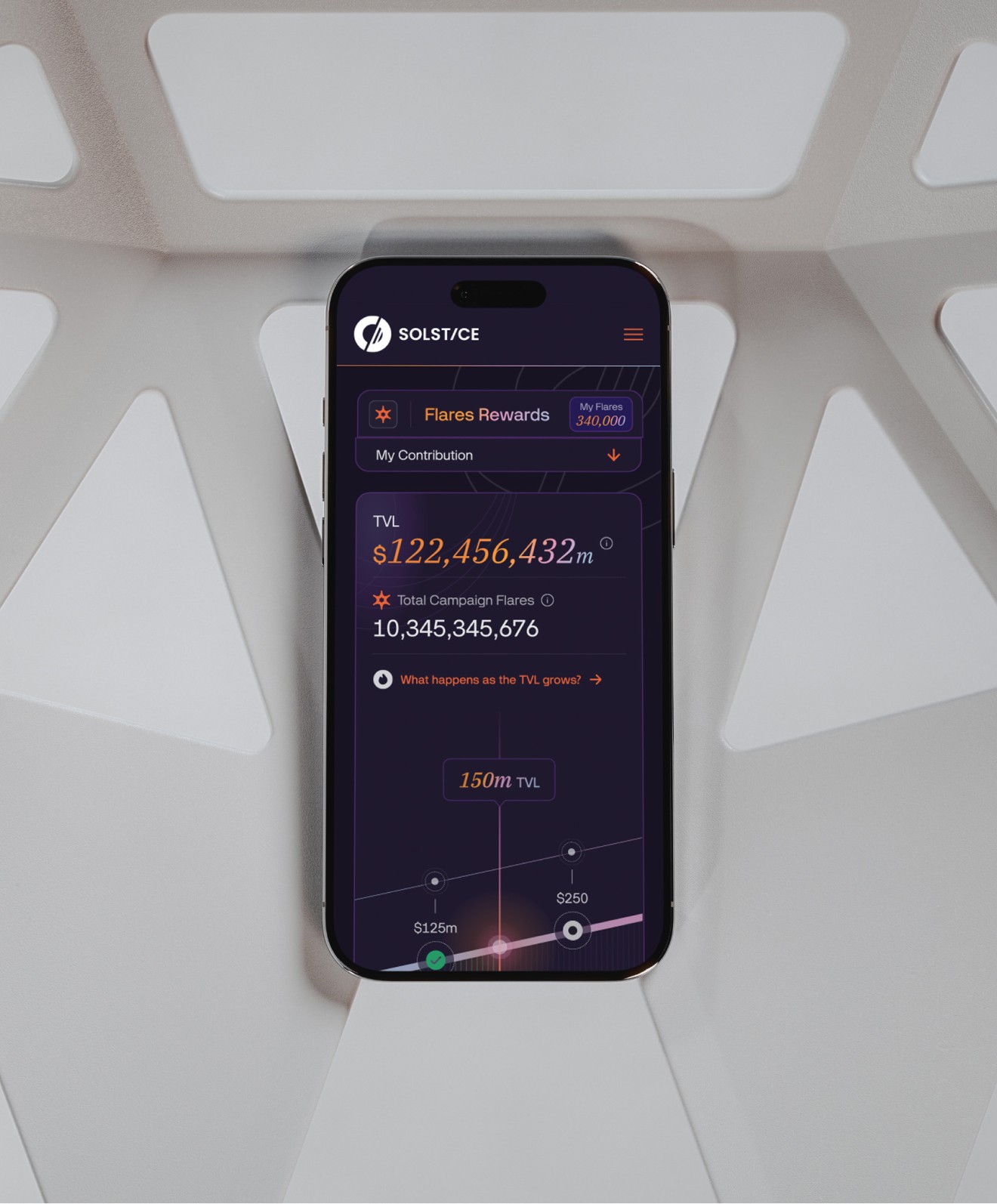
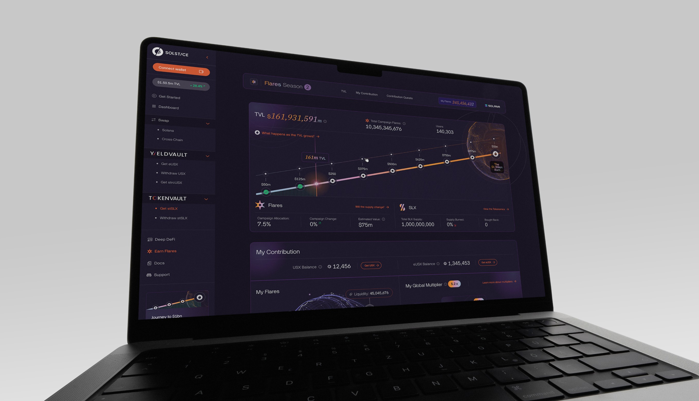
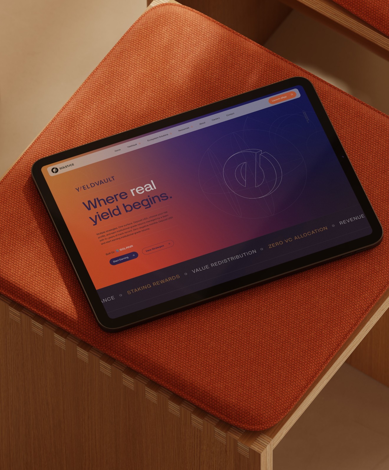
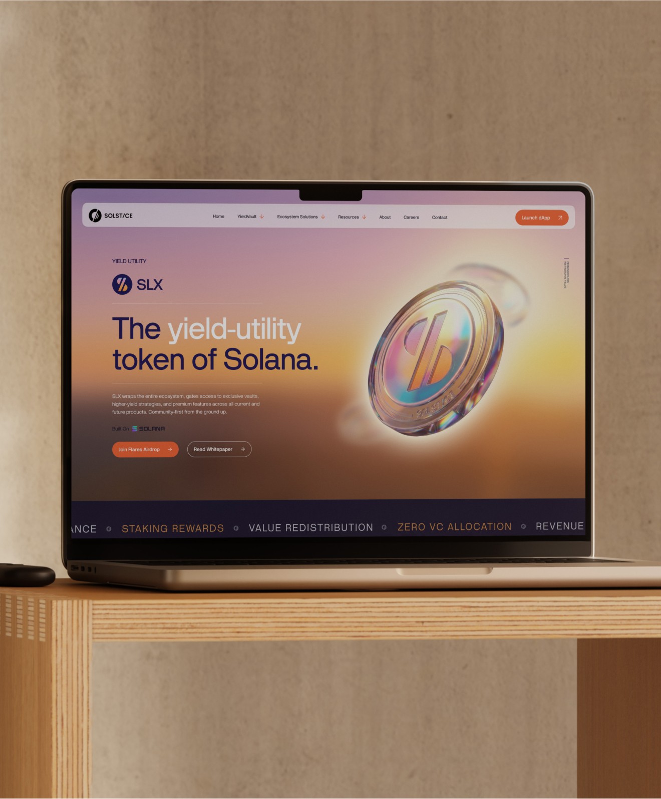
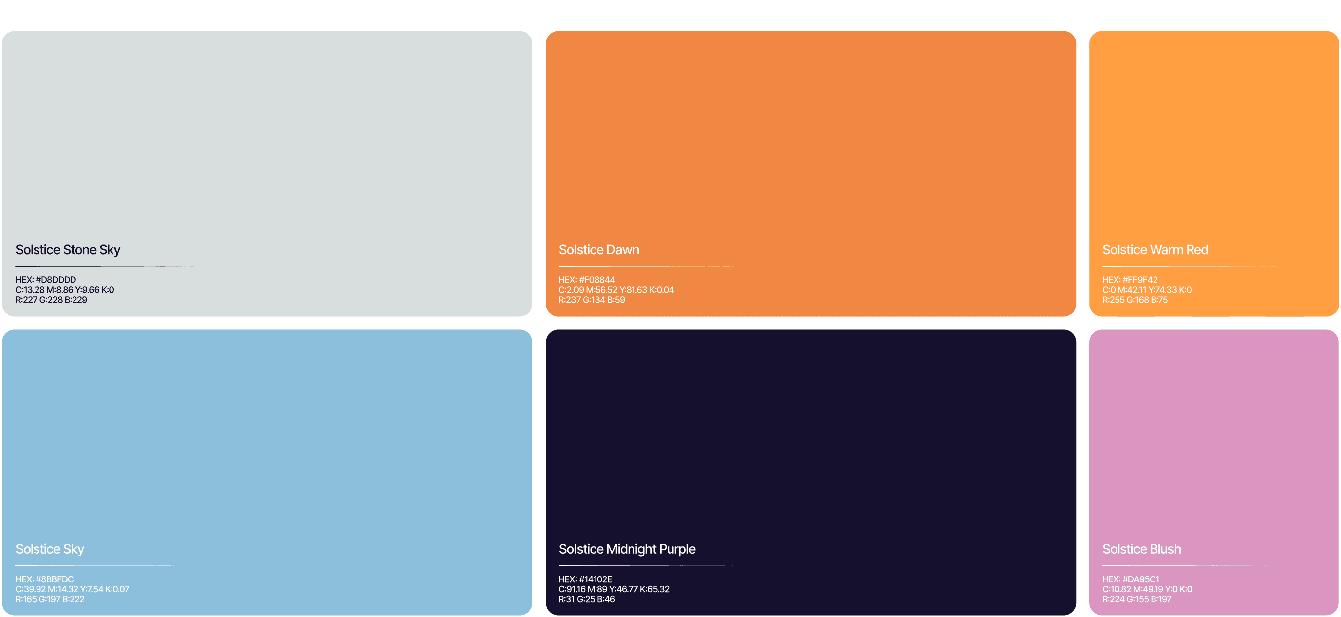
Around the mark we built a dual palette: Summer Solstice for retail surfaces (warm, open, inviting) and Winter Solstice for institutional and transactional environments (deep, focused, professional). Orange becomes the axis between them. The line that holds it all together, One system. One axis. Precision at both extremes, sits at the heart of the identity.
/ 5
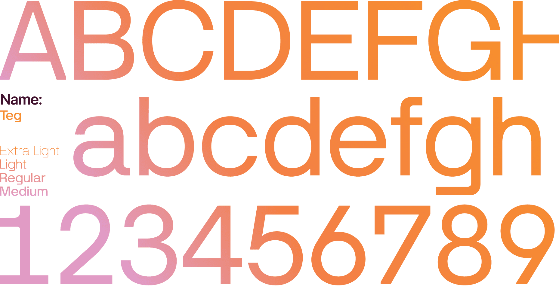
We extended that thinking into a typographic system led by Teg for headlines and Neue Montreal for body, a design grid built on a 23.5° axis, technical illustration inspired by astronomical charts.
We extended that thinking into a typographic system led by Teg for headlines and Neue Montreal for body, a design grid built on a 23.5° axis, technical illustration inspired by astronomical charts.
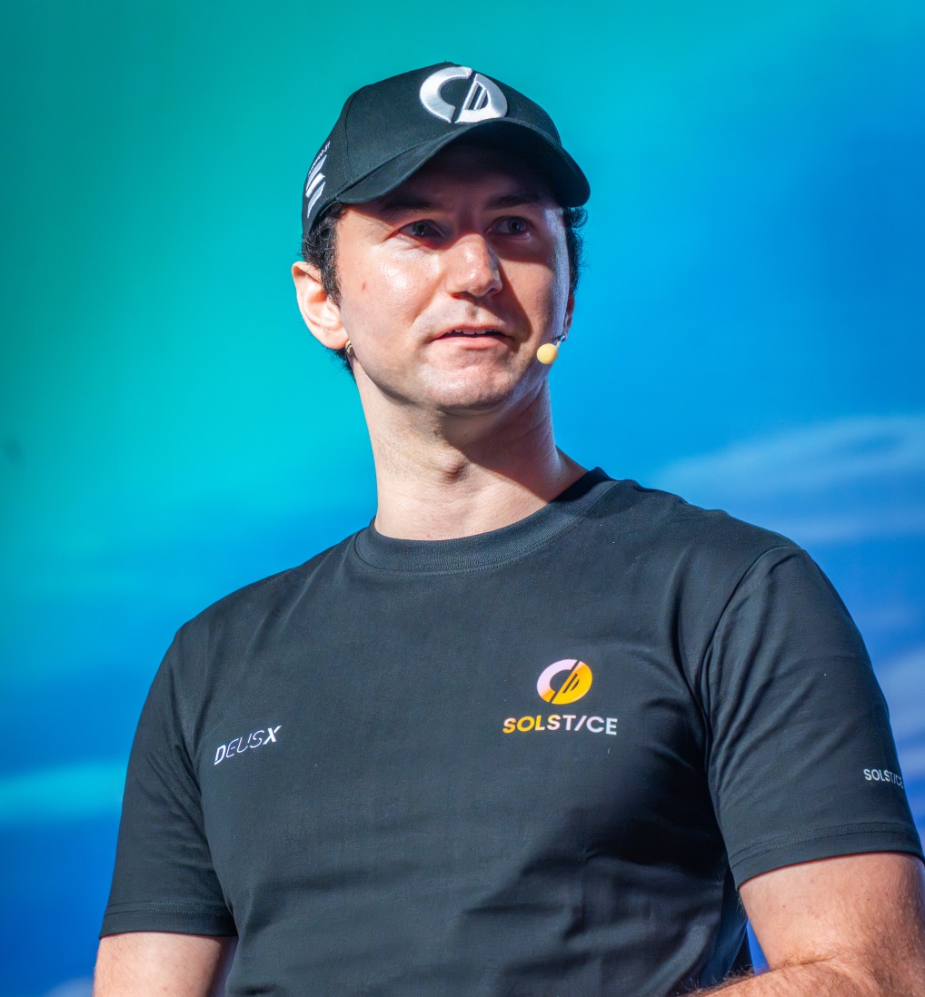
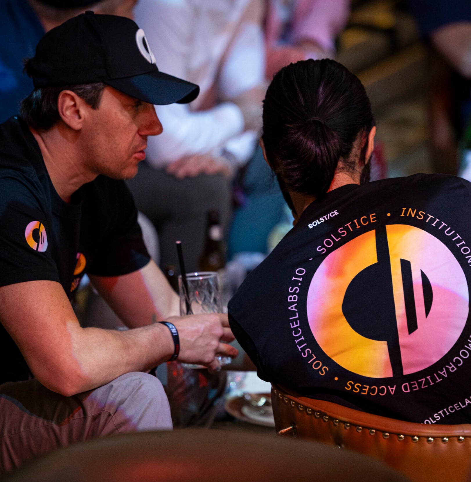
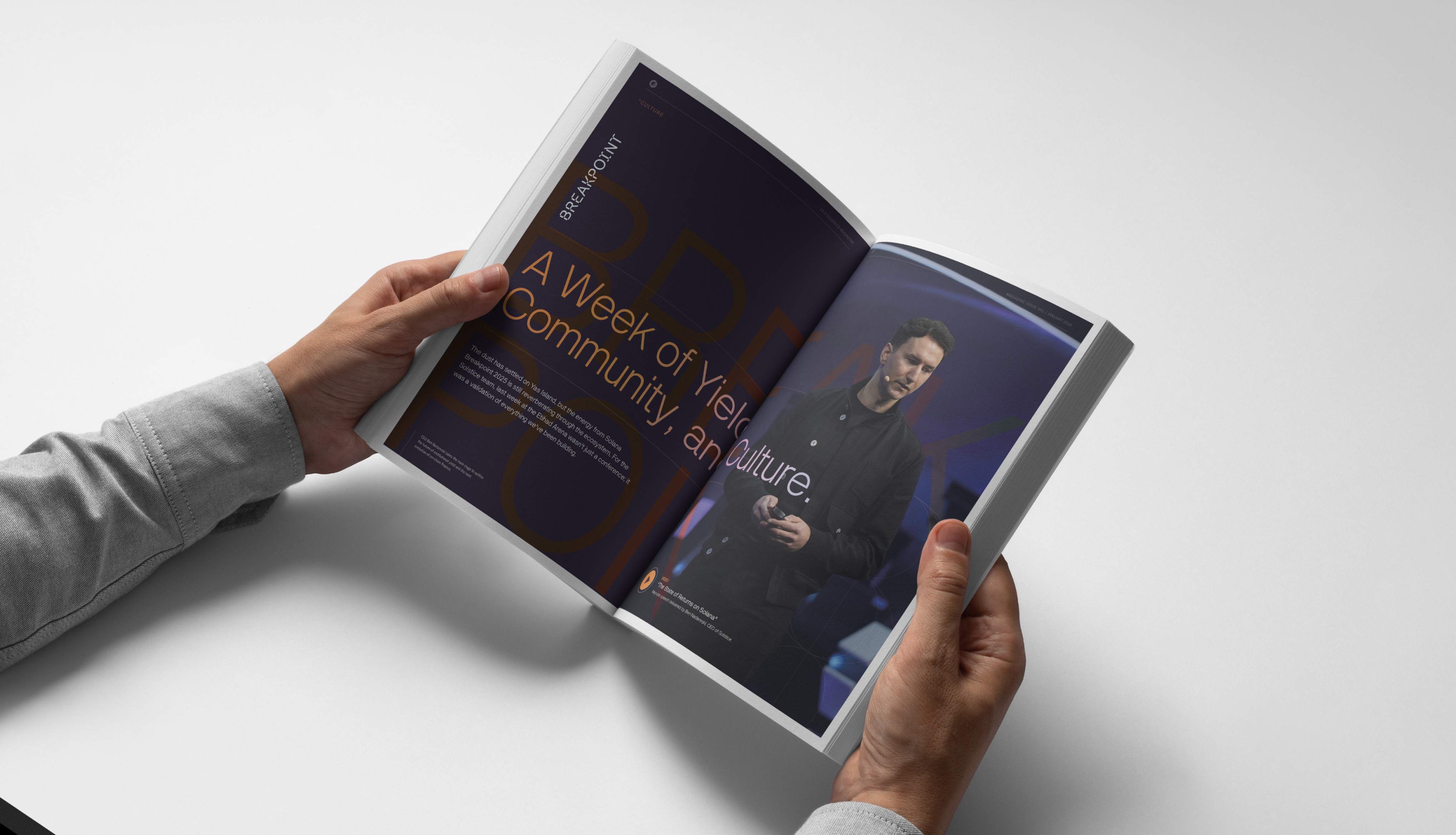
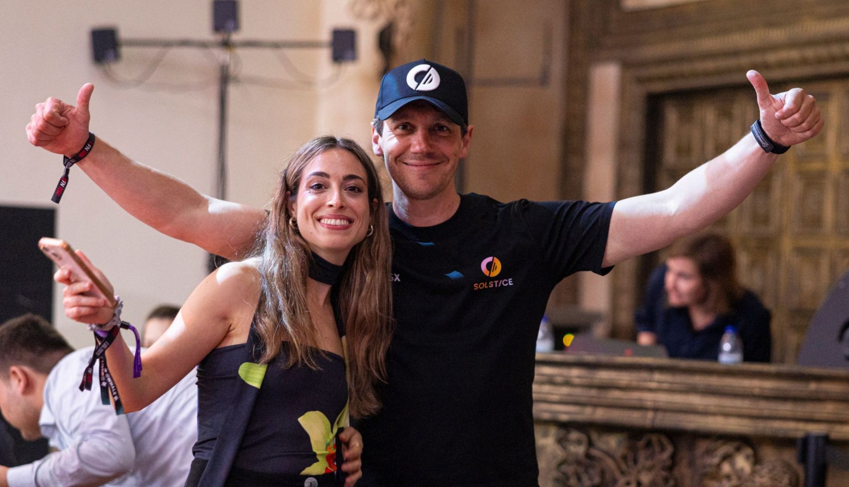
From apparel and accessories to printed collateral, packaging and branded objects, the Solstice identity was designed as a flexible system that could extend beyond screens - creating consistency across every physical touchpoint while reinforcing the brand’s premium and recognisable presence.
From apparel and accessories to printed collateral, packaging and branded objects, the Solstice identity was designed as a flexible system that could extend beyond screens - creating consistency across every physical touchpoint while reinforcing the brand’s premium and recognisable presence.
/ 6
The Solstice identity was built around a single unifying idea: creating a brand that could feel warm enough for accessibility, structured enough for financial trust, and distinctive enough to stand apart in the crowded DeFi landscape. The logo, colour system and visual language were all designed to express that balance.
The Solstice identity was built around a single unifying idea: creating a brand that could feel warm enough for accessibility, structured enough for financial trust, and distinctive enough to stand apart in the crowded DeFi landscape. The logo, colour system and visual language were all designed to express that balance.
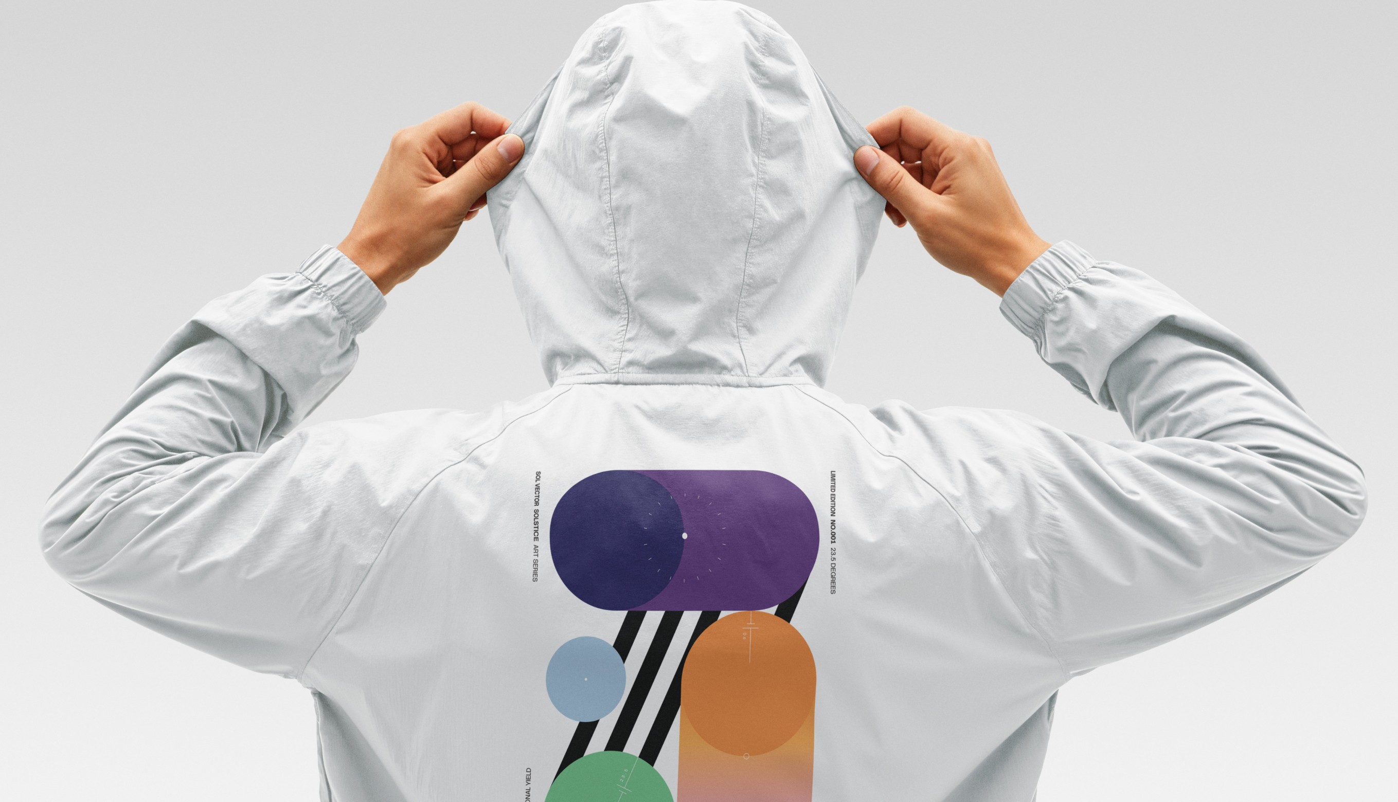
The Solstice identity was designed as a system, not just a logo - flexible enough to extend across apparel, accessories, packaging and branded objects while maintaining consistency across every physical application.
The Solstice identity was designed as a system, not just a logo - flexible enough to extend across apparel, accessories, packaging and branded objects while maintaining consistency across every physical application.
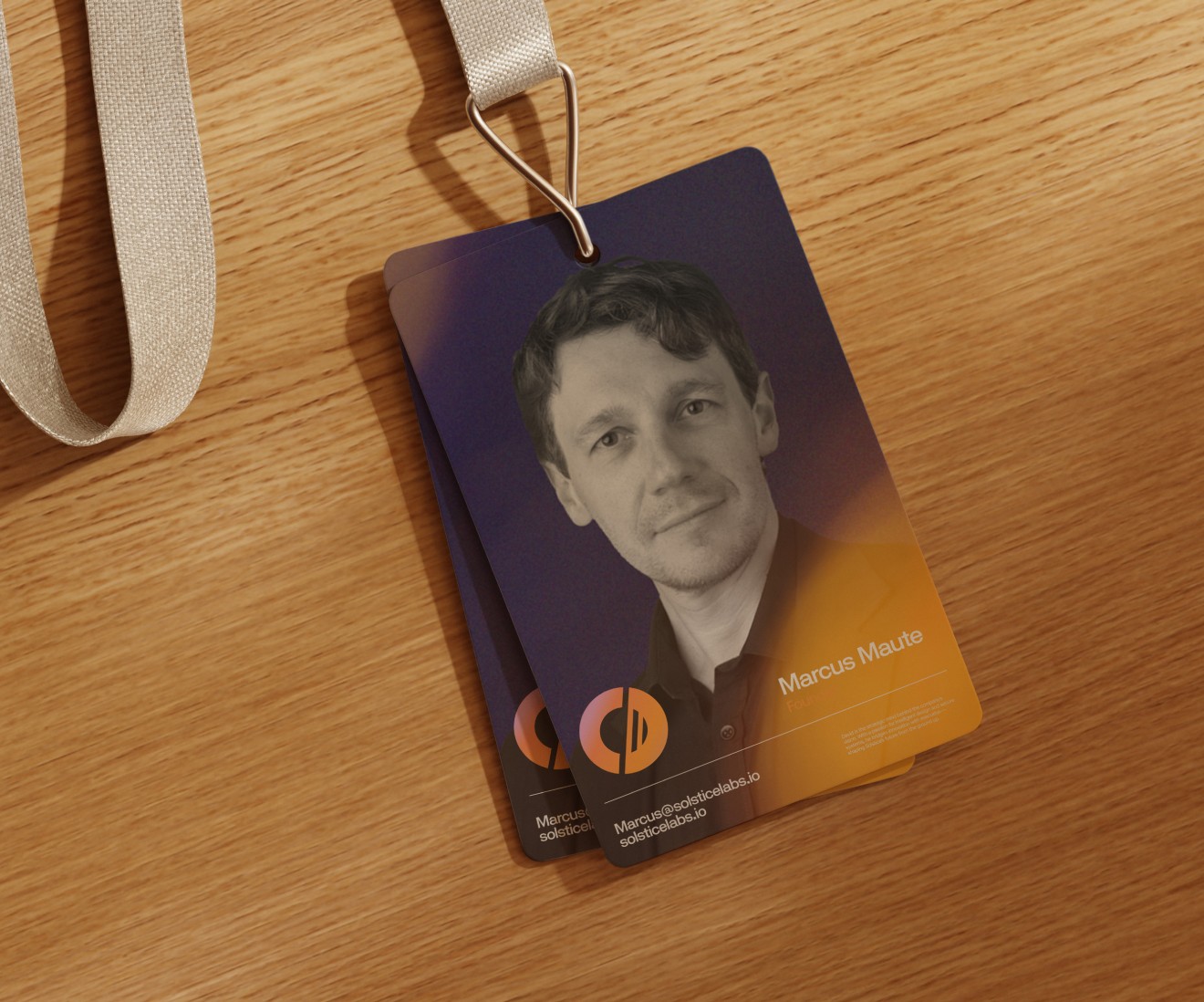

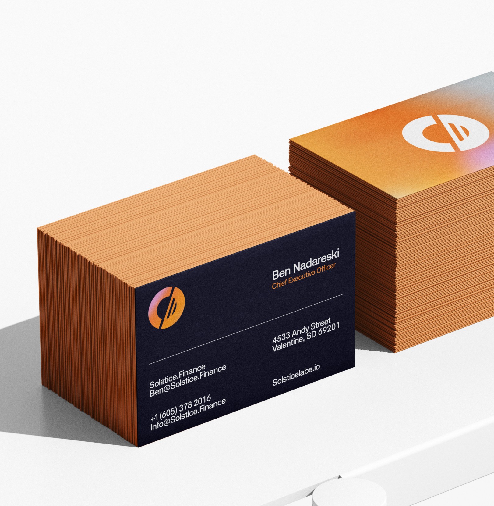
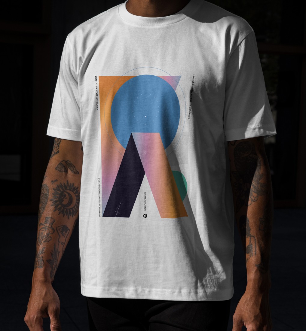
By translating the visual language into merchandise, printed collateral and lifestyle assets, the brand gained a tangible presence beyond digital finance, helping Solstice feel more recognisable, collectible and culturally visible in the real world.
By translating the visual language into merchandise, printed collateral and lifestyle assets, the brand gained a tangible presence beyond digital finance, helping Solstice feel more recognisable, collectible and culturally visible in the real world.
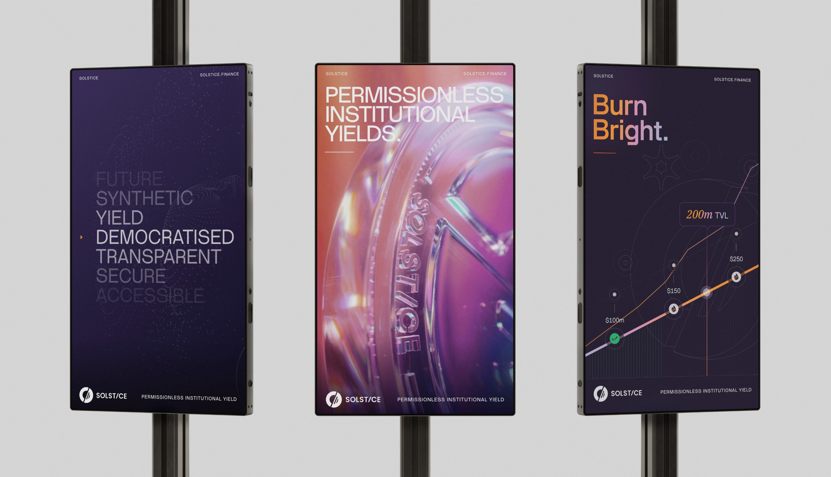
What began as a brand identity project became the public-facing foundation for Solstice’s broader DeFi ecosystem - translating a technically complex financial infrastructure business into a visual and digital system built for trust, clarity and long-term scale. In a category where most platforms lean too speculative for serious capital or too technical for mainstream adoption, Solstice launched with a brand designed to hold both at once: open enough for first-time wallet users, credible enough for institutional stakeholders, and distinctive enough to establish a meaningful presence in one of the fastest-moving sectors in digital finance.
By grounding the work in a clear strategic metaphor and extending it across identity, product design, marketing systems and public-facing digital experiences, Solstice gained more than a visual refresh - it gained a cohesive market-facing brand system capable of supporting launch, adoption and long-term ecosystem growth. The result was a DeFi platform with stronger positioning, clearer communication and a premium identity that helped shape how Solstice was perceived by users, partners and the broader market as it scaled from launch into one of Solana’s most visible stablecoin ecosystems.
What began as a brand identity project became the public-facing foundation for Solstice’s broader DeFi ecosystem - translating a technically complex financial infrastructure business into a visual and digital system built for trust, clarity and long-term scale. In a category where most platforms lean too speculative for serious capital or too technical for mainstream adoption, Solstice launched with a brand designed to hold both at once: open enough for first-time wallet users, credible enough for institutional stakeholders, and distinctive enough to establish a meaningful presence in one of the fastest-moving sectors in digital finance.
By grounding the work in a clear strategic metaphor and extending it across identity, product design, marketing systems and public-facing digital experiences, Solstice gained more than a visual refresh - it gained a cohesive market-facing brand system capable of supporting launch, adoption and long-term ecosystem growth. The result was a DeFi platform with stronger positioning, clearer communication and a premium identity that helped shape how Solstice was perceived by users, partners and the broader market as it scaled from launch into one of Solana’s most visible stablecoin ecosystems.
/ 7
Project impact
$500M+
$500M+
Total value locked (May 2026)
15.4K+
15.4K+
Active wallets
Top 7
Top 7
Stablecoin on Solana
30+
30+
Launch partners
