'26
Invictus Games Sydney 2018 needed a local identity that could honour one of the world’s most recognised sporting brands while expressing the culture, energy and spirit of Australia as host nation. We developed a visual system that respected the global Invictus framework while introducing a distinctly Australian voice, creating a brand experience designed to carry the emotional weight of the Games across athletes, audiences, venues and screens around the world.
Invictus Games Sydney 2018 needed a local identity that could honour one of the world’s most recognised sporting brands while expressing the culture, energy and spirit of Australia as host nation. We developed a visual system that respected the global Invictus framework while introducing a distinctly Australian voice, creating a brand experience designed to carry the emotional weight of the Games across athletes, audiences, venues and screens around the world.
/ 1
The challenge was not creating a new identity from scratch, but evolving a global icon without losing the power that made it resonate worldwide. Invictus already carried strong brand equity, emotional meaning and an unmistakable voice.
Our role was to build a localised system that felt authentically Australian while remaining true to the global foundation, creating a flexible visual language that could scale across competition venues, athlete kits, broadcast systems, merchandise and city-wide event branding with equal strength and dignity.
The challenge was not creating a new identity from scratch, but evolving a global icon without losing the power that made it resonate worldwide. Invictus already carried strong brand equity, emotional meaning and an unmistakable voice.
Our role was to build a localised system that felt authentically Australian while remaining true to the global foundation, creating a flexible visual language that could scale across competition venues, athlete kits, broadcast systems, merchandise and city-wide event branding with equal strength and dignity.
/ 2
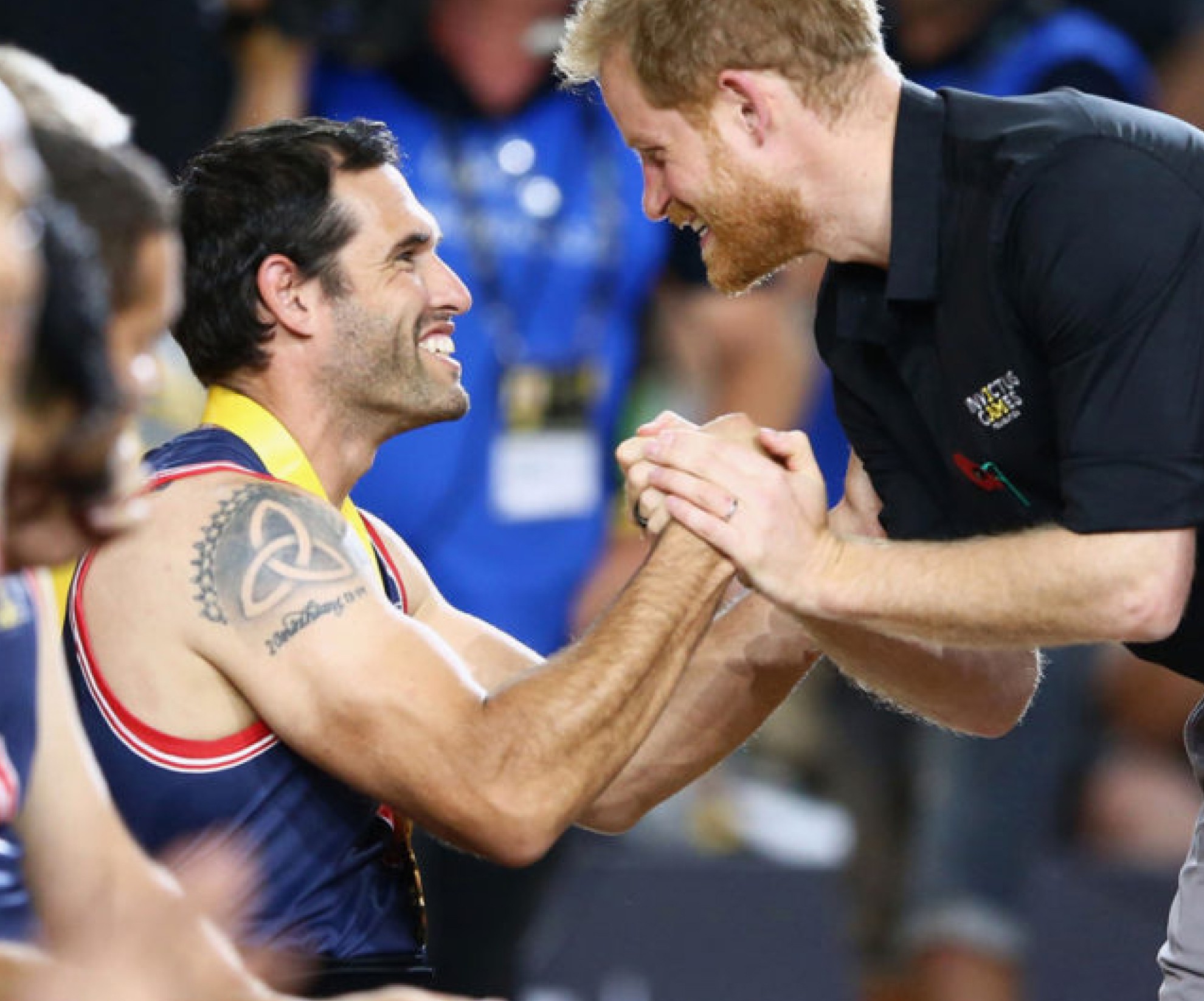
The Sydney 2018 identity was designed to extend the Invictus visual language through a uniquely Australian lens, balancing the strength of the global I AM symbol with local cultural influence and sporting energy. Bold typography, high-contrast colour, modular geometry and a flexible visual system created a brand language that could feel powerful in stadiums, intimate on merchandise and instantly recognisable across every event touchpoint.
The Sydney 2018 identity was designed to extend the Invictus visual language through a uniquely Australian lens, balancing the strength of the global I AM symbol with local cultural influence and sporting energy. Bold typography, high-contrast colour, modular geometry and a flexible visual system created a brand language that could feel powerful in stadiums, intimate on merchandise and instantly recognisable across every event touchpoint.
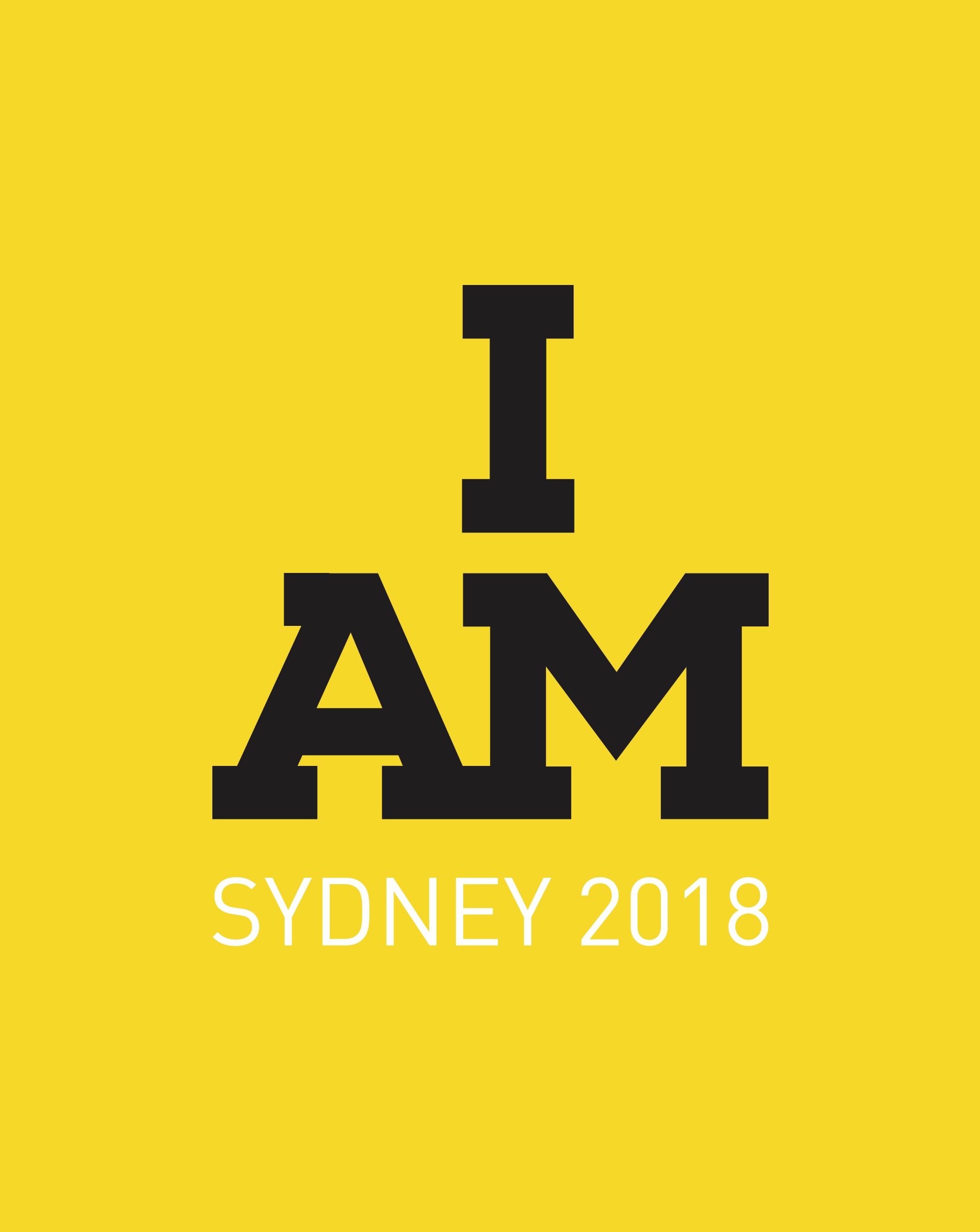
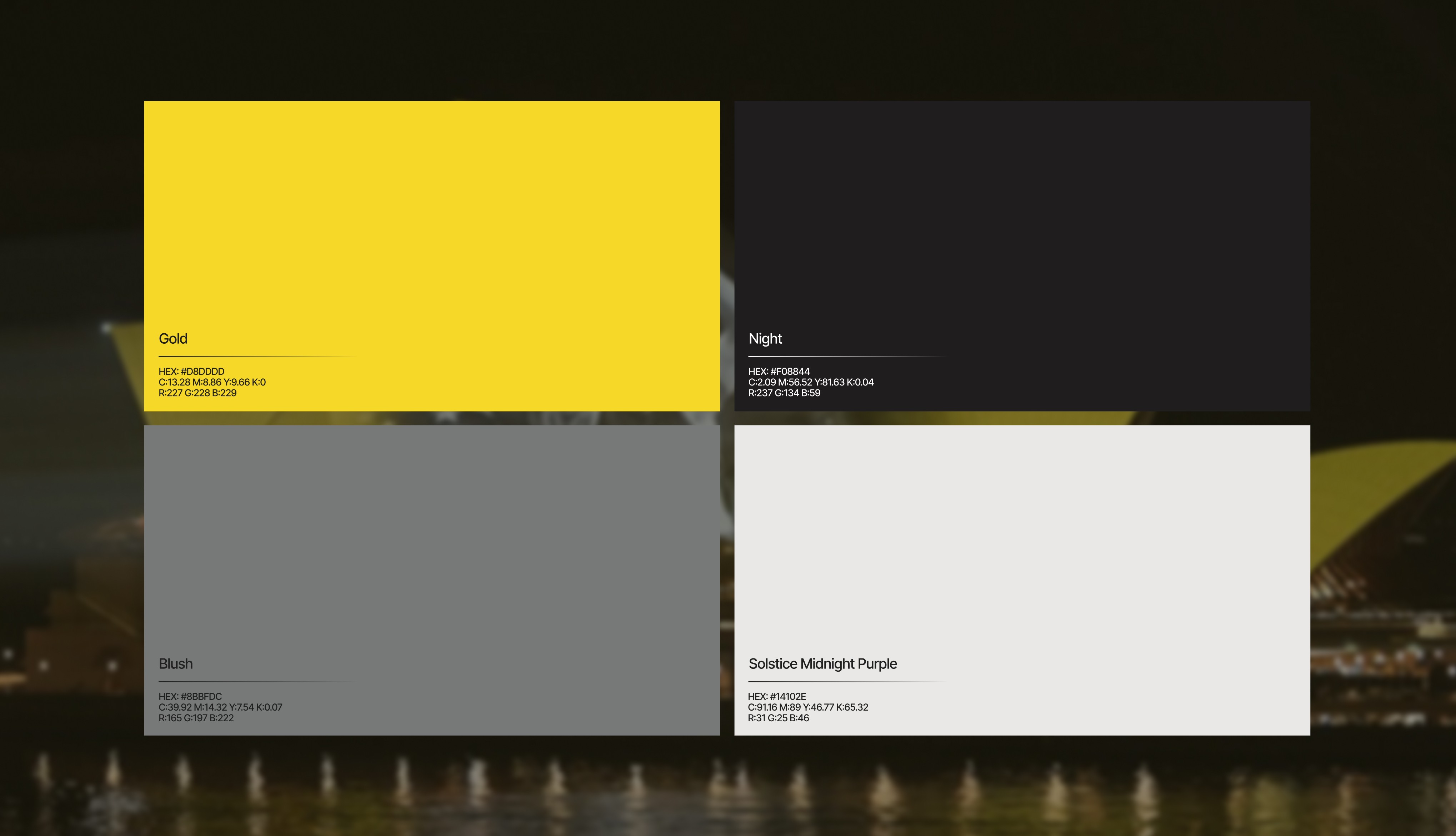
Invictus Games Sydney 2018 needed a local identity that could honour one of the world’s most recognised sporting brands while expressing the culture, energy and spirit of Australia as host nation. We developed a visual system that respected the global Invictus framework while introducing a distinctly Australian voice, creating a brand experience designed to carry the emotional weight of the Games across athletes, audiences, venues and screens around the world.
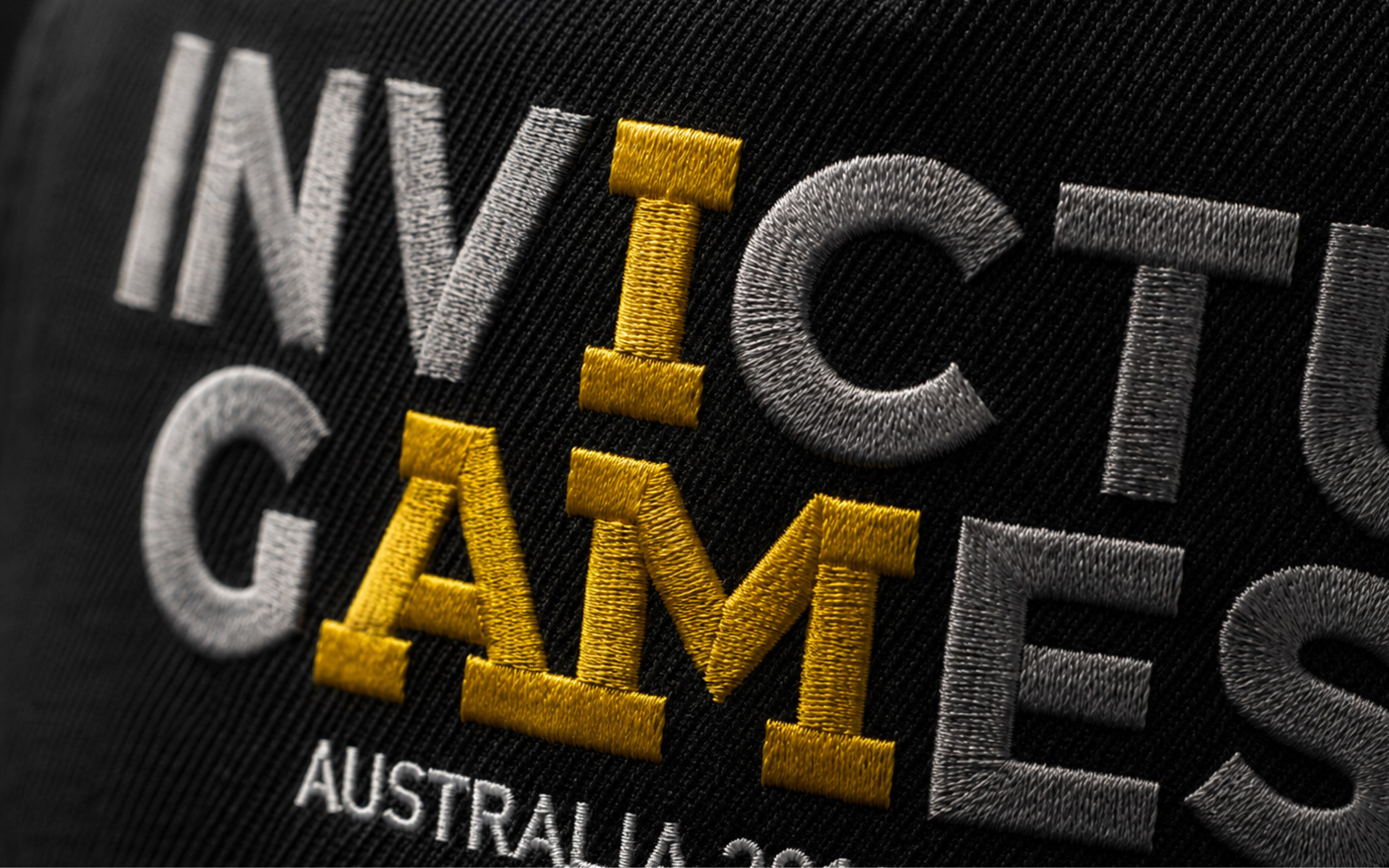
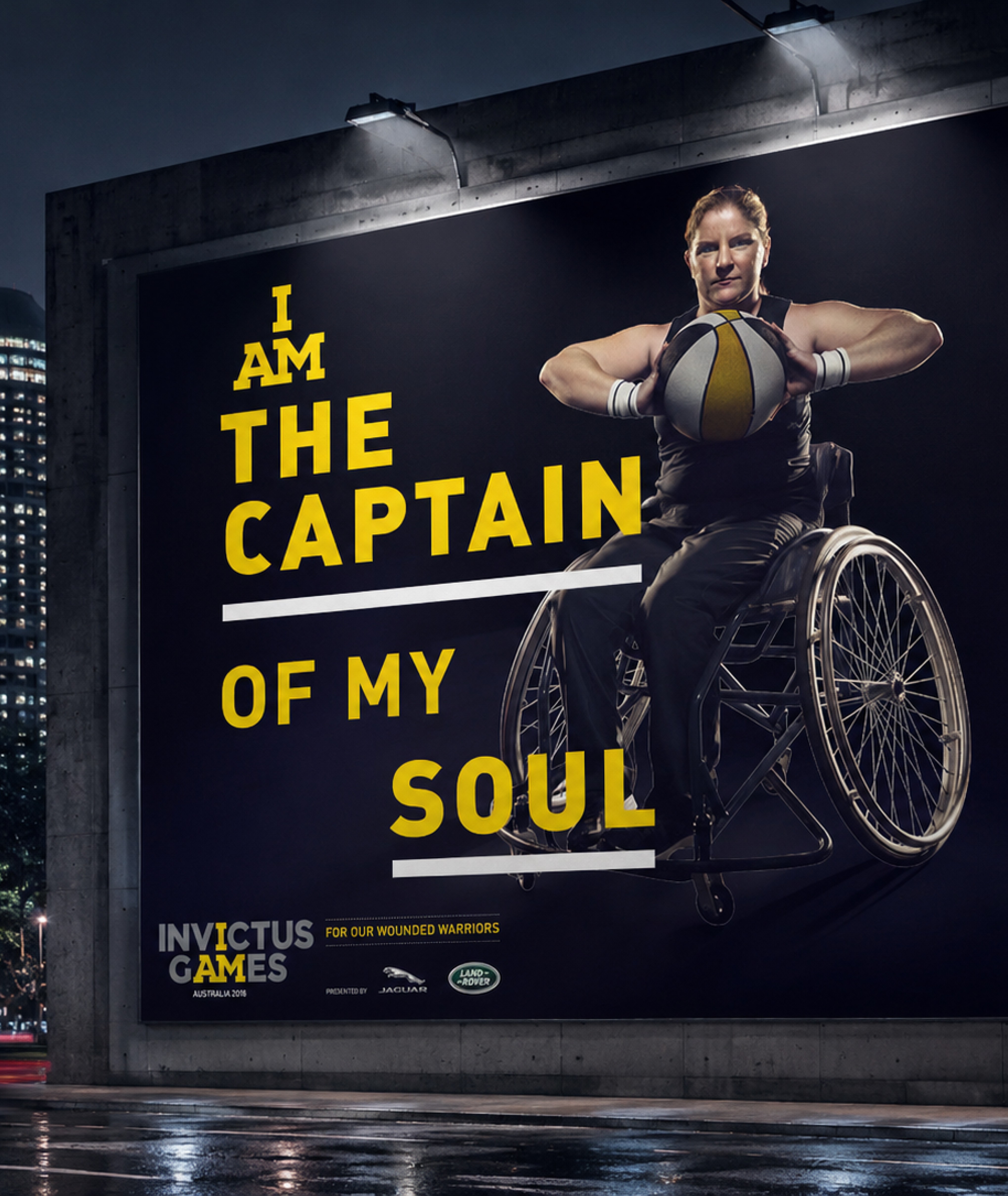
Built to flex across stadium environments, merchandise, athlete kit and campaign materials, the Sydney 2018 identity translated the spirit of Invictus into a bold and highly adaptable visual language. By combining the iconic global “I AM” brand equity with Australian sporting energy and Indigenous-inspired graphic influence, the system created a brand presence that felt powerful, memorable and capable of carrying the emotional weight of the Games across every touchpoint.
Built to flex across stadium environments, merchandise, athlete kit and campaign materials, the Sydney 2018 identity translated the spirit of Invictus into a bold and highly adaptable visual language. By combining the iconic global “I AM” brand equity with Australian sporting energy and Indigenous-inspired graphic influence, the system created a brand presence that felt powerful, memorable and capable of carrying the emotional weight of the Games across every touchpoint.
/ 3
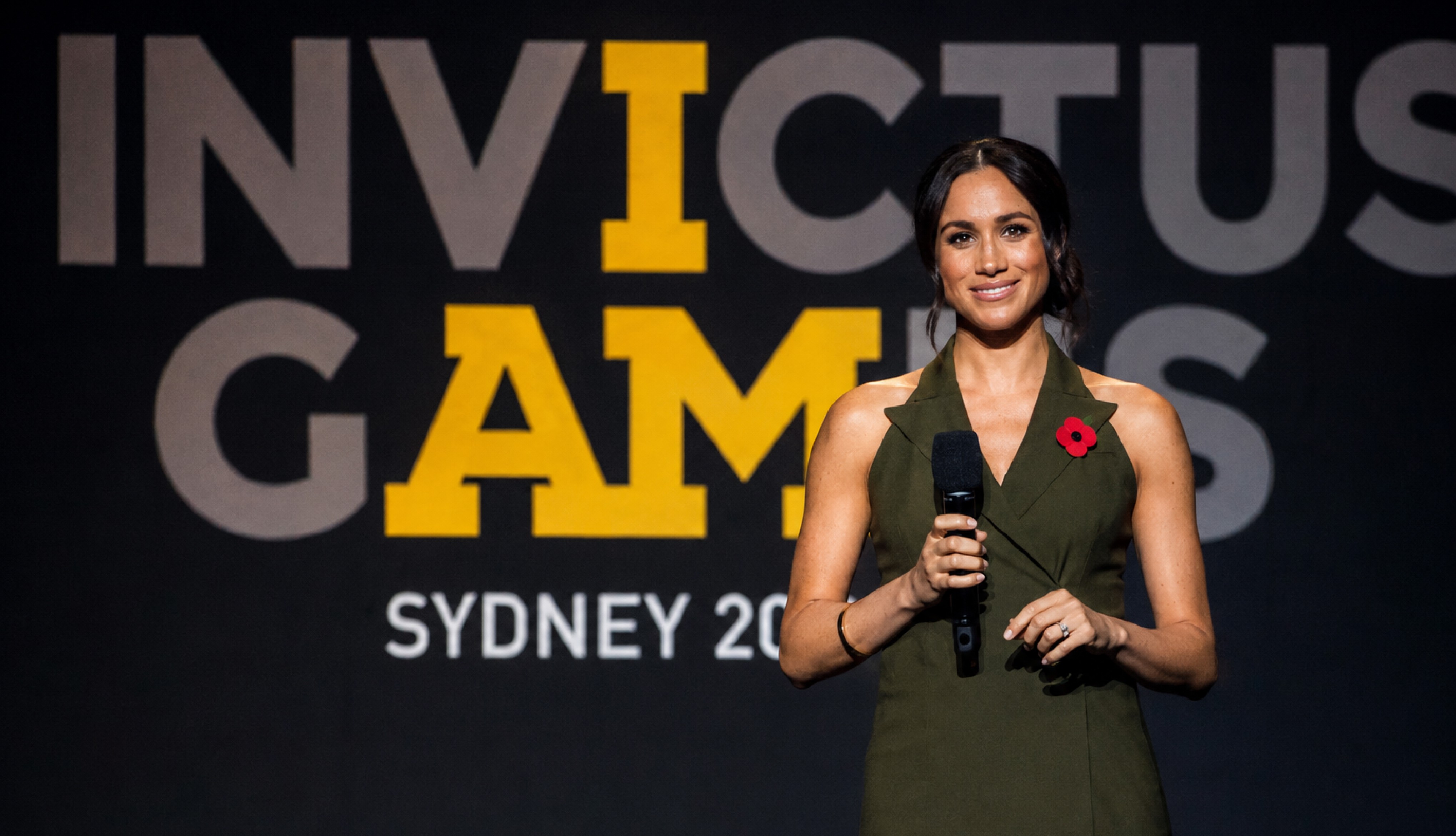
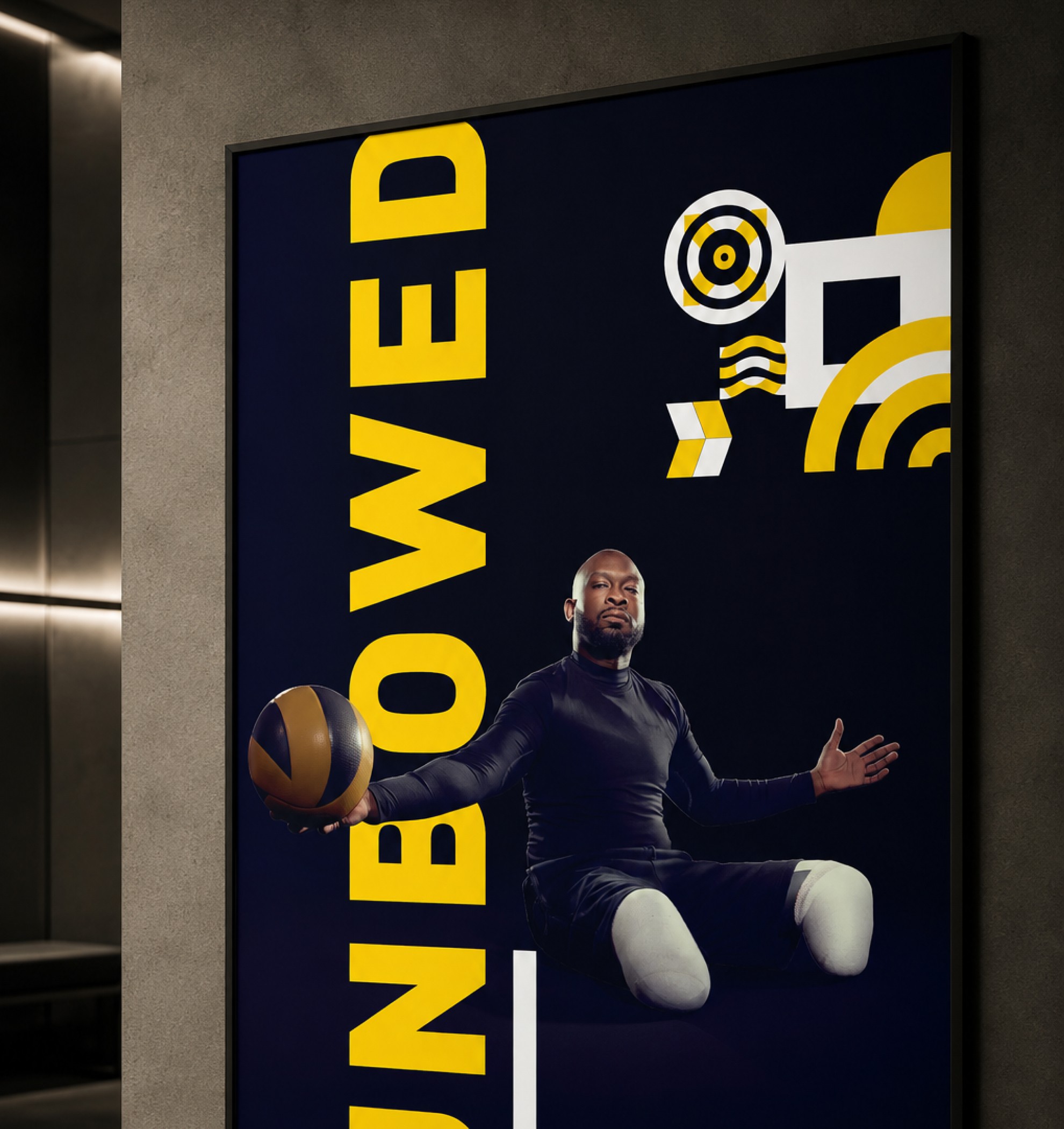
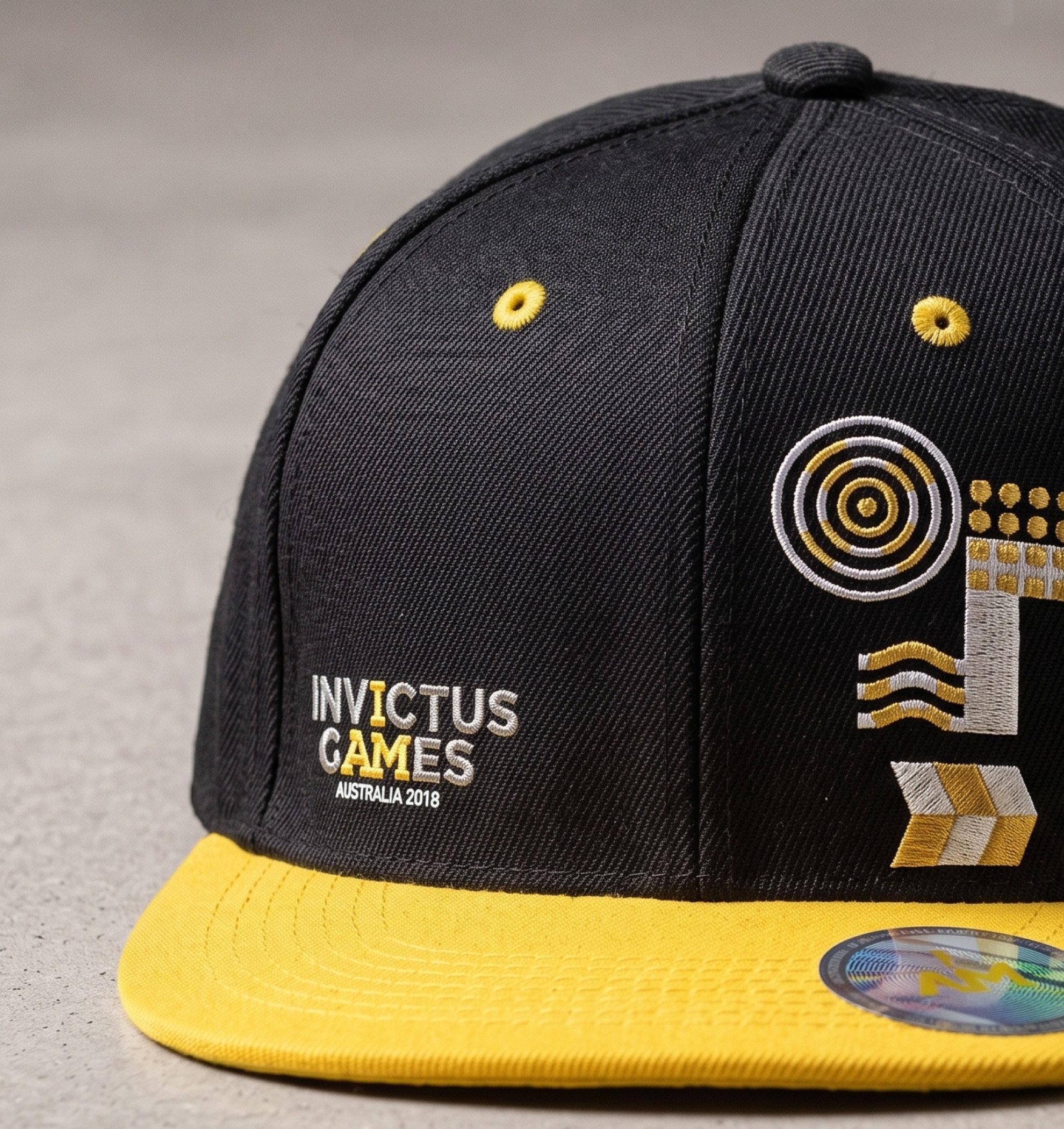
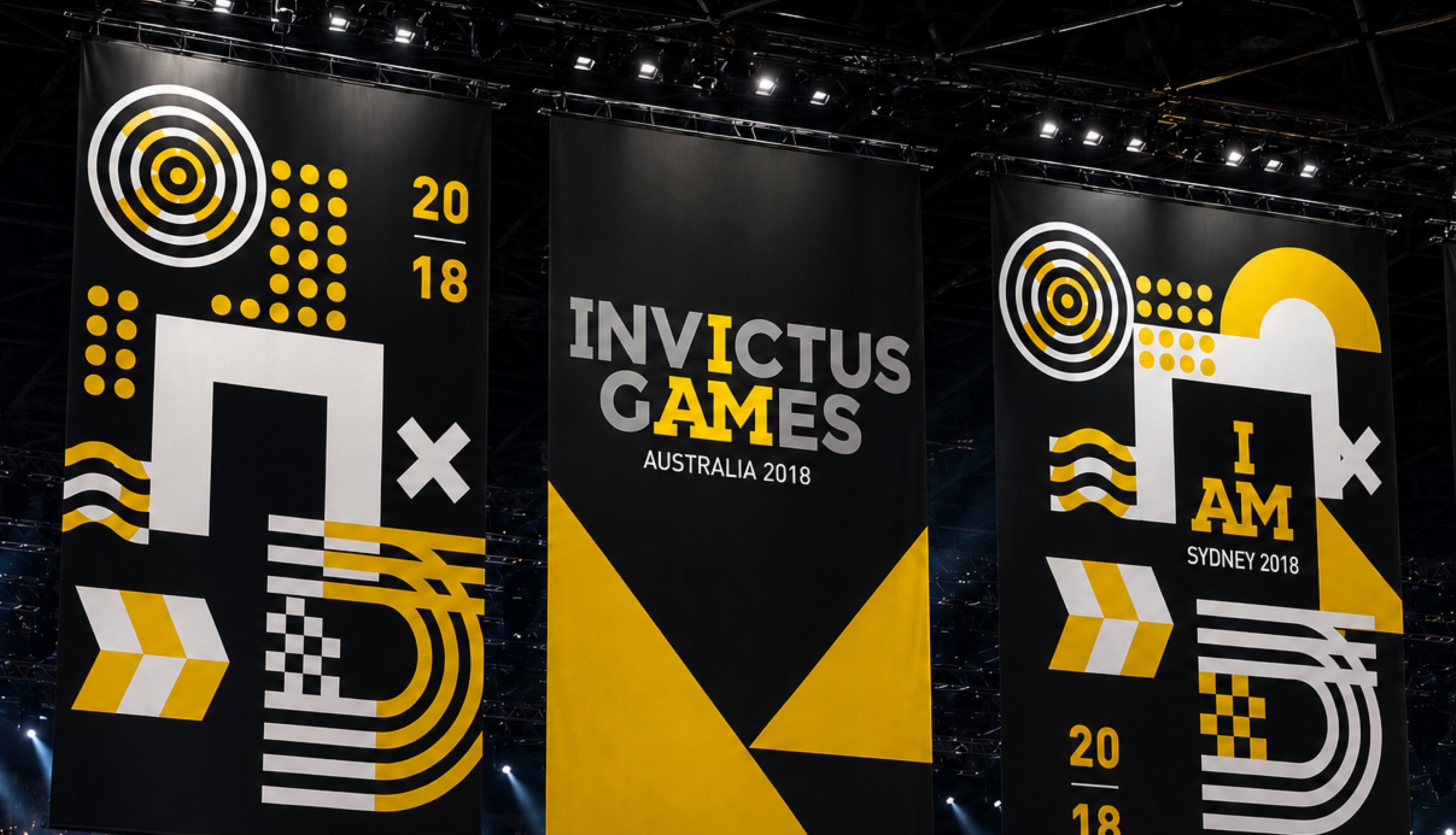
The Sydney 2018 identity was built to move beyond logos and into the experience of the Games themselves. From stadium branding and city-scale installations to athlete-led campaign assets and public storytelling, the visual system created a presence that felt bold, dignified and instantly recognisable, giving the event a unified identity across physical and broadcast environments.
The Sydney 2018 identity was built to move beyond logos and into the experience of the Games themselves. From stadium branding and city-scale installations to athlete-led campaign assets and public storytelling, the visual system created a presence that felt bold, dignified and instantly recognisable, giving the event a unified identity across physical and broadcast environments.
/ 4
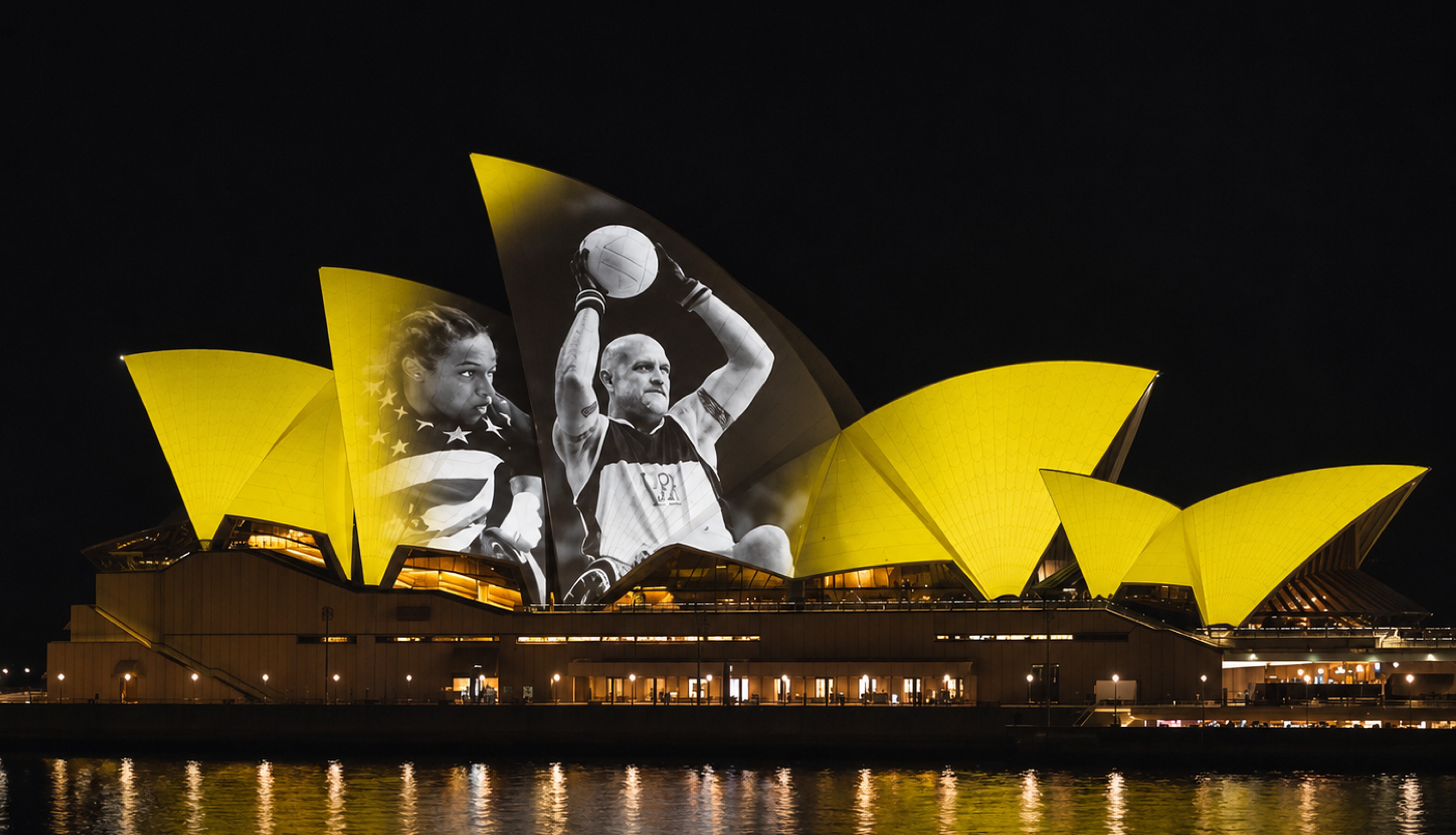
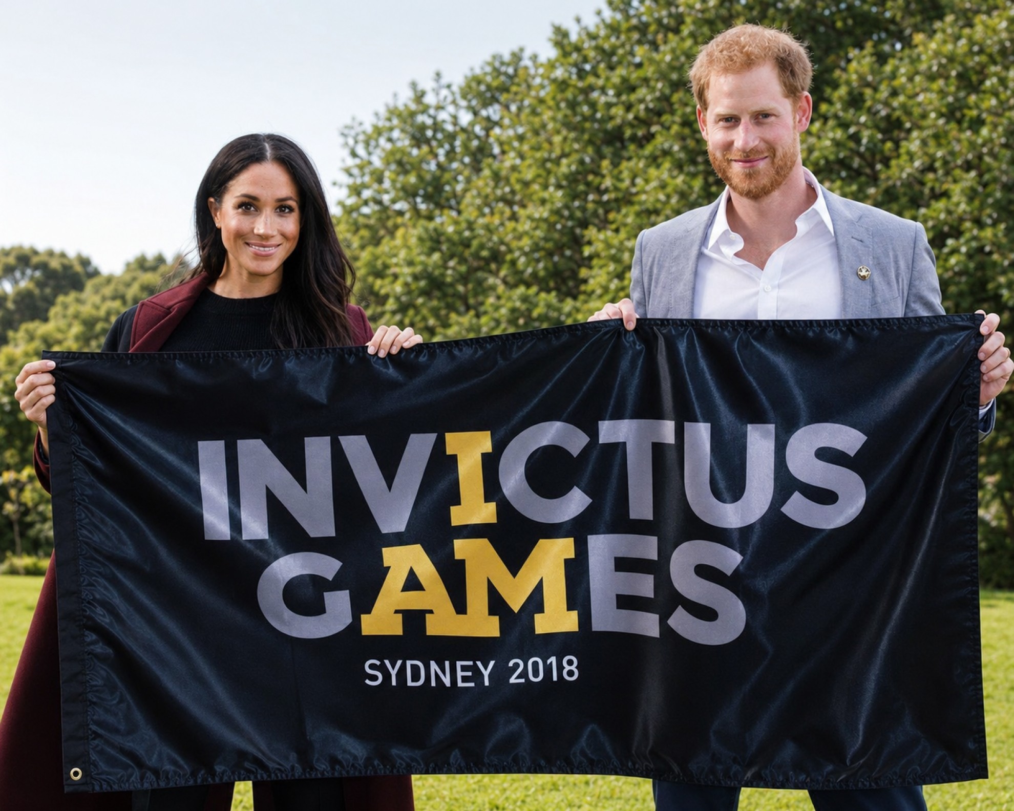
Typography, poetry-led messaging and high-contrast visual compositions worked together to celebrate not only competition, but the resilience and human stories behind every athlete. The result was a brand experience that transformed the Games into something larger than sport: a global event with emotional impact, cultural relevance and a visual language built to inspire audiences both on the ground and around the world.
Typography, poetry-led messaging and high-contrast visual compositions worked together to celebrate not only competition, but the resilience and human stories behind every athlete. The result was a brand experience that transformed the Games into something larger than sport: a global event with emotional impact, cultural relevance and a visual language built to inspire audiences both on the ground and around the world.
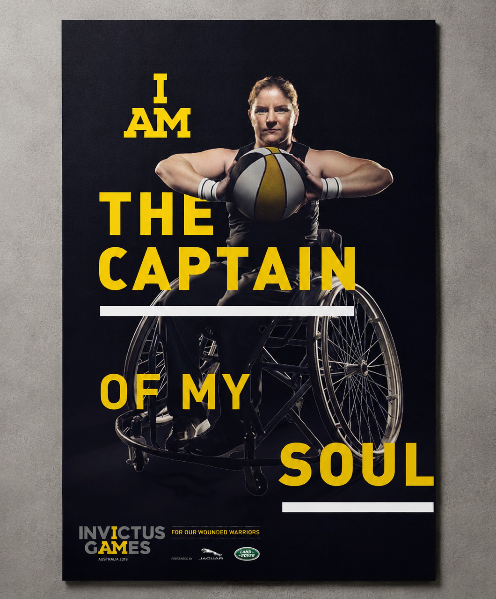
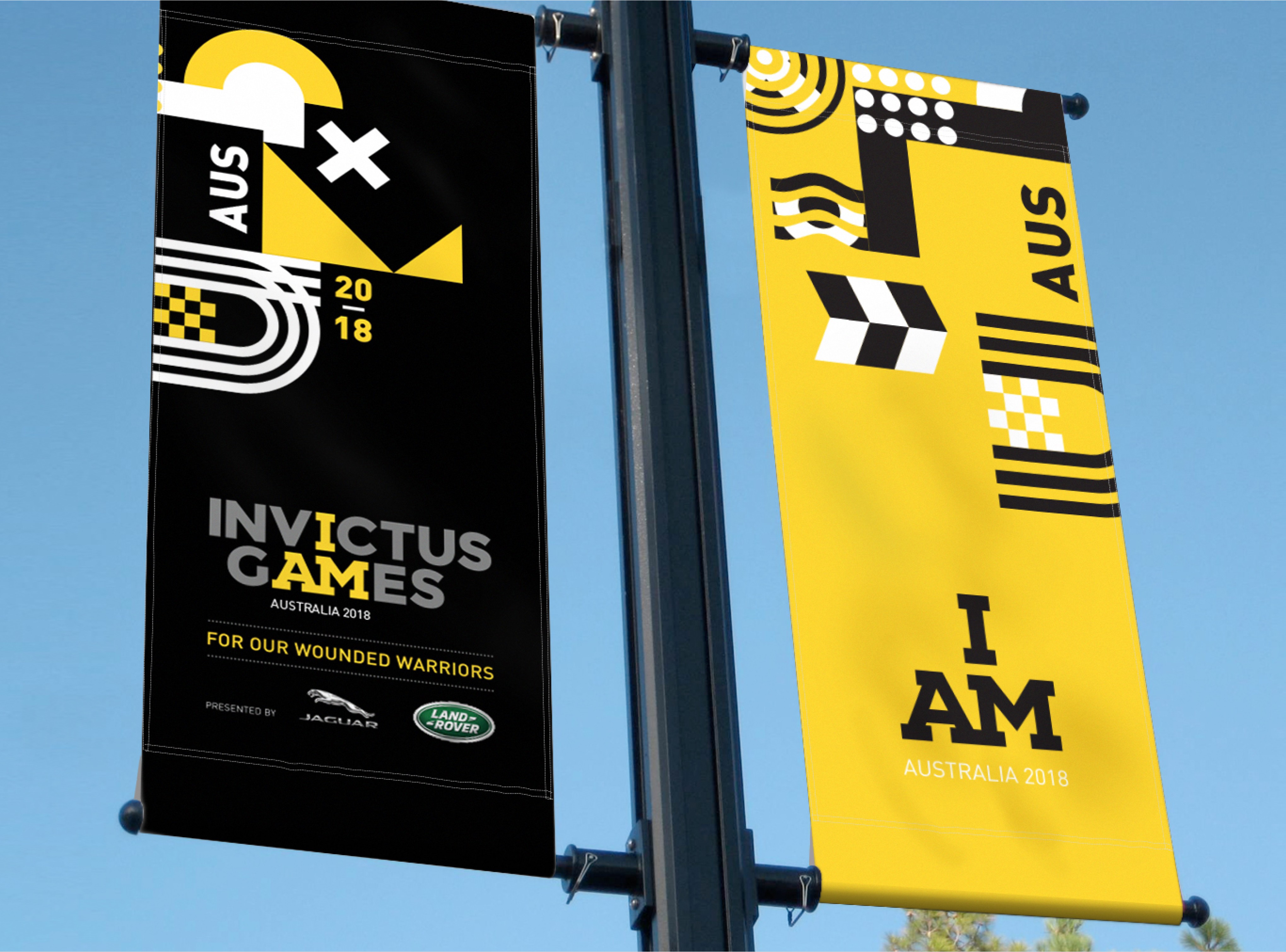
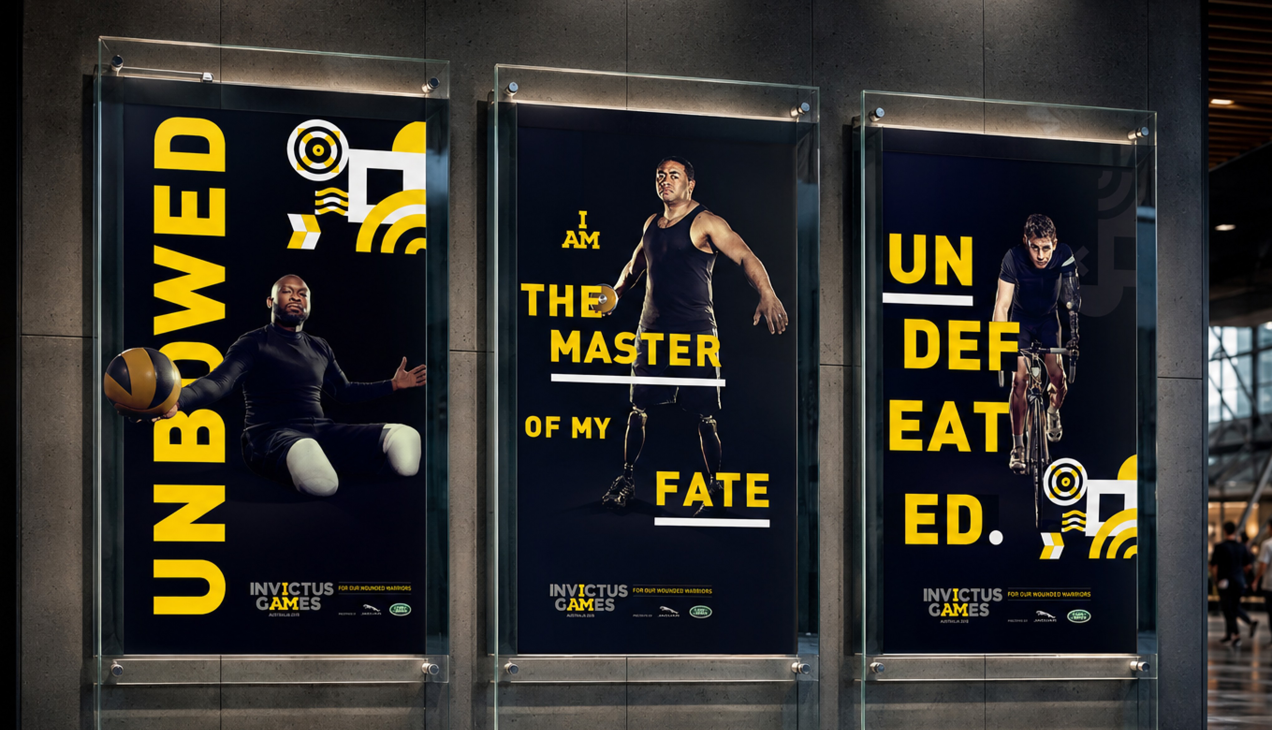
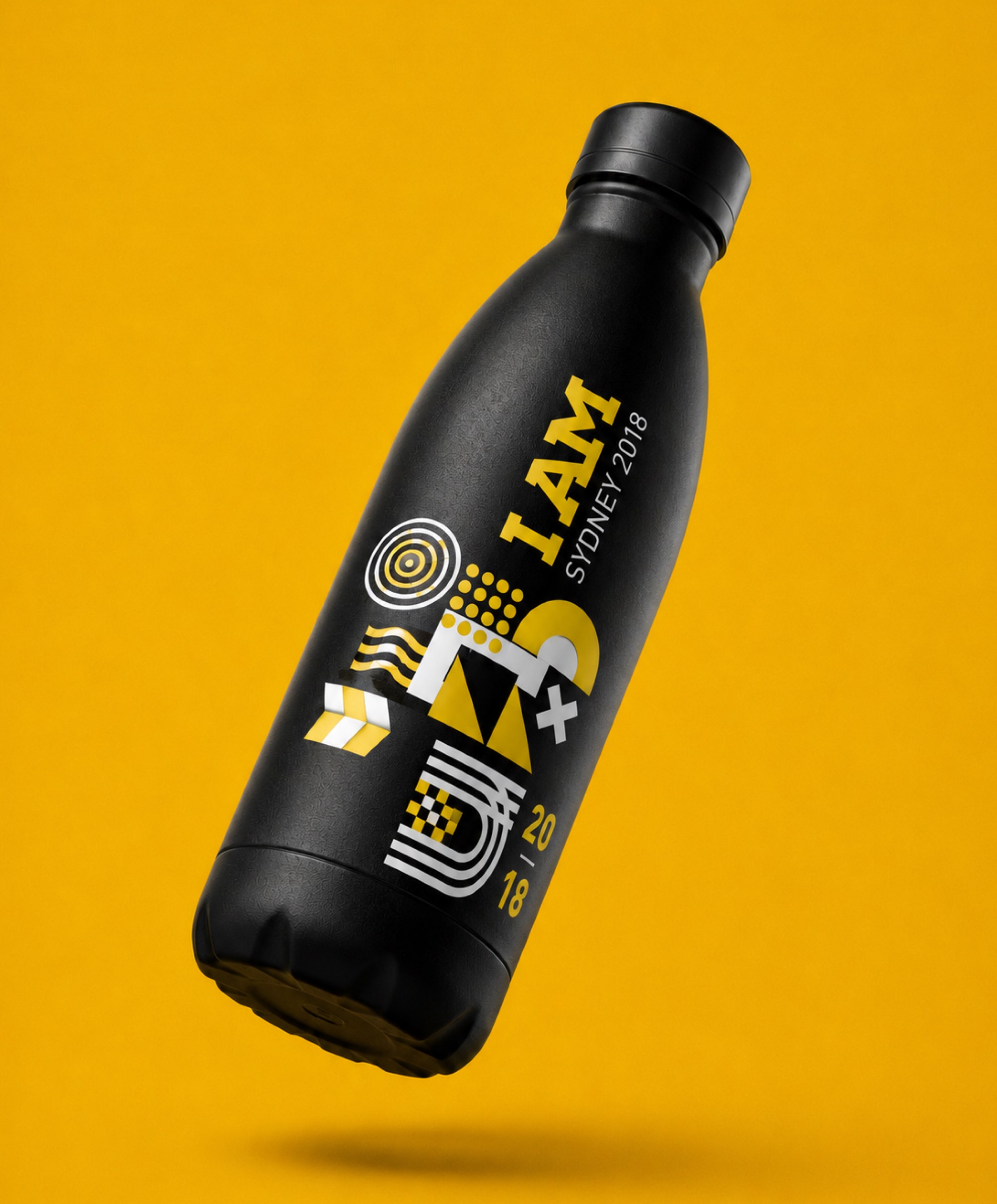
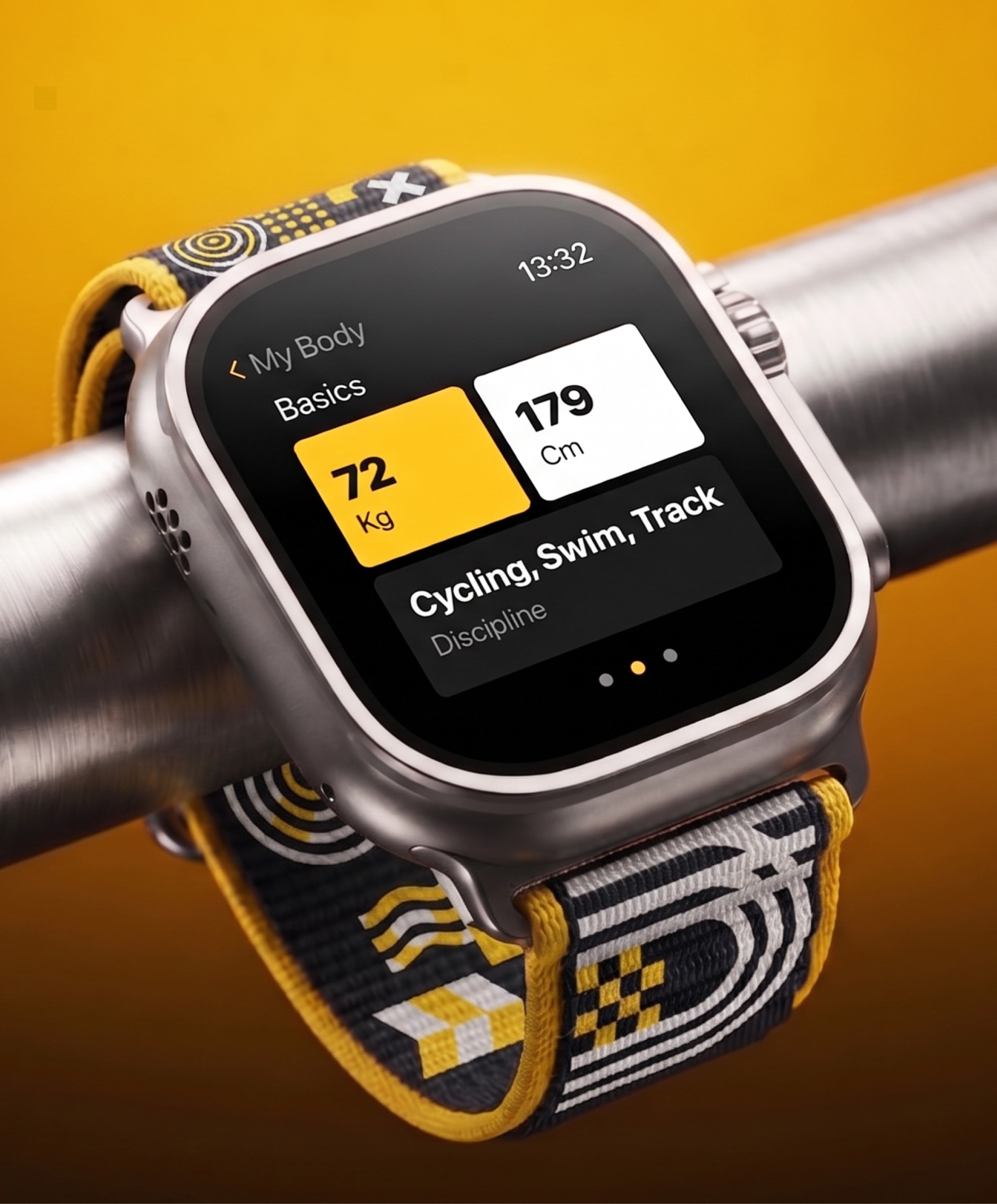
The Invictus Games Sydney identity was designed as a system that could scale across hundreds of applications without losing impact or recognition. From athlete apparel and branded merchandise to wearable accessories, venue signage and sponsor environments, every touchpoint carried the same bold visual language, reinforcing a sense of unity, resilience and global event presence.
/ 5
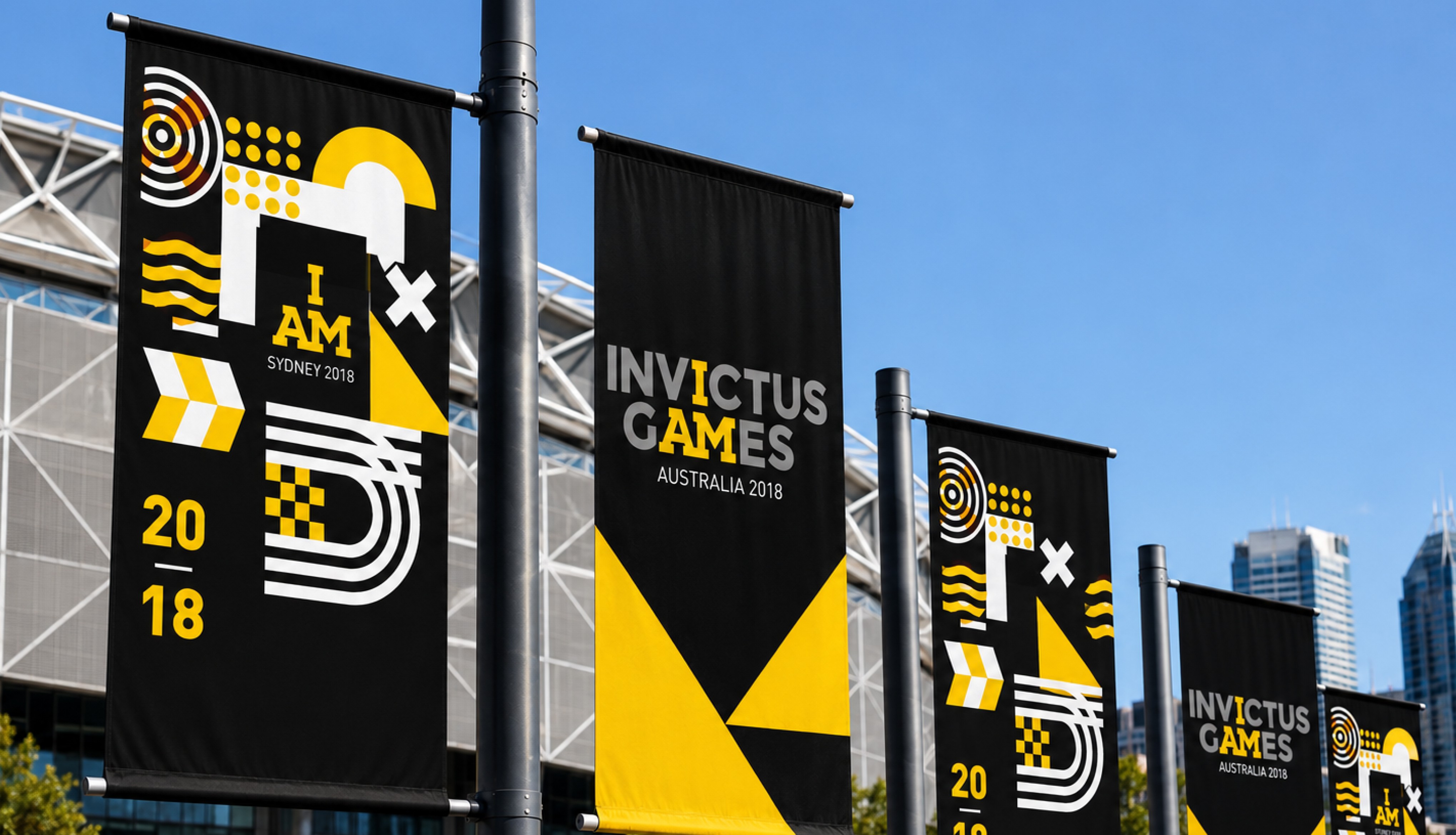
Built around the iconic I AM symbol, modular graphic forms and high-contrast colour, the system translated seamlessly across physical and digital formats of every scale. Whether experienced on a flag, a water bottle, an athlete’s uniform or city-wide event branding, the identity maintained the same emotional strength and recognisable energy, creating a brand presence that felt cohesive, memorable and unmistakably Invictus.
Built around the iconic I AM symbol, modular graphic forms and high-contrast colour, the system translated seamlessly across physical and digital formats of every scale. Whether experienced on a flag, a water bottle, an athlete’s uniform or city-wide event branding, the identity maintained the same emotional strength and recognisable energy, creating a brand presence that felt cohesive, memorable and unmistakably Invictus.
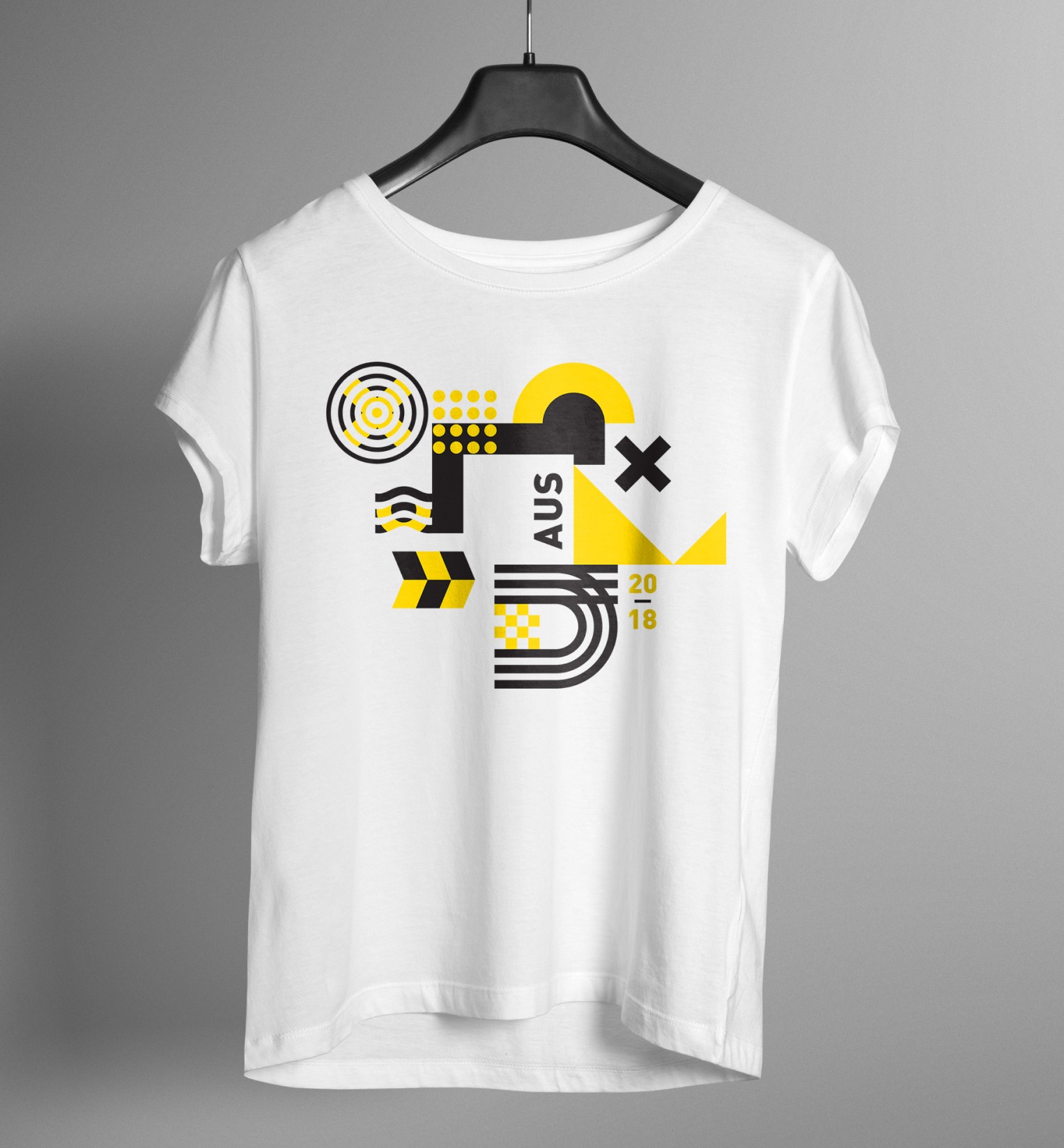
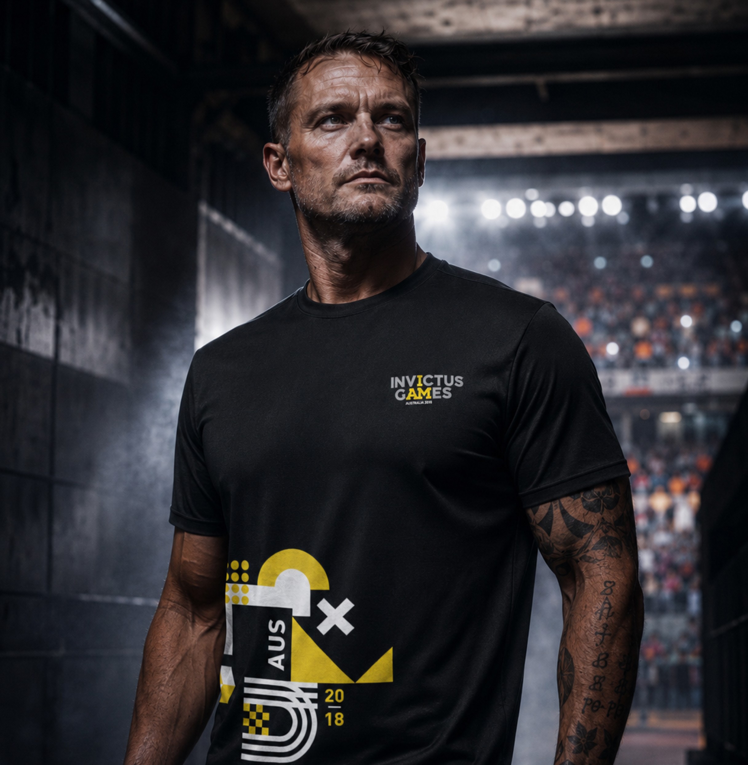
The Invictus Games Sydney identity was built to communicate far beyond the field of play, extending into campaign posters, public messaging, merchandise and city-wide storytelling moments. Bold typographic compositions, athlete-led imagery and lifted lines from the Invictus poem transformed communications into emotionally charged visual statements that could inspire audiences instantly and carry the spirit of the Games into everyday public spaces.
The Invictus Games Sydney identity was built to communicate far beyond the field of play, extending into campaign posters, public messaging, merchandise and city-wide storytelling moments. Bold typographic compositions, athlete-led imagery and lifted lines from the Invictus poem transformed communications into emotionally charged visual statements that could inspire audiences instantly and carry the spirit of the Games into everyday public spaces.
/ 6
The challenge was not creating a new identity from scratch, but evolving a global icon without losing the power that made it resonate worldwide. Invictus already carried strong brand equity, emotional meaning and an unmistakable voice.
Our role was to build a localised system that felt authentically Australian while remaining true to the global foundation, creating a flexible visual language that could scale across competition venues, athlete kits, broadcast systems, merchandise and city-wide event branding with equal strength and dignity.
The challenge was not creating a new identity from scratch, but evolving a global icon without losing the power that made it resonate worldwide. Invictus already carried strong brand equity, emotional meaning and an unmistakable voice.
Our role was to build a localised system that felt authentically Australian while remaining true to the global foundation, creating a flexible visual language that could scale across competition venues, athlete kits, broadcast systems, merchandise and city-wide event branding with equal strength and dignity.
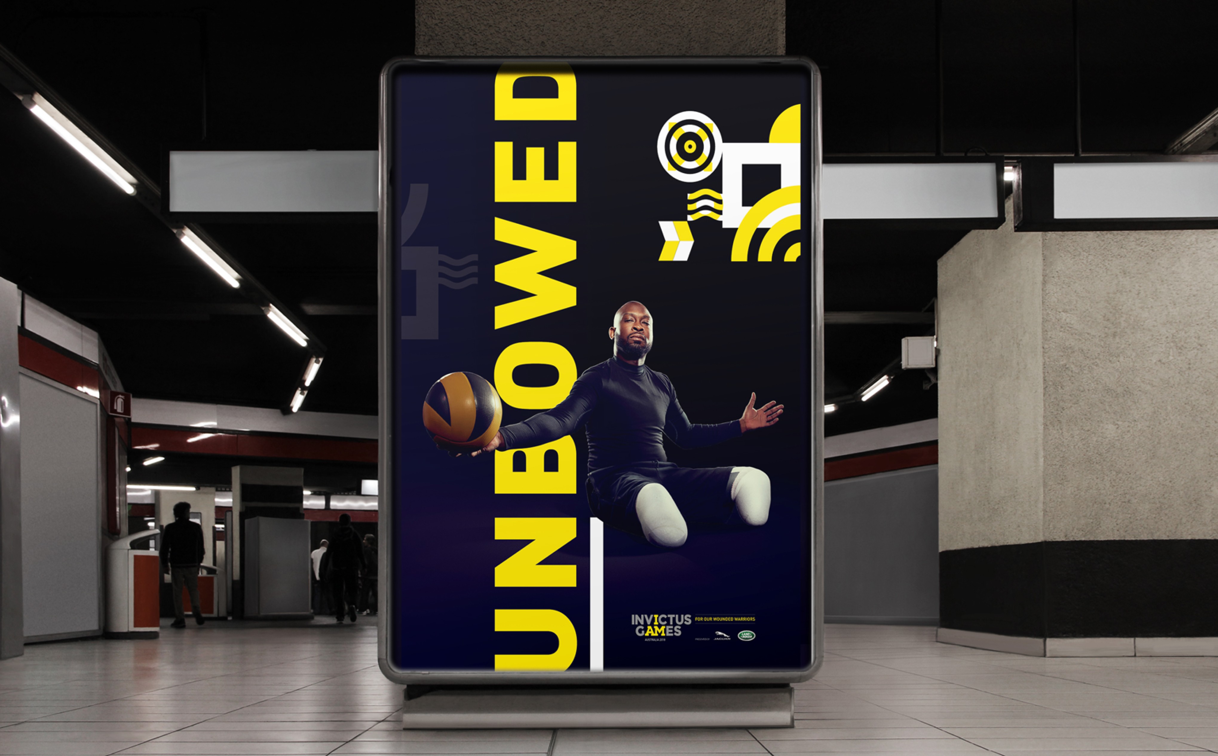
From posters and apparel to broadcast graphics, outdoor media and branded accessories, every application was designed to feel unmistakably Invictus while maintaining flexibility across hundreds of event touchpoints. The visual system balanced strength and dignity with warmth and humanity, allowing the Games to speak with a voice that felt both globally iconic and deeply personal.
From posters and apparel to broadcast graphics, outdoor media and branded accessories, every application was designed to feel unmistakably Invictus while maintaining flexibility across hundreds of event touchpoints. The visual system balanced strength and dignity with warmth and humanity, allowing the Games to speak with a voice that felt both globally iconic and deeply personal.
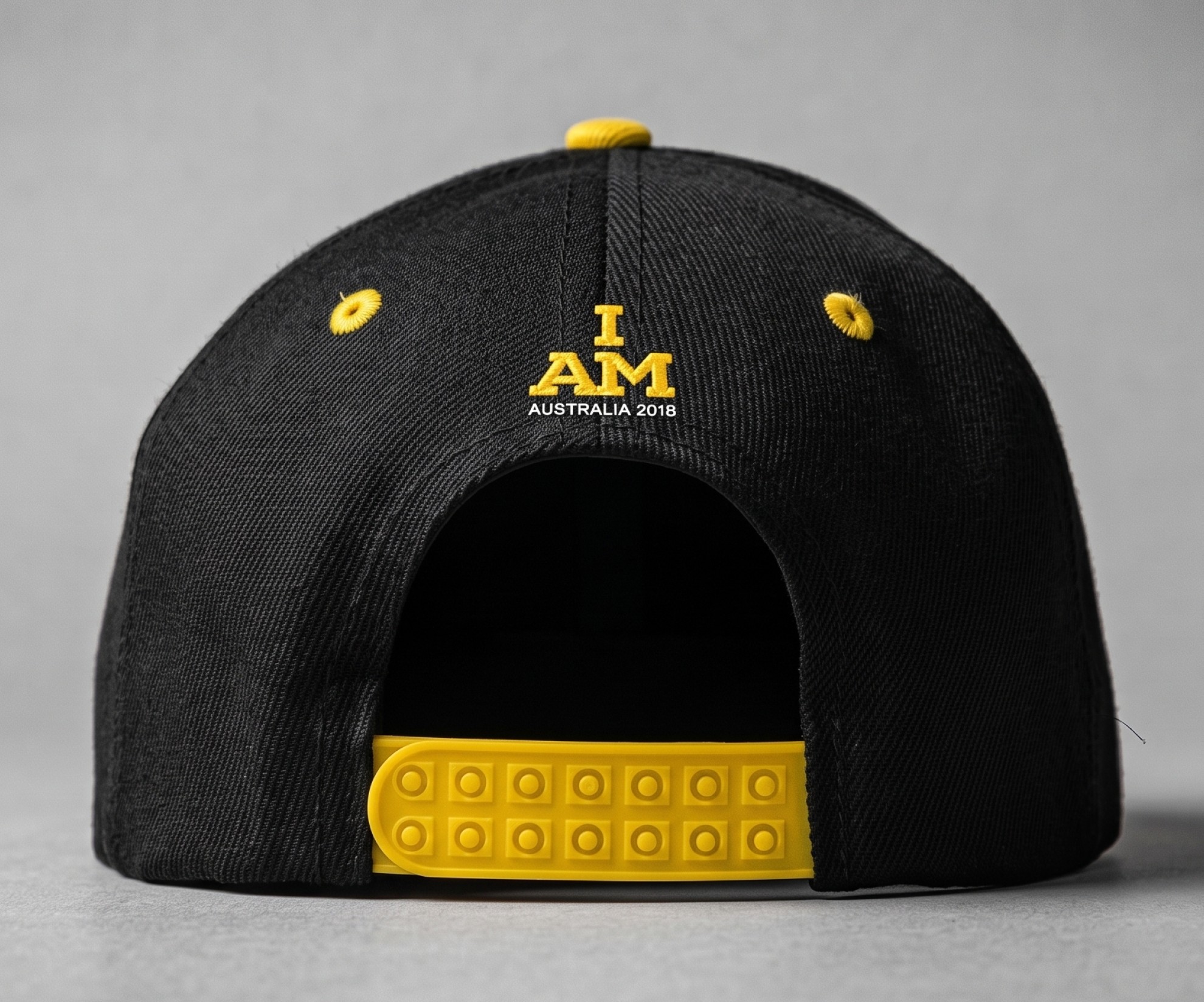
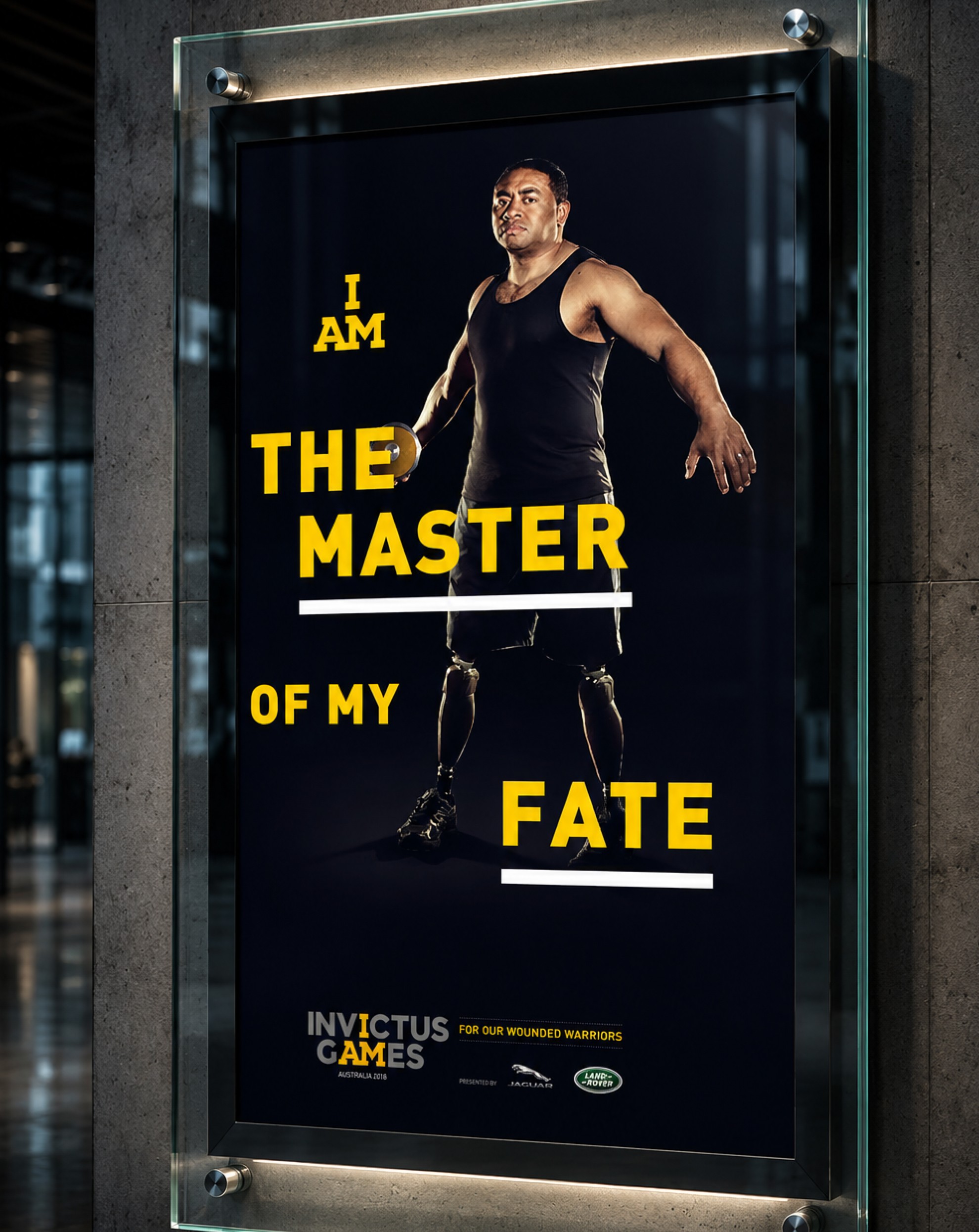
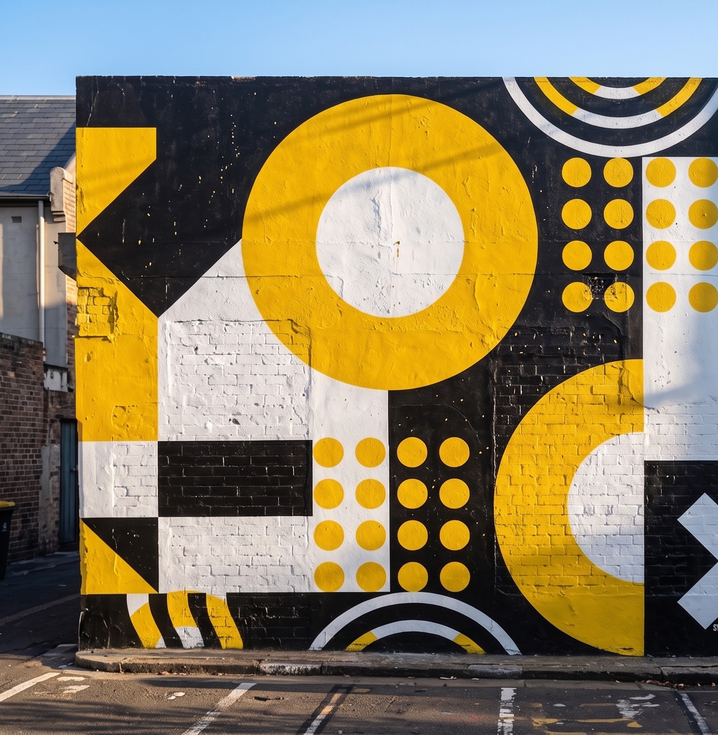
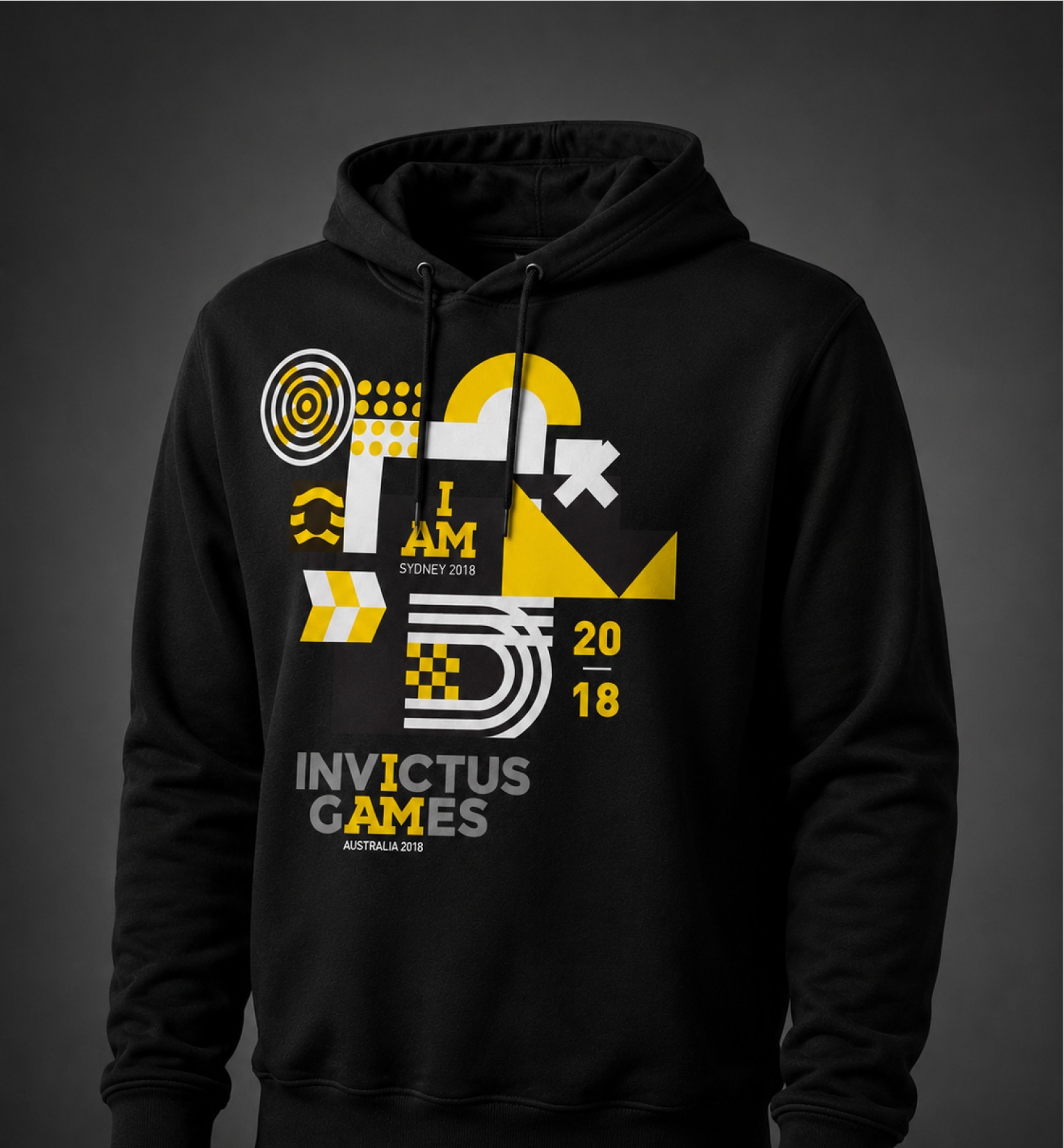
Together, these touchpoints created a campaign ecosystem that reinforced the deeper meaning behind the Games: resilience, recovery and the power of sport to transform lives. The result was a city-wide and globally broadcast brand presence that celebrated not only athletic performance, but the extraordinary people and stories at the heart of Invictus.
Together, these touchpoints created a campaign ecosystem that reinforced the deeper meaning behind the Games: resilience, recovery and the power of sport to transform lives. The result was a city-wide and globally broadcast brand presence that celebrated not only athletic performance, but the extraordinary people and stories at the heart of Invictus.
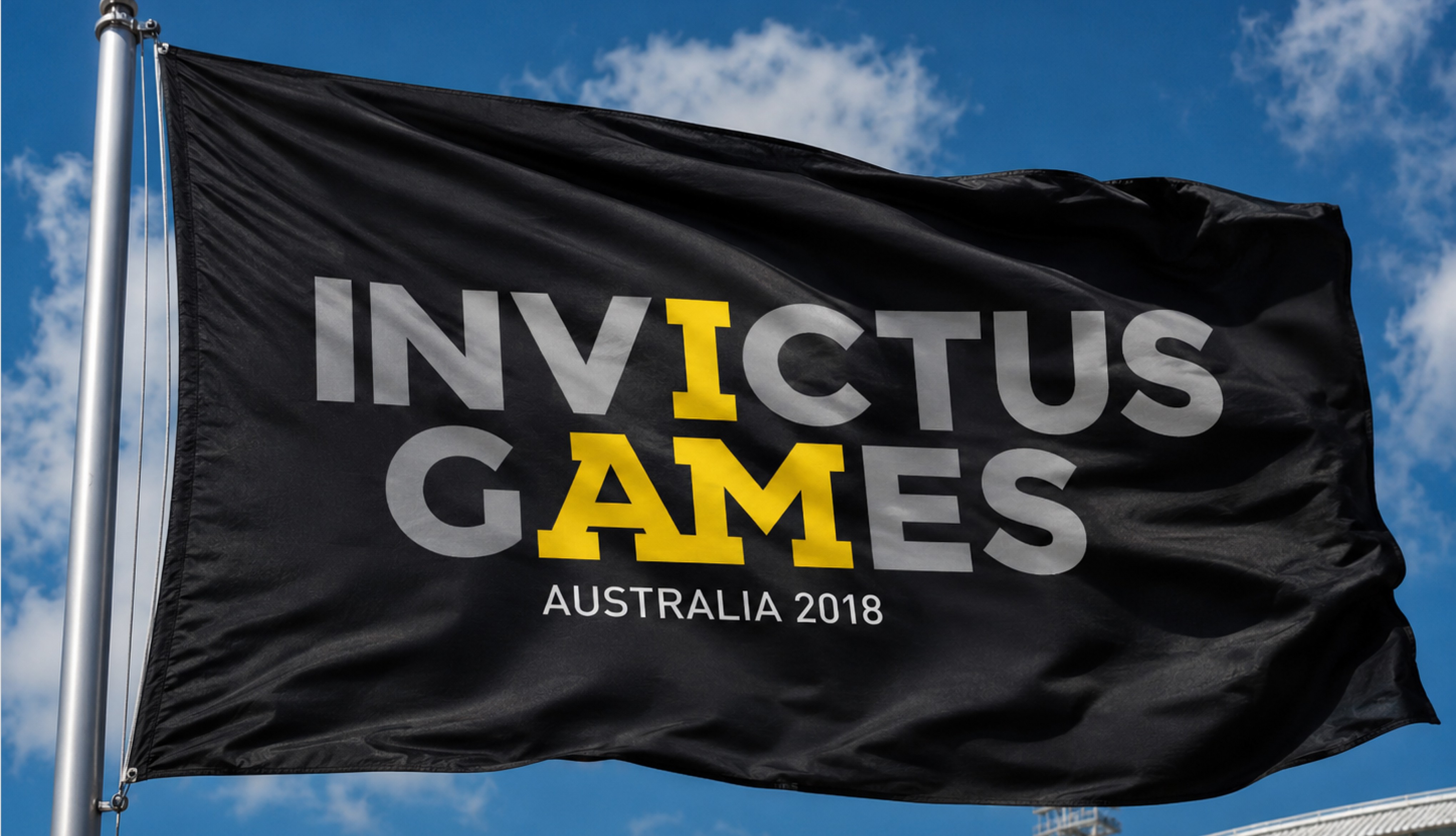
The outcome of the project was far more than a local event identity. It was the creation of a visual system capable of carrying one of the world’s most emotionally powerful sporting events through an Australian cultural lens without losing the strength of the global Invictus brand. By combining bold event branding, meaningful storytelling and a flexible visual system, Sydney 2018 became a host identity that felt dignified, memorable and deeply connected to the athletes and communities at the heart of the Games.
The design system became the public face of the Games across venues, broadcasts, merchandise, athlete kit and city-wide communications, creating a unified experience that carried both emotional depth and sporting energy at every scale. More than branding an event, the work helped shape how Sydney welcomed the world, celebrating resilience, recovery and the extraordinary stories of competitors through a visual language built to inspire audiences on the ground and across global screens.
The outcome of the project was far more than a local event identity. It was the creation of a visual system capable of carrying one of the world’s most emotionally powerful sporting events through an Australian cultural lens without losing the strength of the global Invictus brand. By combining bold event branding, meaningful storytelling and a flexible visual system, Sydney 2018 became a host identity that felt dignified, memorable and deeply connected to the athletes and communities at the heart of the Games.
The design system became the public face of the Games across venues, broadcasts, merchandise, athlete kit and city-wide communications, creating a unified experience that carried both emotional depth and sporting energy at every scale. More than branding an event, the work helped shape how Sydney welcomed the world, celebrating resilience, recovery and the extraordinary stories of competitors through a visual language built to inspire audiences on the ground and across global screens.
/ 7
These shifts translated into measurable improvements:
491
491
Competitors
18
18
Nations represented
105K+
105K+
Spectators on the ground
21.7M+
21.7M+
Global broadcast viewers