'26
Old Quarter Coffee Merchants needed a brand identity that reflected what made it genuinely different in Australian specialty coffee: a sourcing model built entirely around Southeast Asia and direct relationships with farming families often overlooked by the category. The new identity was designed to celebrate origin, culture and craft in equal measure, creating a brand system that felt warm, optimistic and distinct across retail, café and wholesale touchpoints.
Old Quarter Coffee Merchants needed a brand identity that reflected what made it genuinely different in Australian specialty coffee: a sourcing model built entirely around Southeast Asia and direct relationships with farming families often overlooked by the category. The new identity was designed to celebrate origin, culture and craft in equal measure, creating a brand system that felt warm, optimistic and distinct across retail, café and wholesale touchpoints.
/ 1
Inspired by Southeast Asian visual heritage, the identity combined expressive typography, vibrant colour and packaging systems that brought farm, family and provenance to the front of the brand experience. Rather than blending into specialty coffee’s visual clichés, Old Quarter became a confident and culturally rooted brand designed to stand apart on shelves, in cafés and across every customer interaction.
Inspired by Southeast Asian visual heritage, the identity combined expressive typography, vibrant colour and packaging systems that brought farm, family and provenance to the front of the brand experience. Rather than blending into specialty coffee’s visual clichés, Old Quarter became a confident and culturally rooted brand designed to stand apart on shelves, in cafés and across every customer interaction.
/ 2
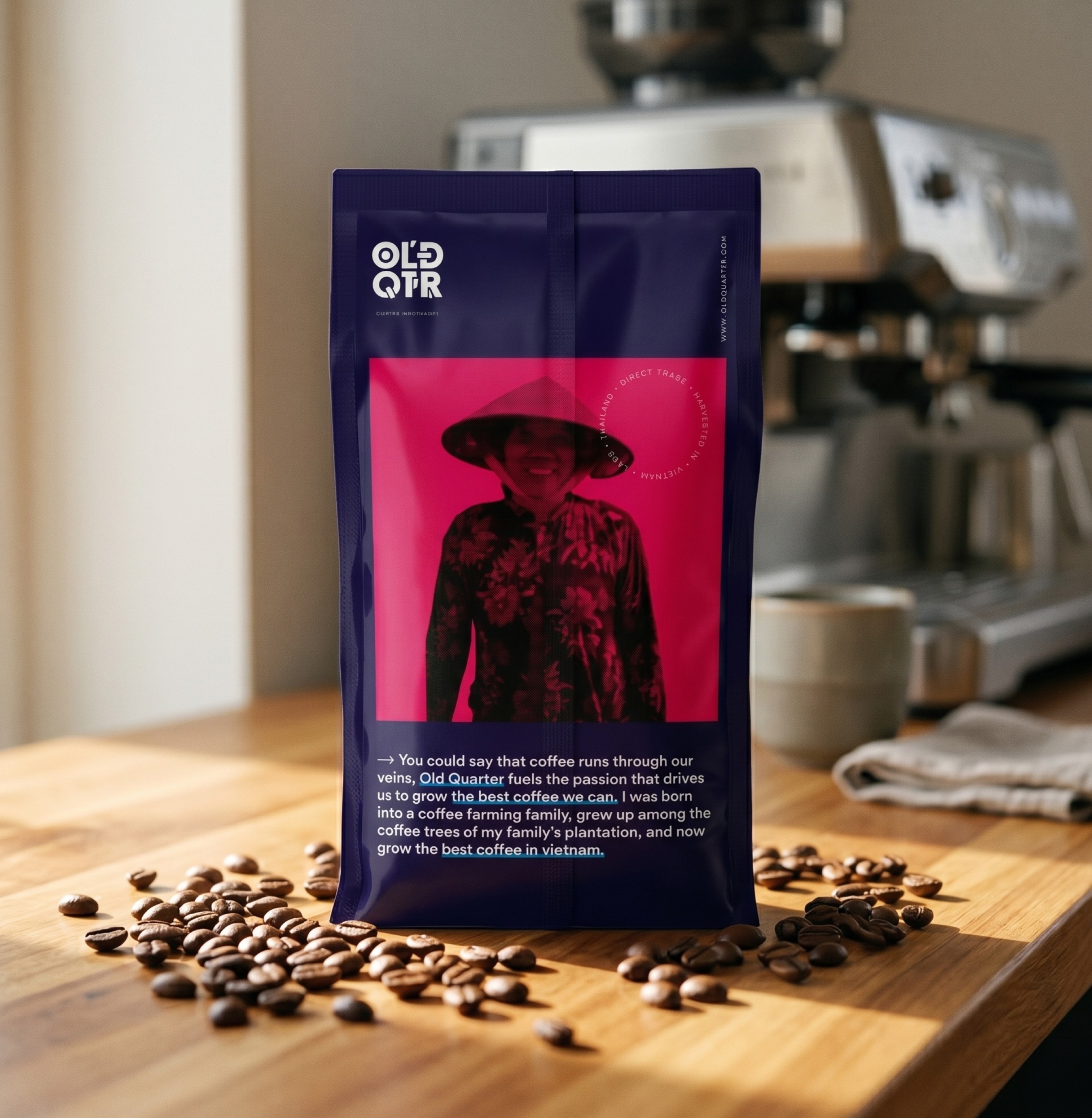
The packaging system was designed to turn provenance into the most visible part of the brand experience. Rather than hiding sourcing details in secondary information, Old Quarter’s bags lead with farm, region and origin story through a bold visual structure that makes each release feel distinctive while still belonging to one cohesive system.
The packaging system was designed to turn provenance into the most visible part of the brand experience. Rather than hiding sourcing details in secondary information, Old Quarter’s bags lead with farm, region and origin story through a bold visual structure that makes each release feel distinctive while still belonging to one cohesive system.
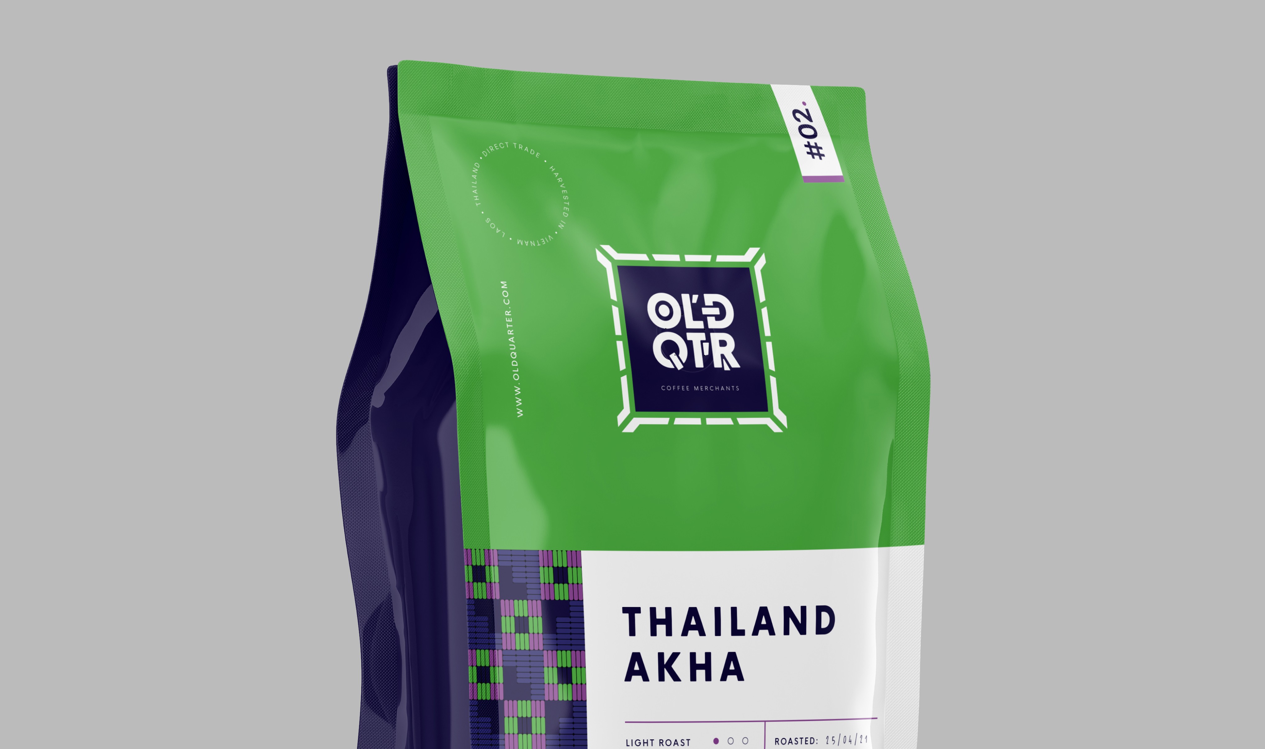
Old Quarter Coffee Merchants needed a brand identity that reflected what made it genuinely different in Australian specialty coffee: a sourcing model built entirely around Southeast Asia and direct relationships with farming families often overlooked by the category. The new identity was designed to celebrate origin, culture and craft in equal measure, creating a brand system that felt warm, optimistic and distinct across retail, café and wholesale touchpoints.
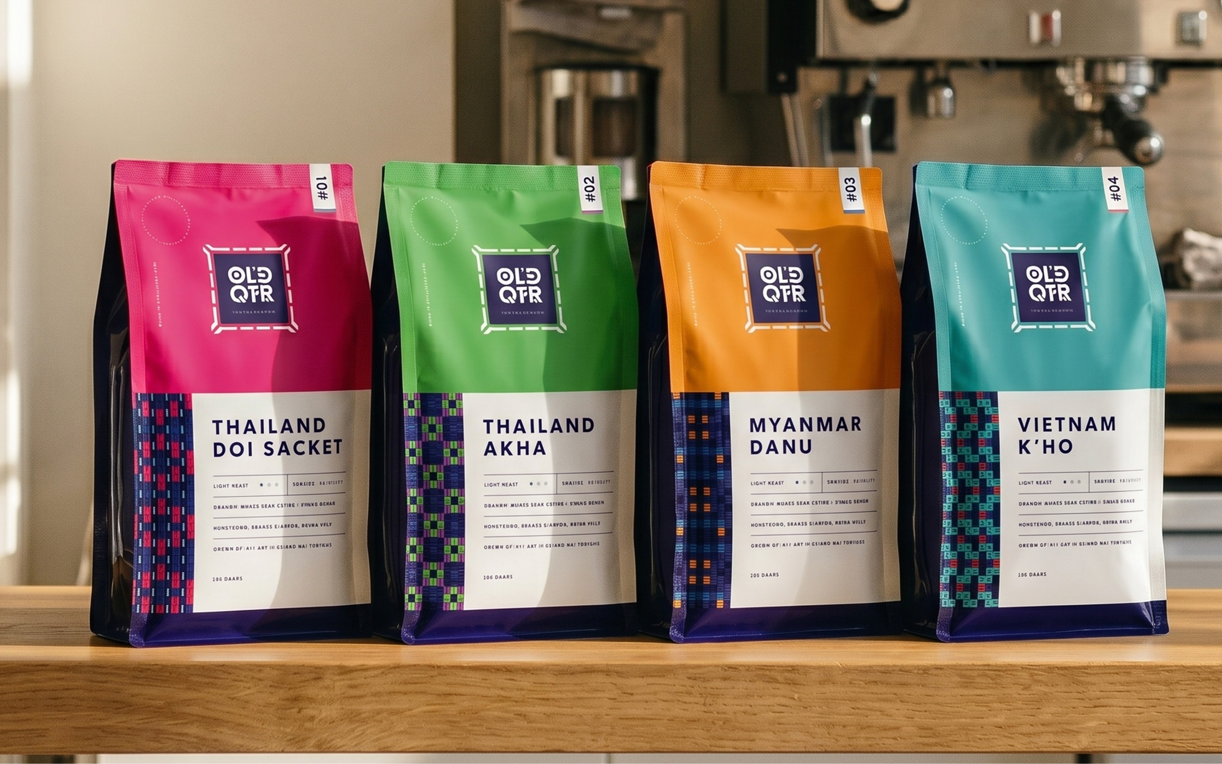
Old Quarter’s identity was built to carry its story from the shelf to the café counter through a bold and highly recognisable packaging system. Distinct colour-coded origins, expressive typography and culturally rooted graphic details transformed each coffee release into a more memorable brand experience, helping provenance, farmer story and product discovery become central to how customers engaged with the brand.
Old Quarter’s identity was built to carry its story from the shelf to the café counter through a bold and highly recognisable packaging system. Distinct colour-coded origins, expressive typography and culturally rooted graphic details transformed each coffee release into a more memorable brand experience, helping provenance, farmer story and product discovery become central to how customers engaged with the brand.
/ 3
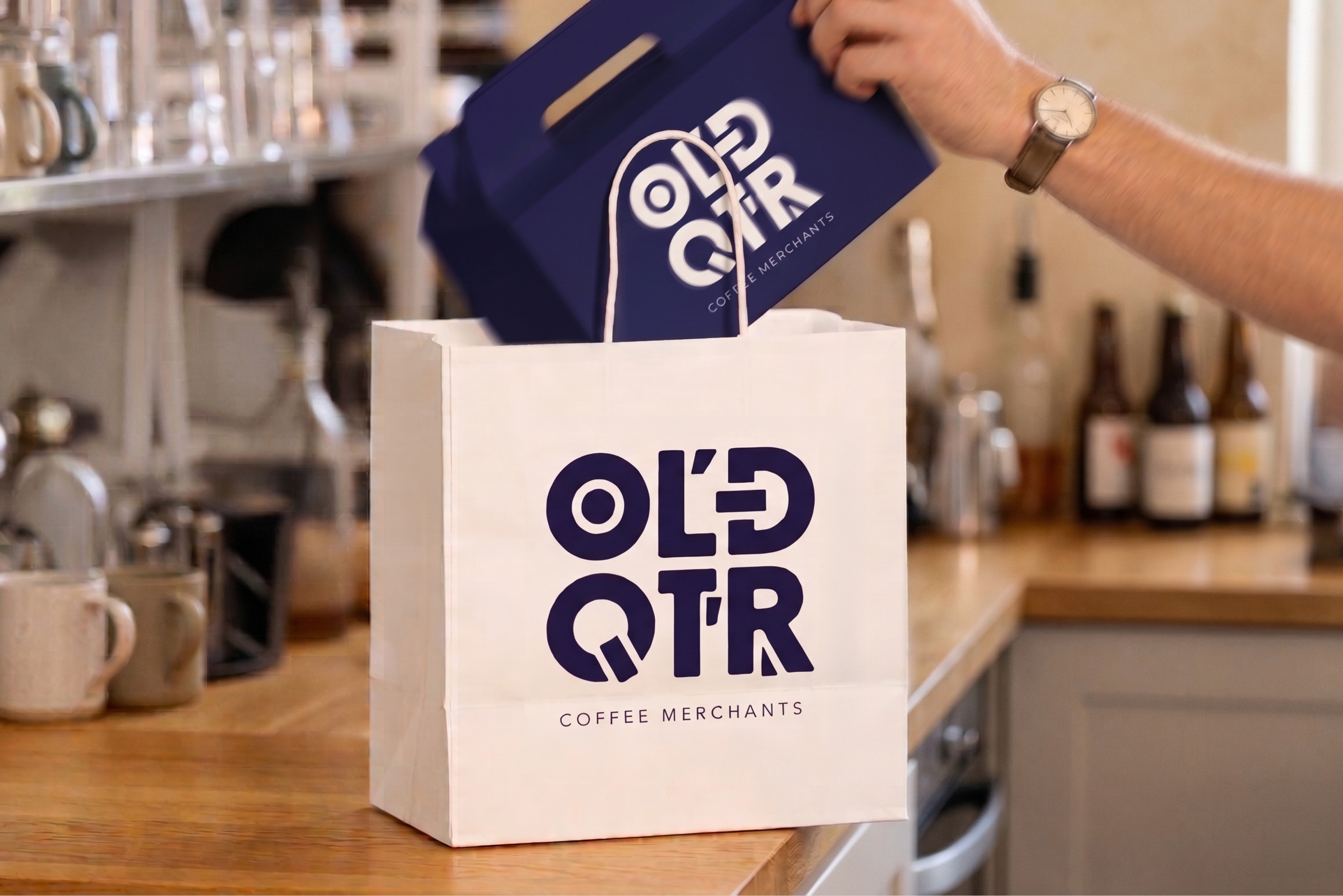
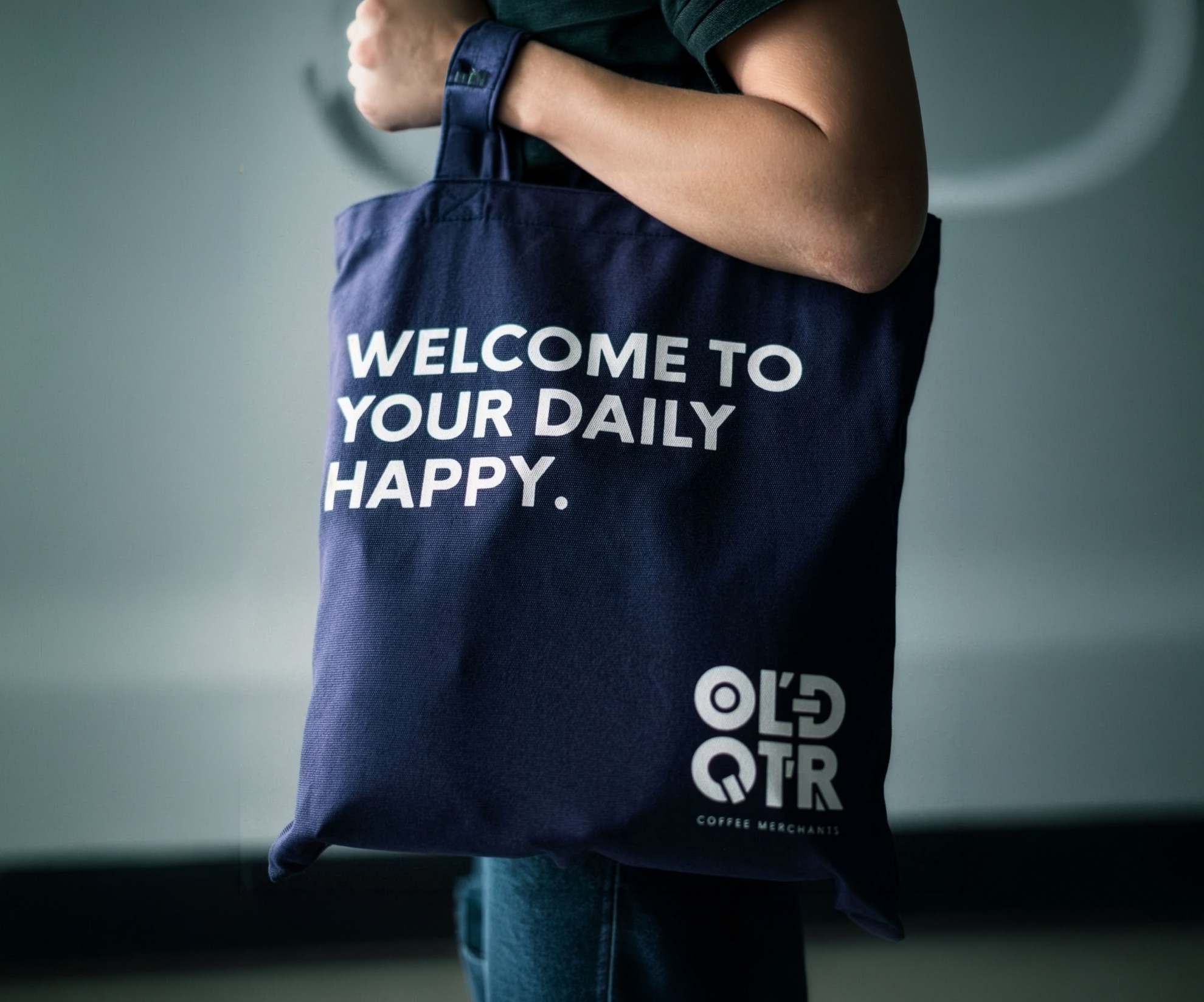
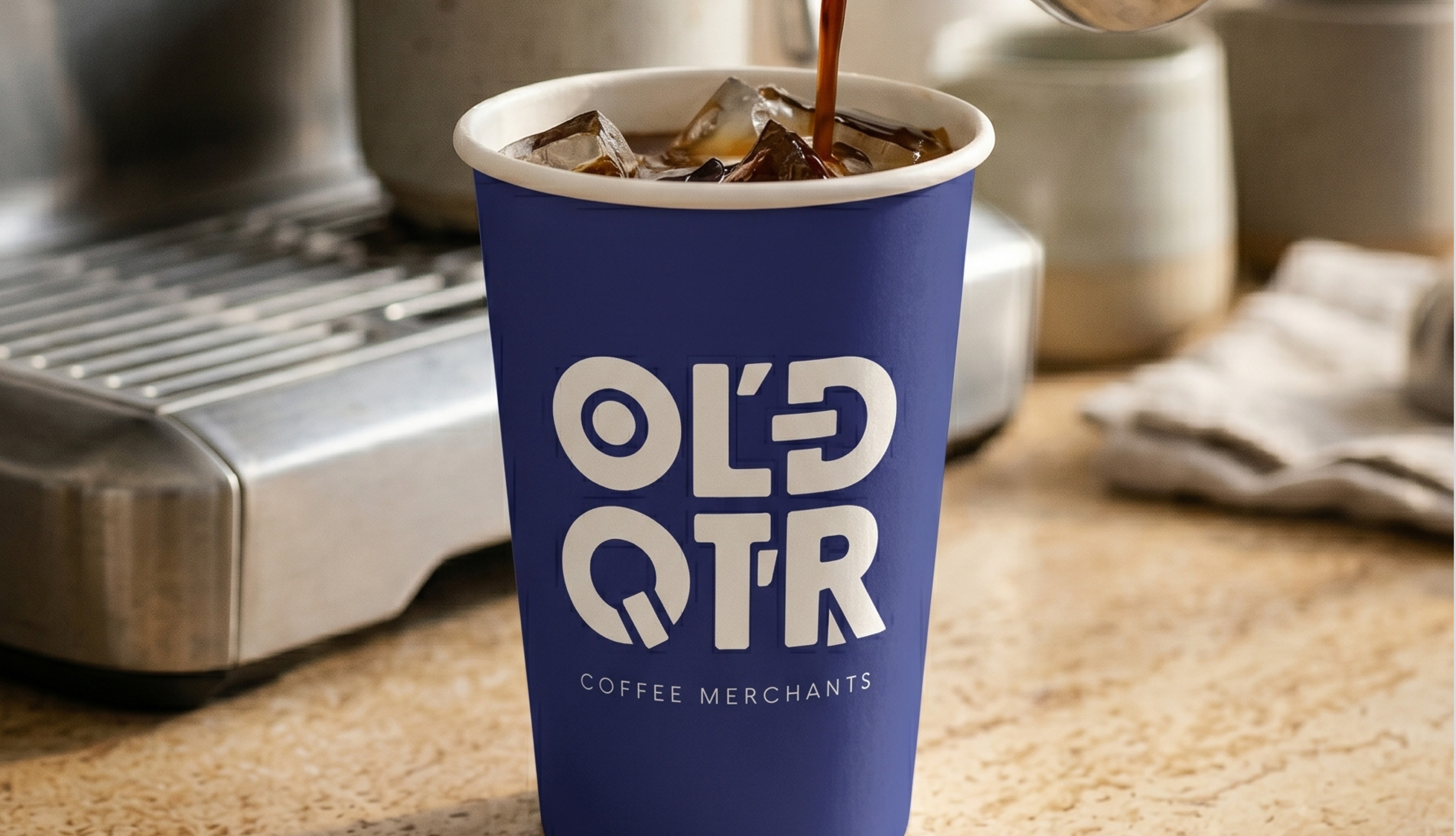
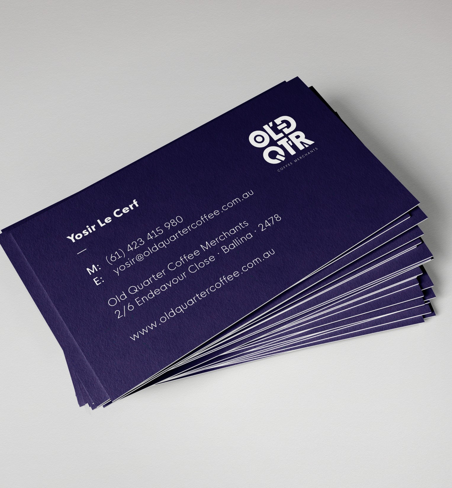
From takeaway cups and packaging to stationery, signage and in-store collateral, the identity was built to flex across everyday brand moments without losing its personality. Bold typography, vibrant colour and culturally rooted graphic details created a system that felt instantly recognisable, helping Old Quarter deliver a warm, memorable and cohesive experience whether encountered in a café, on a shelf or through wholesale touchpoints.
From takeaway cups and packaging to stationery, signage and in-store collateral, the identity was built to flex across everyday brand moments without losing its personality. Bold typography, vibrant colour and culturally rooted graphic details created a system that felt instantly recognisable, helping Old Quarter deliver a warm, memorable and cohesive experience whether encountered in a café, on a shelf or through wholesale touchpoints.
/ 4
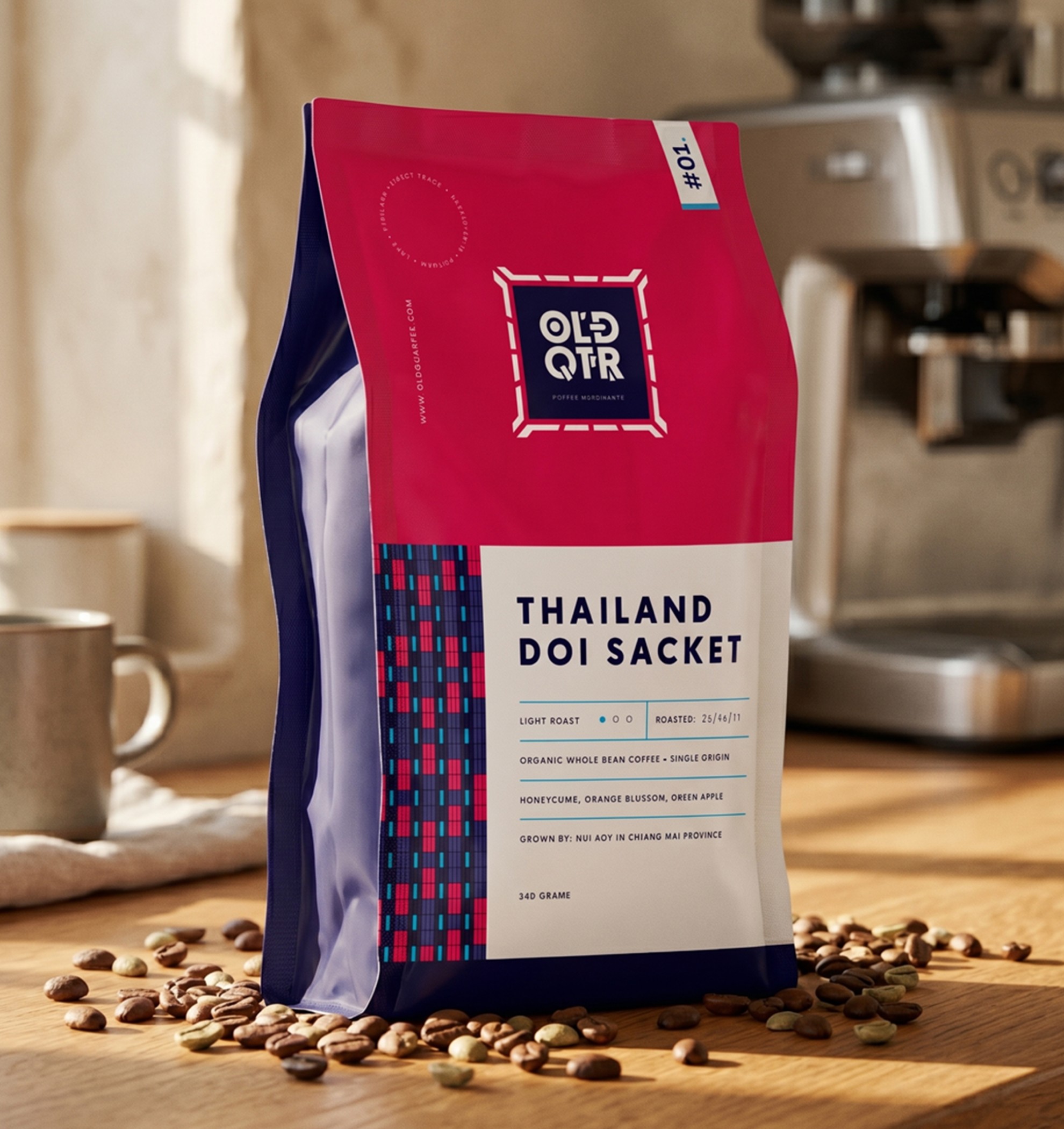
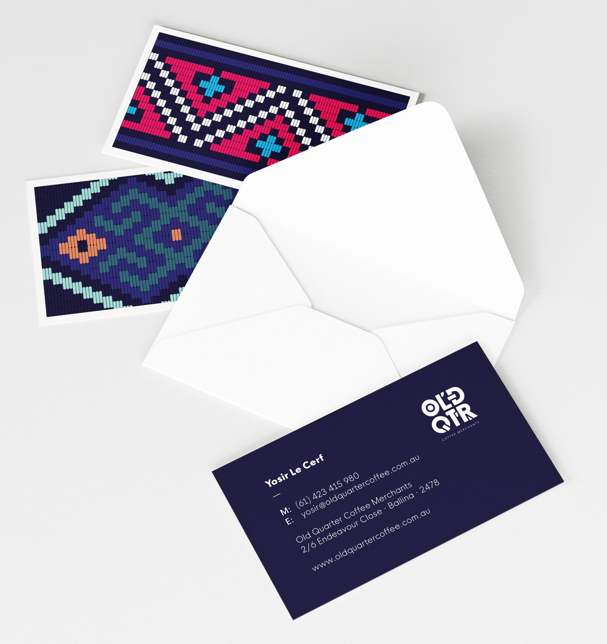
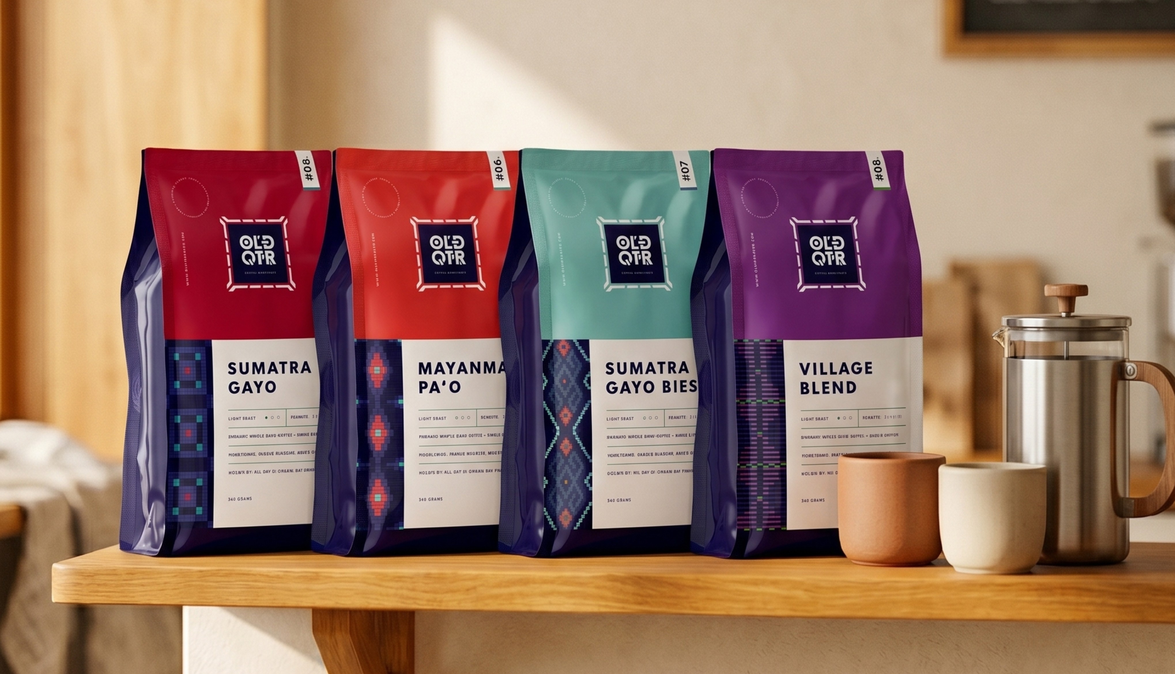
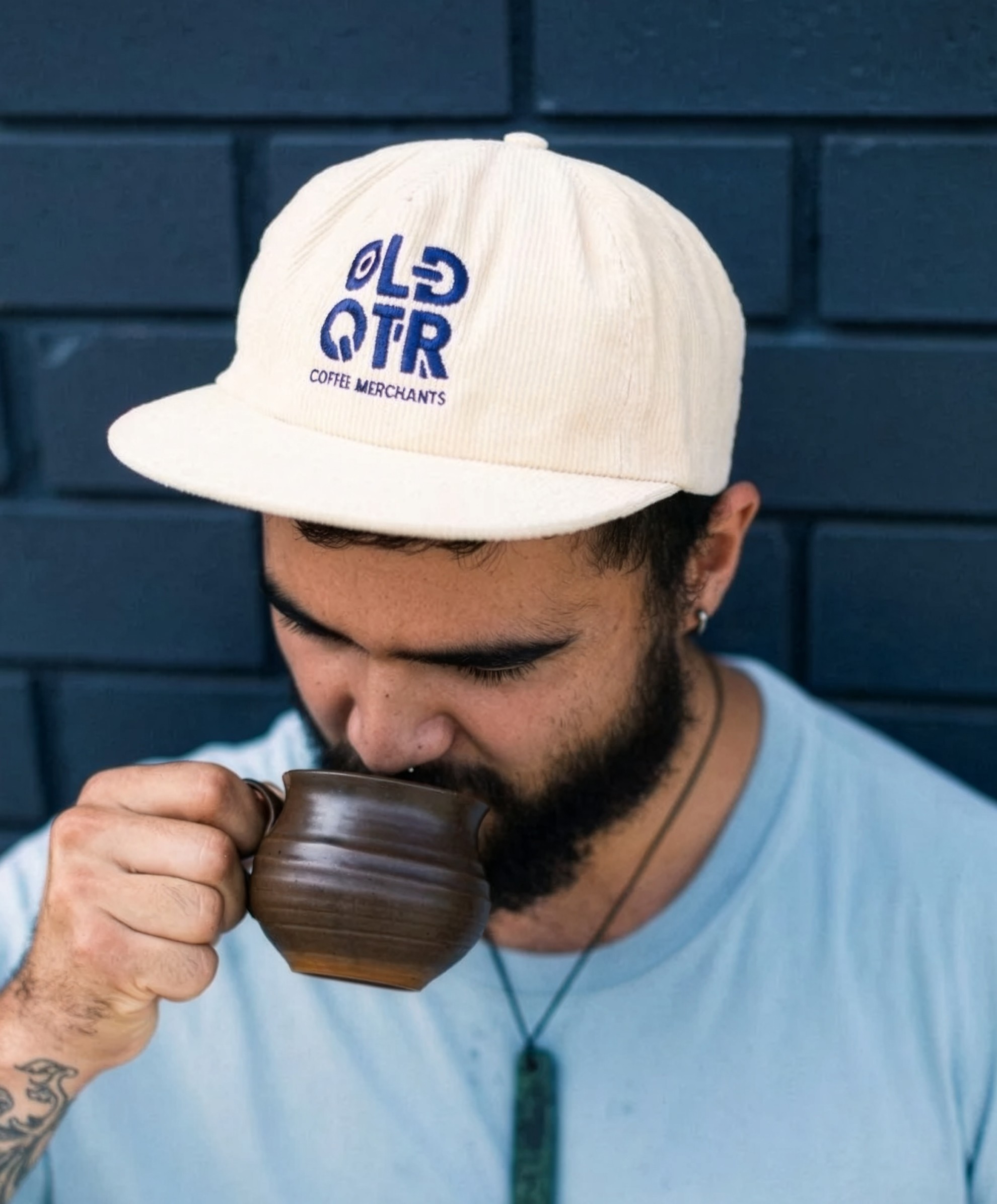
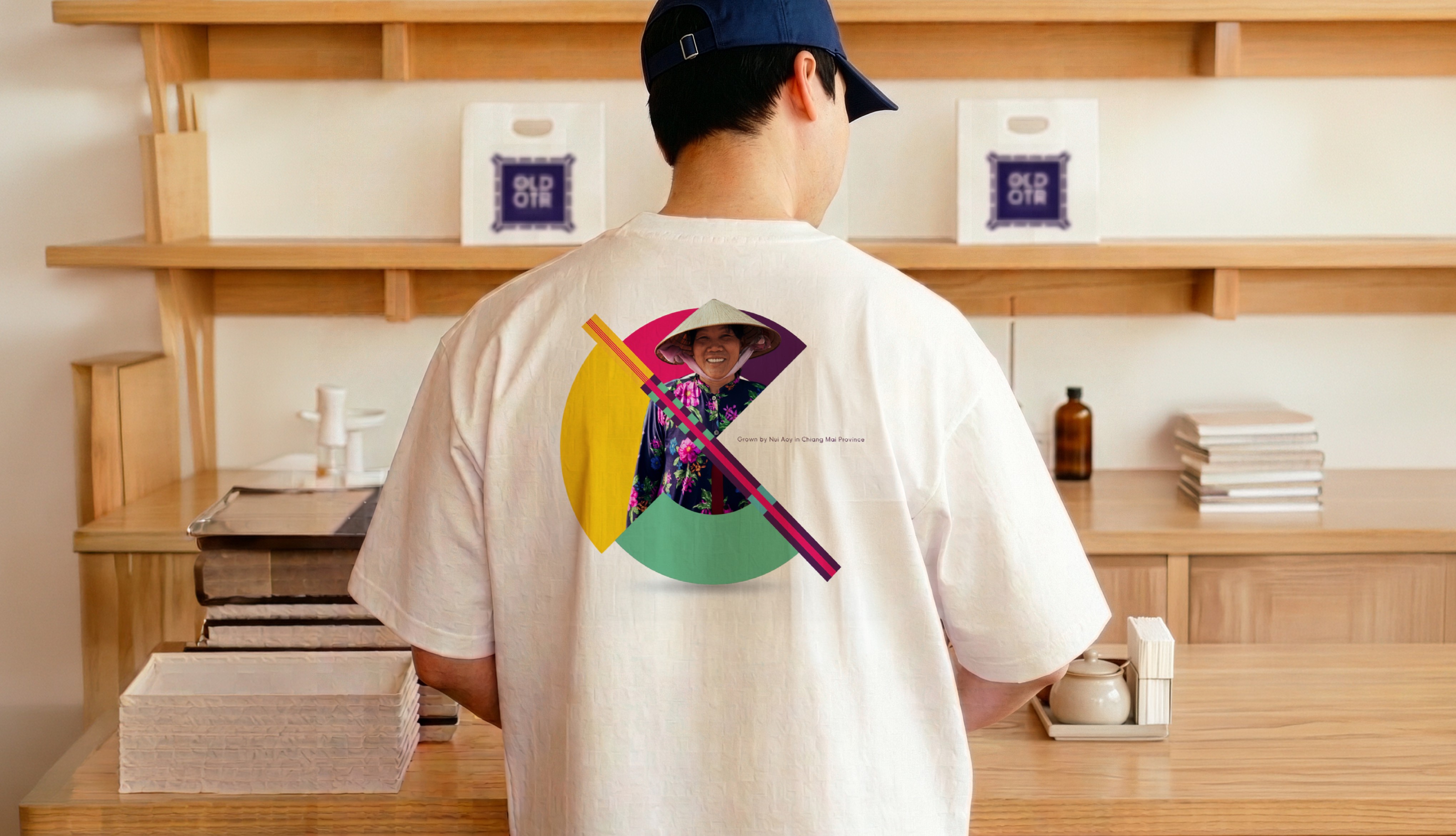
The identity system was designed not just to package coffee, but to create a recognisable culture around the brand. Apparel, café merchandise and printed storytelling assets extended Old Quarter’s personality into everyday touchpoints, helping the brand feel warm, youthful and emotionally memorable beyond the product itself.
/ 5
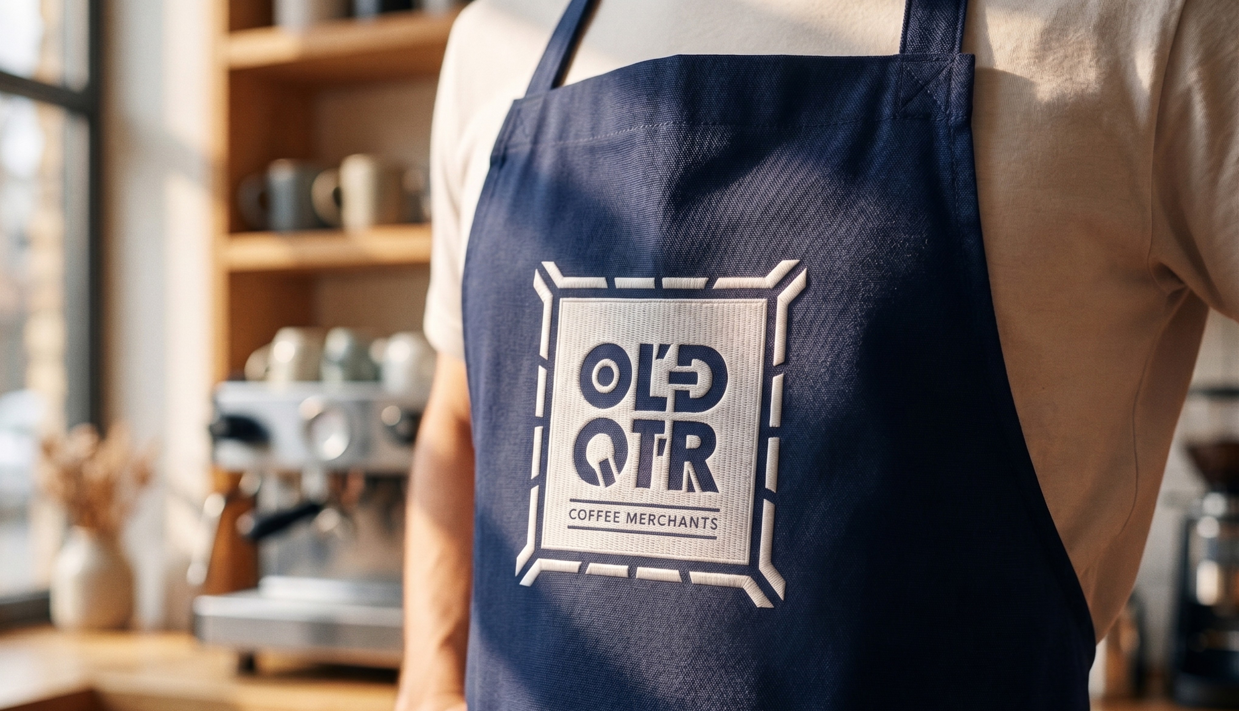
By blending bold graphic expression with human storytelling and lifestyle applications, the brand moved from being a specialty coffee roaster to becoming a more immersive experience. Every touchpoint reinforced the same feeling: optimistic, culturally rich and rooted in a direct connection between the people growing the coffee and the people enjoying it.
By blending bold graphic expression with human storytelling and lifestyle applications, the brand moved from being a specialty coffee roaster to becoming a more immersive experience. Every touchpoint reinforced the same feeling: optimistic, culturally rich and rooted in a direct connection between the people growing the coffee and the people enjoying it.


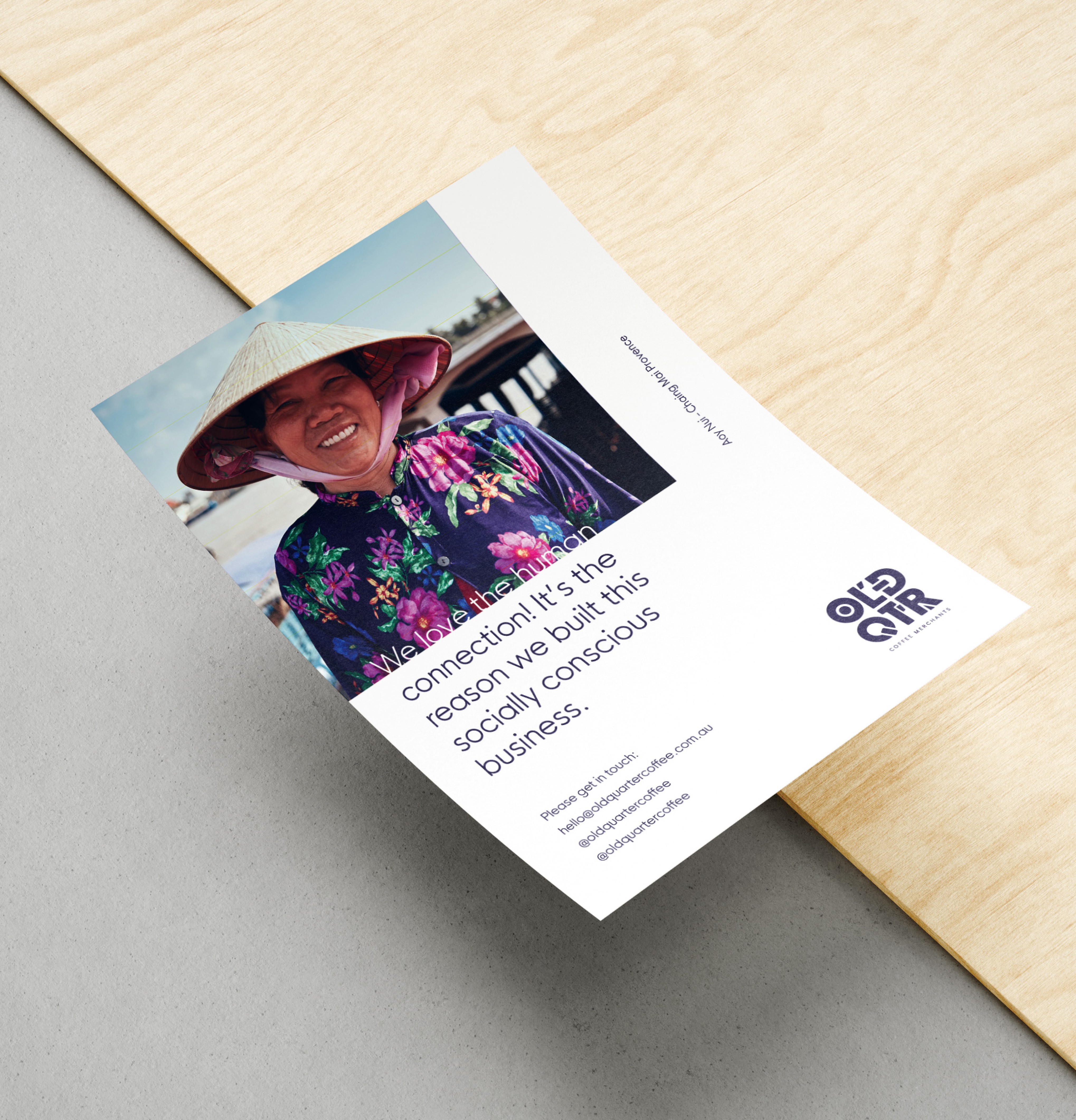
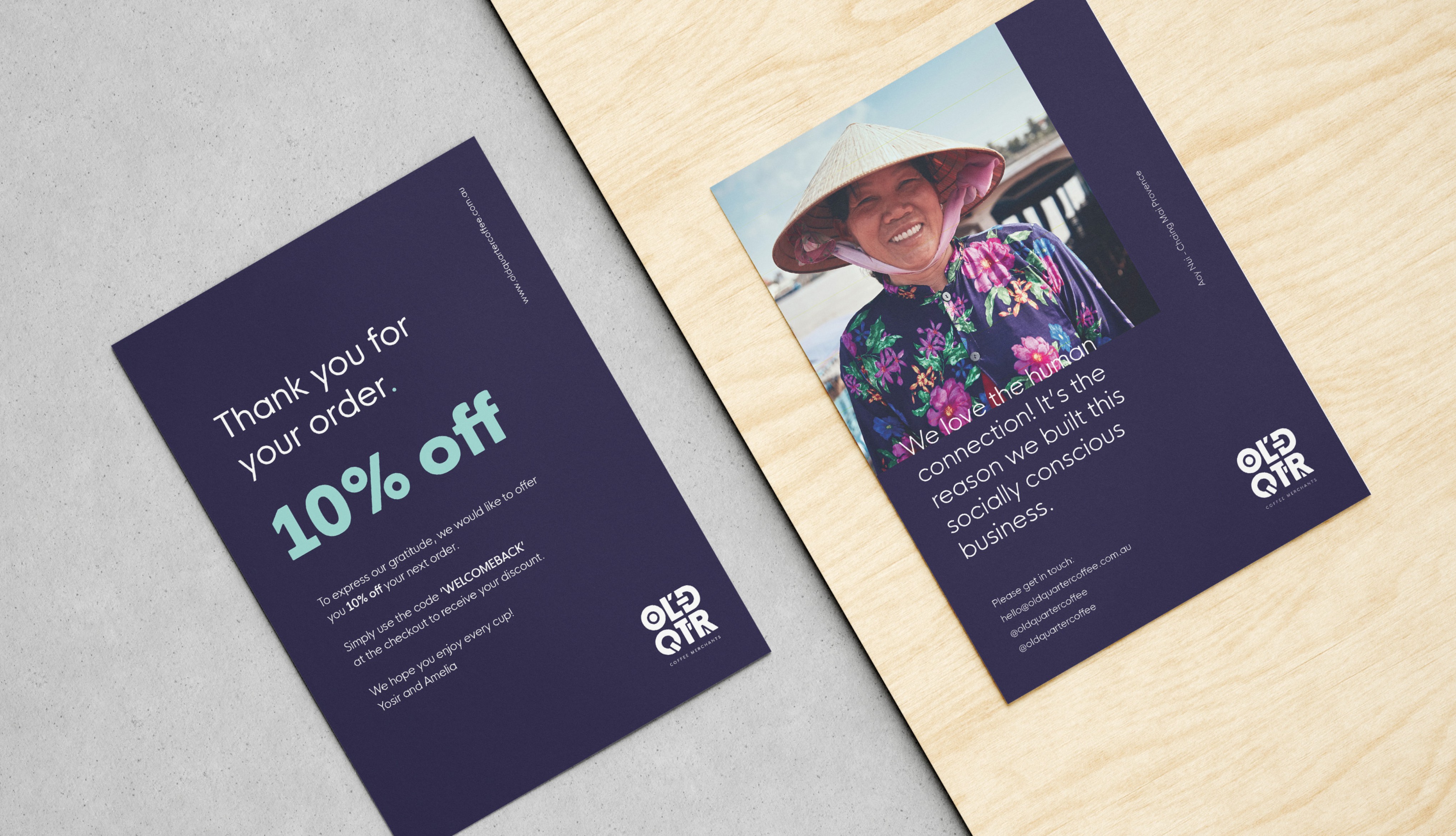
Beyond packaging and café applications, Old Quarter’s identity system expanded into a rich set of printed assets designed to communicate the people, places and cultural heritage behind each coffee. Postcards, storytelling inserts, collateral and editorial pieces transformed brand communication into something more personal, allowing customers to engage with the story behind the product in a more meaningful way.
Beyond packaging and café applications, Old Quarter’s identity system expanded into a rich set of printed assets designed to communicate the people, places and cultural heritage behind each coffee. Postcards, storytelling inserts, collateral and editorial pieces transformed brand communication into something more personal, allowing customers to engage with the story behind the product in a more meaningful way.
/ 6
Inspired by Southeast Asian visual heritage, the identity combined expressive typography, vibrant colour and packaging systems that brought farm, family and provenance to the front of the brand experience. Rather than blending into specialty coffee’s visual clichés, Old Quarter became a confident and culturally rooted brand designed to stand apart on shelves, in cafés and across every customer interaction.
Inspired by Southeast Asian visual heritage, the identity combined expressive typography, vibrant colour and packaging systems that brought farm, family and provenance to the front of the brand experience. Rather than blending into specialty coffee’s visual clichés, Old Quarter became a confident and culturally rooted brand designed to stand apart on shelves, in cafés and across every customer interaction.
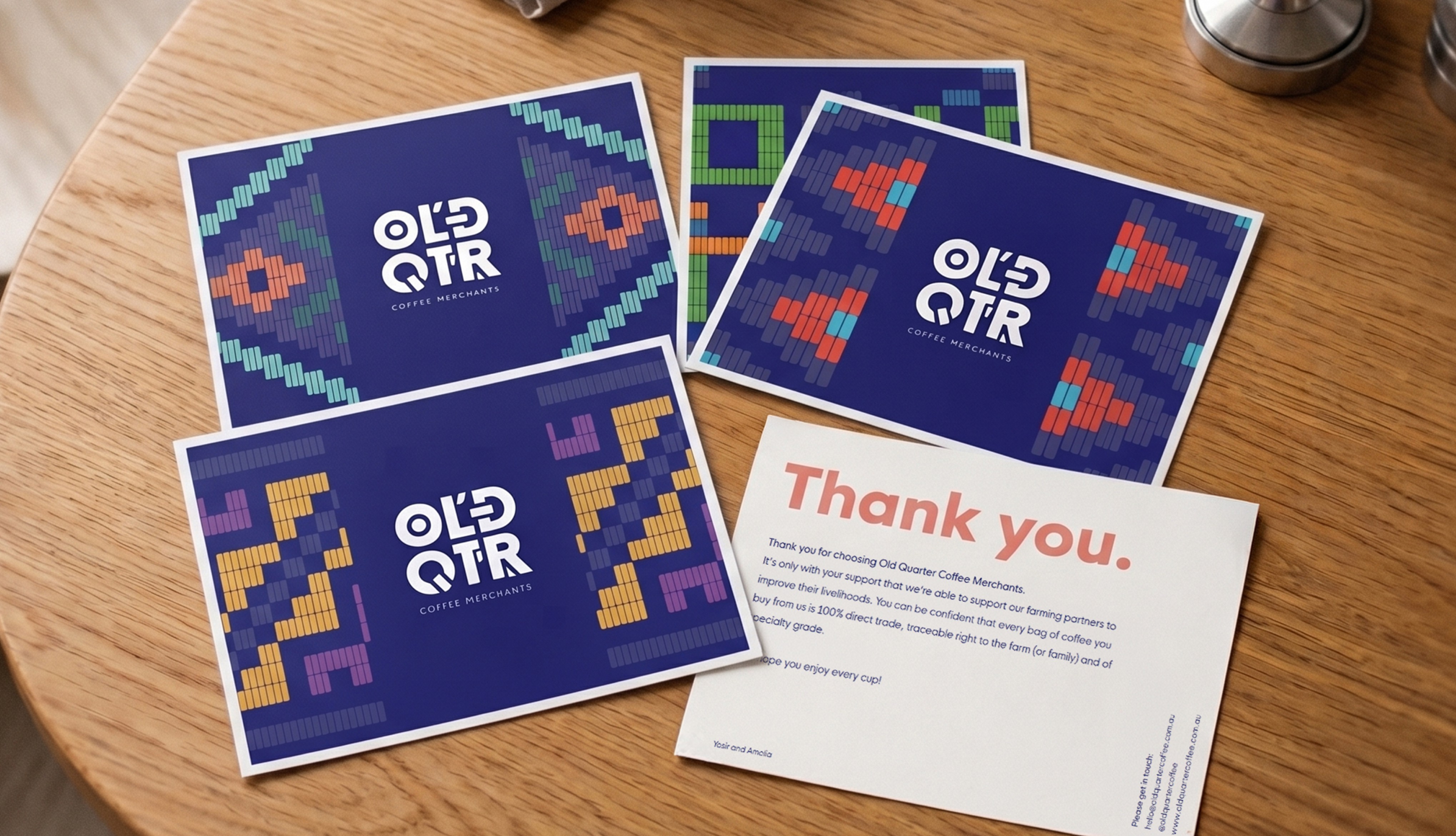
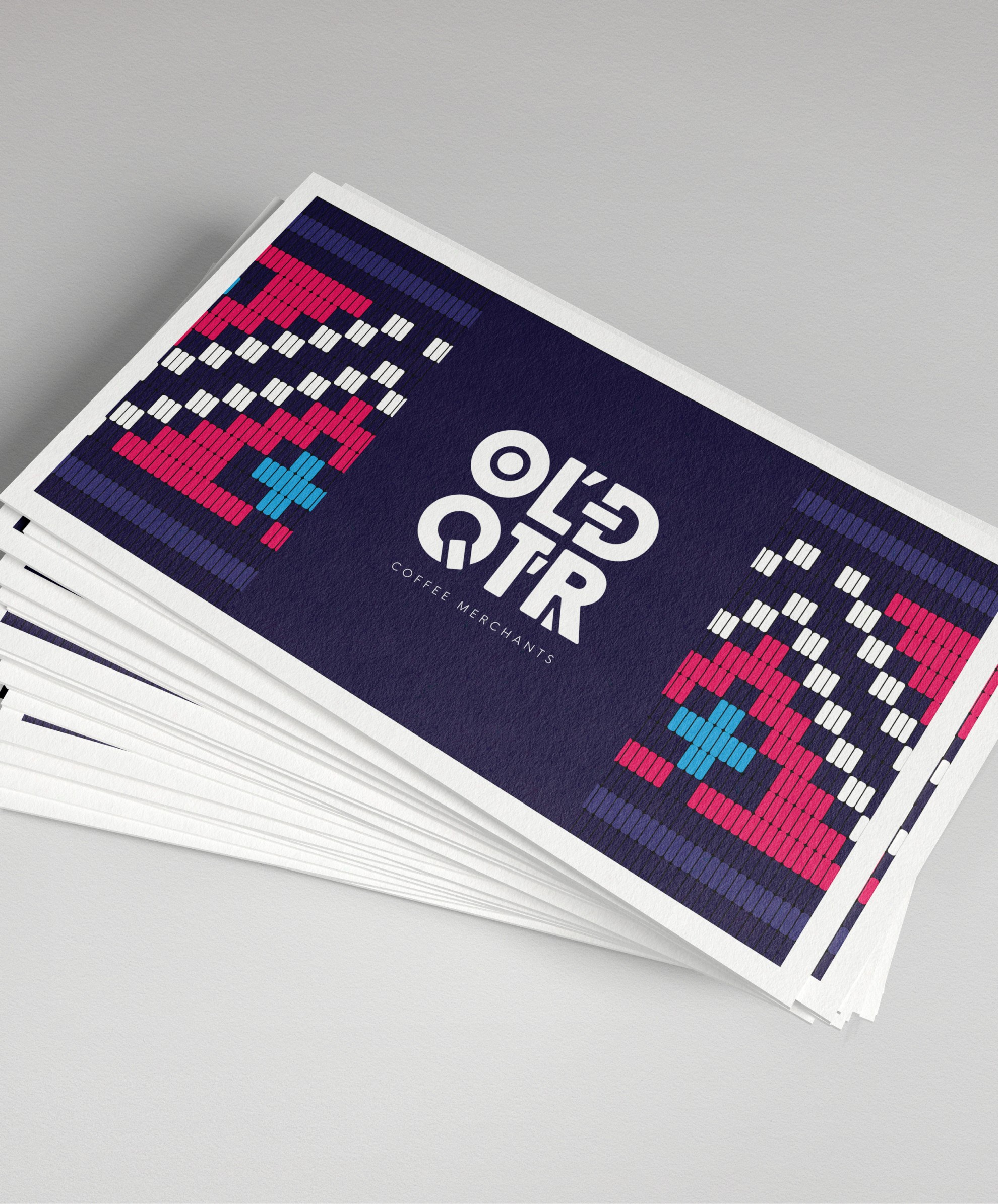
Graphic patterns, bold colour combinations and expressive layouts created a visual language that could flex across campaign materials, print collateral and storytelling formats without losing consistency. Every asset reinforced the same idea: this was not just coffee branding, but a system designed to celebrate provenance, community and cultural identity in a more visible way.
Graphic patterns, bold colour combinations and expressive layouts created a visual language that could flex across campaign materials, print collateral and storytelling formats without losing consistency. Every asset reinforced the same idea: this was not just coffee branding, but a system designed to celebrate provenance, community and cultural identity in a more visible way.
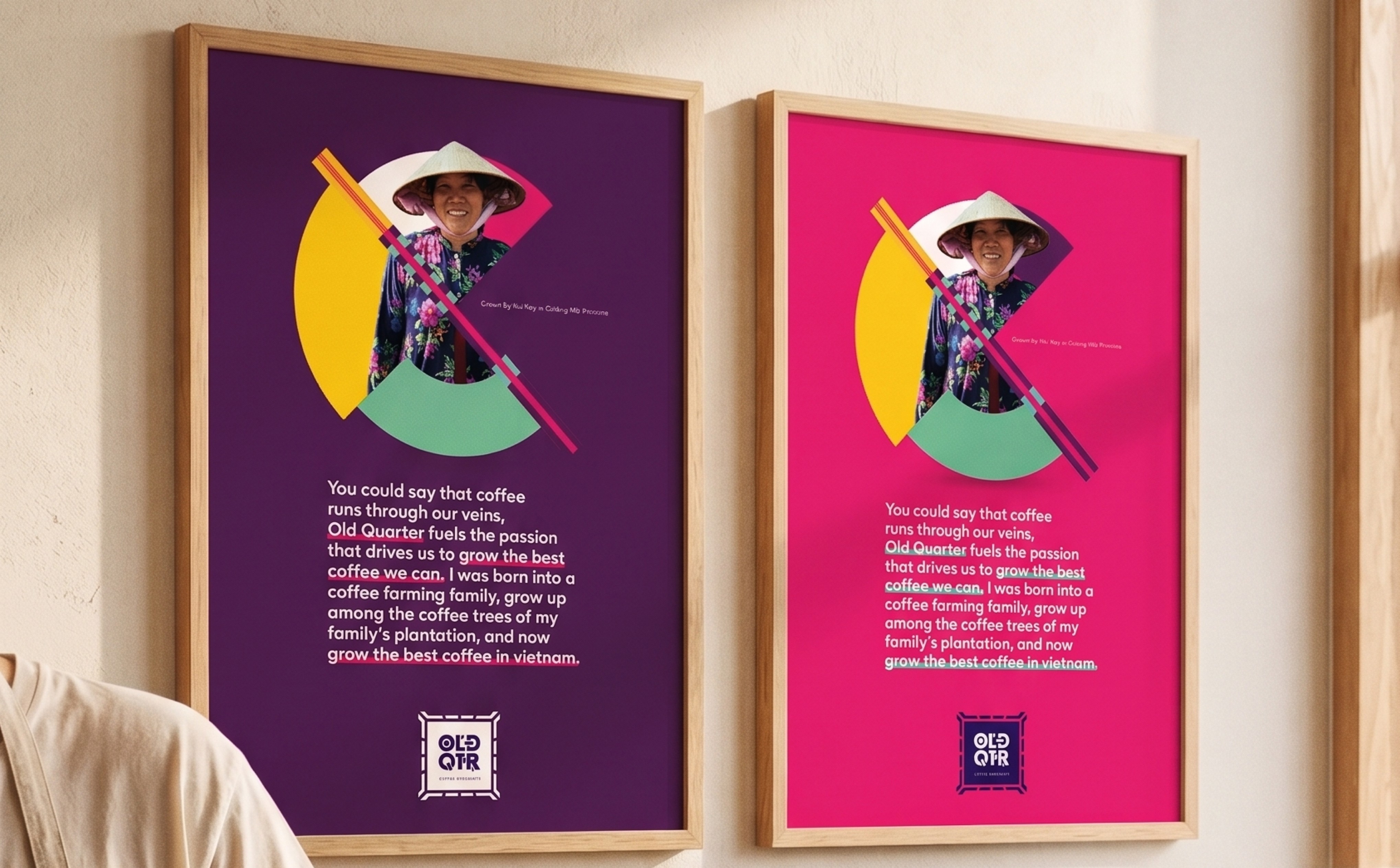
Graphic patterns, bold colour combinations and expressive layouts created a visual language that could flex across campaign materials, print collateral and storytelling formats without losing consistency. Every asset reinforced the same idea: this was not just coffee branding, but a system designed to celebrate provenance, community and cultural identity in a more visible way.
Graphic patterns, bold colour combinations and expressive layouts created a visual language that could flex across campaign materials, print collateral and storytelling formats without losing consistency. Every asset reinforced the same idea: this was not just coffee branding, but a system designed to celebrate provenance, community and cultural identity in a more visible way.
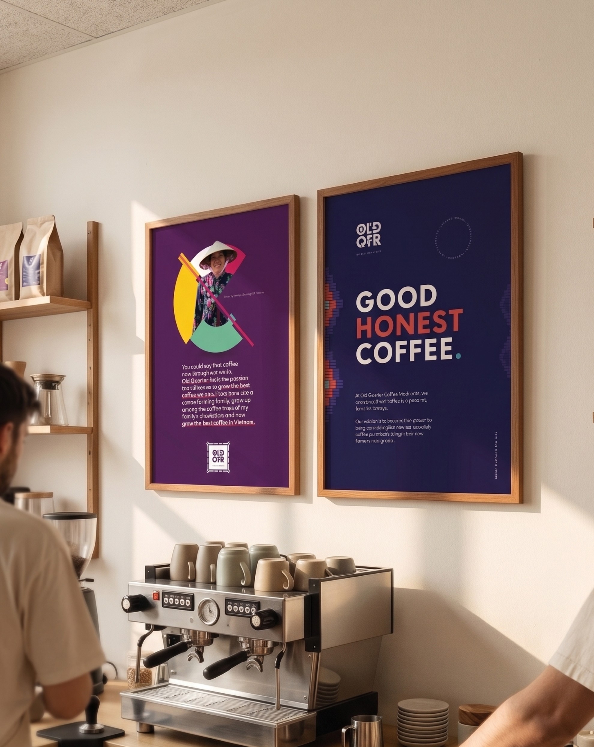
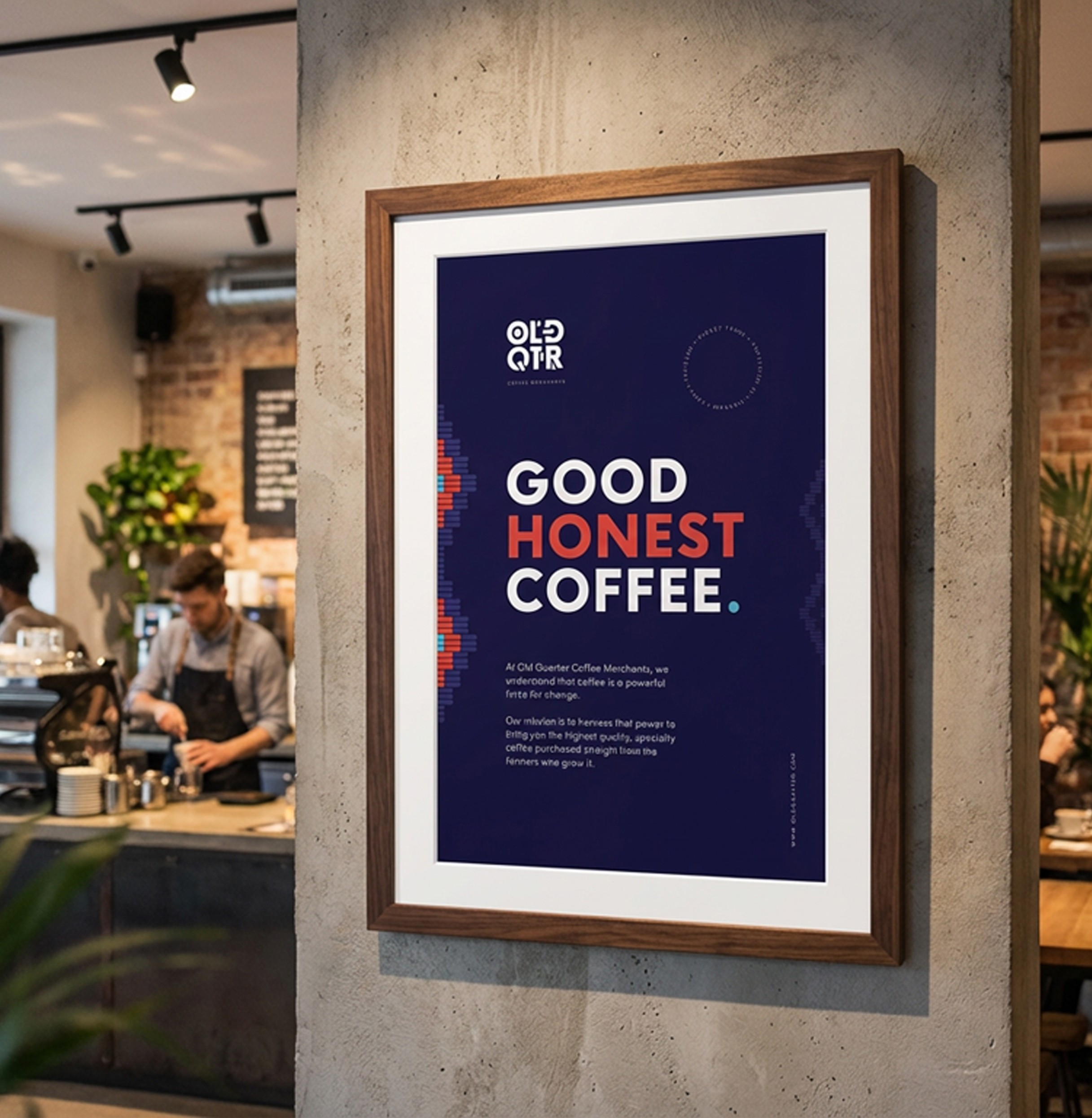
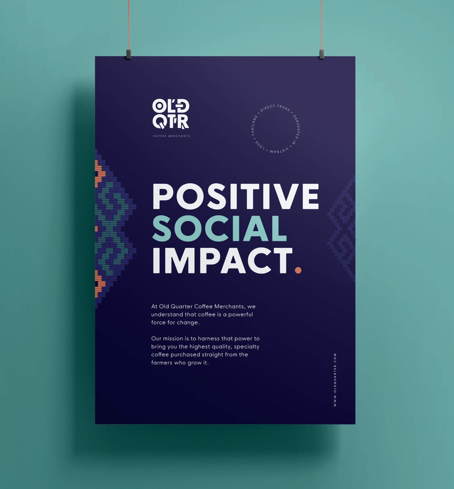
By bringing farmer stories, origin narratives and visual heritage into everyday brand materials, Old Quarter created a stronger emotional connection between source and customer. The result was a brand experience that felt distinctive, human and culturally rooted across every interaction, extending the identity far beyond the product itself.
By bringing farmer stories, origin narratives and visual heritage into everyday brand materials, Old Quarter created a stronger emotional connection between source and customer. The result was a brand experience that felt distinctive, human and culturally rooted across every interaction, extending the identity far beyond the product itself.
The outcome of the project was more than just a refreshed look - it was a transformation in how the brand communicated, behaved, and connected with its audience. By creating a system that was both consistent and adaptable, the work gave structure to everyday communication while leaving space for evolution.
The design language became a unifying force across platforms, improving clarity internally and strengthening recognition externally. Digital experiences became smoother and more engaging, while the overall identity positioned the brand as confident, timeless, and ready for growth.
The outcome of the project was more than just a refreshed look - it was a transformation in how the brand communicated, behaved, and connected with its audience. By creating a system that was both consistent and adaptable, the work gave structure to everyday communication while leaving space for evolution.
The design language became a unifying force across platforms, improving clarity internally and strengthening recognition externally. Digital experiences became smoother and more engaging, while the overall identity positioned the brand as confident, timeless, and ready for growth.
/ 7
These shifts translated into measurable improvements:
+62%
+62%
Increase in online orders
+40%
+40%
Return customer rate
+78%
+78%
Brand recognition in key markets
+17%
+17%
Conversion rate