'26
Most blockchain infrastructure brands look the same - clean, blue, geometric and designed to reassure investors. That language works in finance, but it doesn’t speak to gamers, developers or the Web3-native audiences DeMoN was built for.
Most blockchain infrastructure brands look the same - clean, blue, geometric and designed to reassure investors. That language works in finance, but it doesn’t speak to gamers, developers or the Web3-native audiences DeMoN was built for.
/ 1
DeMoN needed to sit in a different corner of the category: technically serious enough for engineers and ecosystem builders, but visually darker, sharper and culturally closer to gaming than banking. The challenge was to create a brand that could signal power, technical depth and originality without losing clarity or credibility.
DeMoN needed to sit in a different corner of the category: technically serious enough for engineers and ecosystem builders, but visually darker, sharper and culturally closer to gaming than banking. The challenge was to create a brand that could signal power, technical depth and originality without losing clarity or credibility.
/ 2
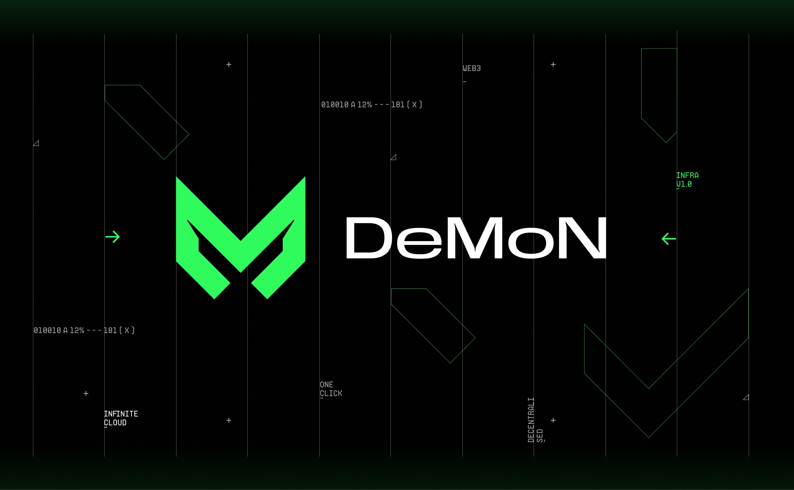
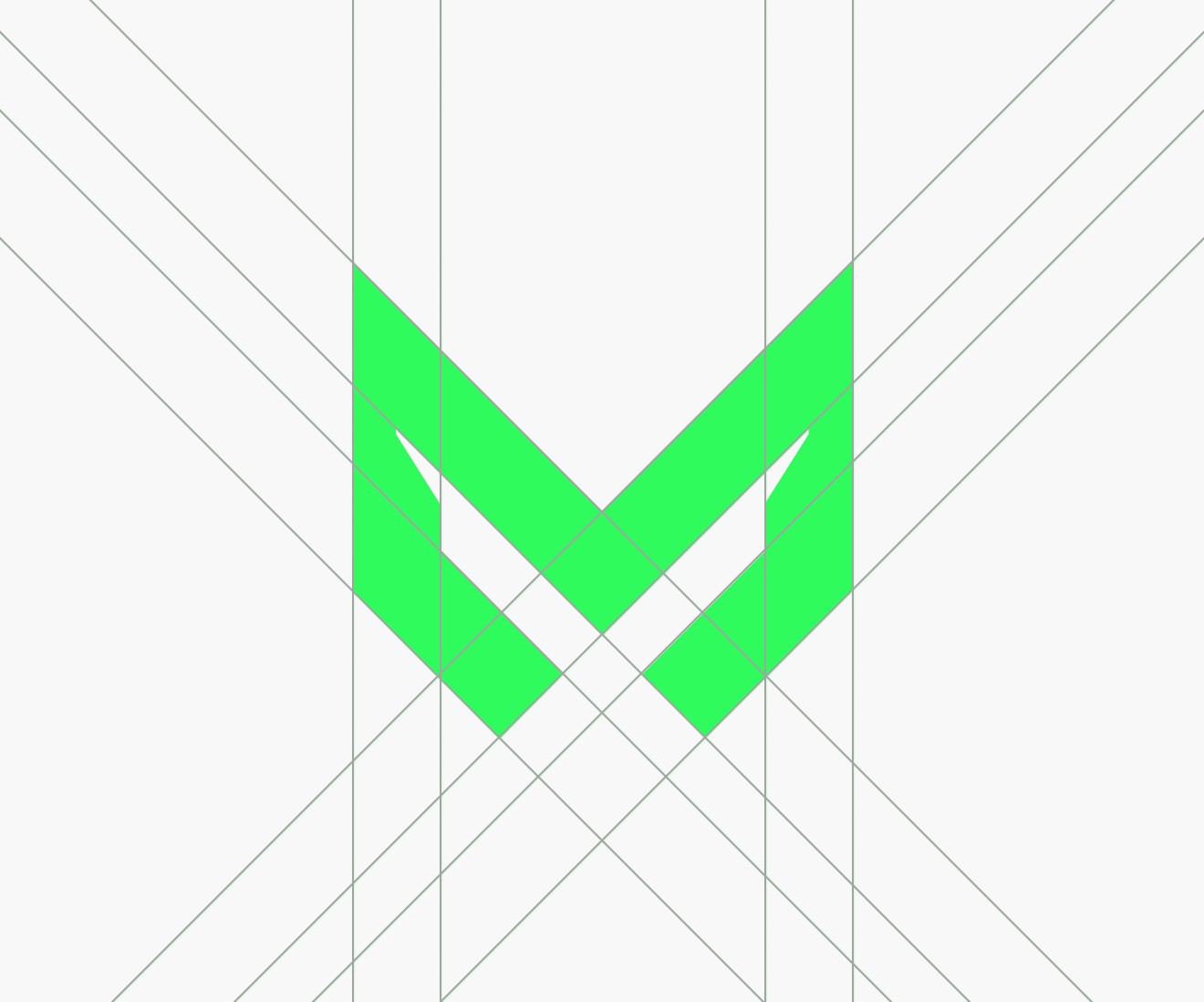
Built around the dual meaning of the name - Decentralised Modular Networking and the darker cultural edge of “demon” itself - the symbol was designed to feel sharp, technical and instantly ownable.
Built around the dual meaning of the name - Decentralised Modular Networking and the darker cultural edge of “demon” itself - the symbol was designed to feel sharp, technical and instantly ownable.
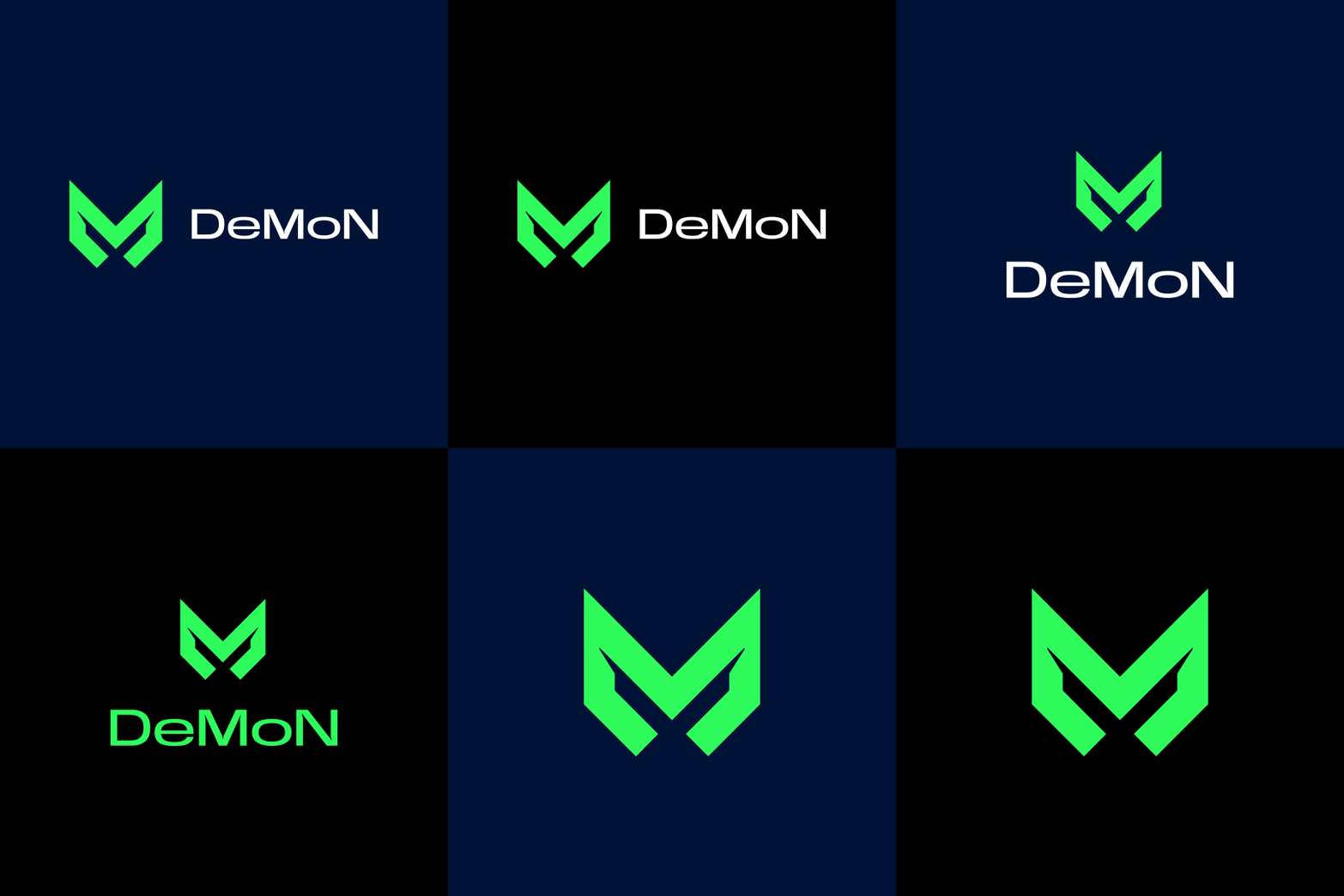
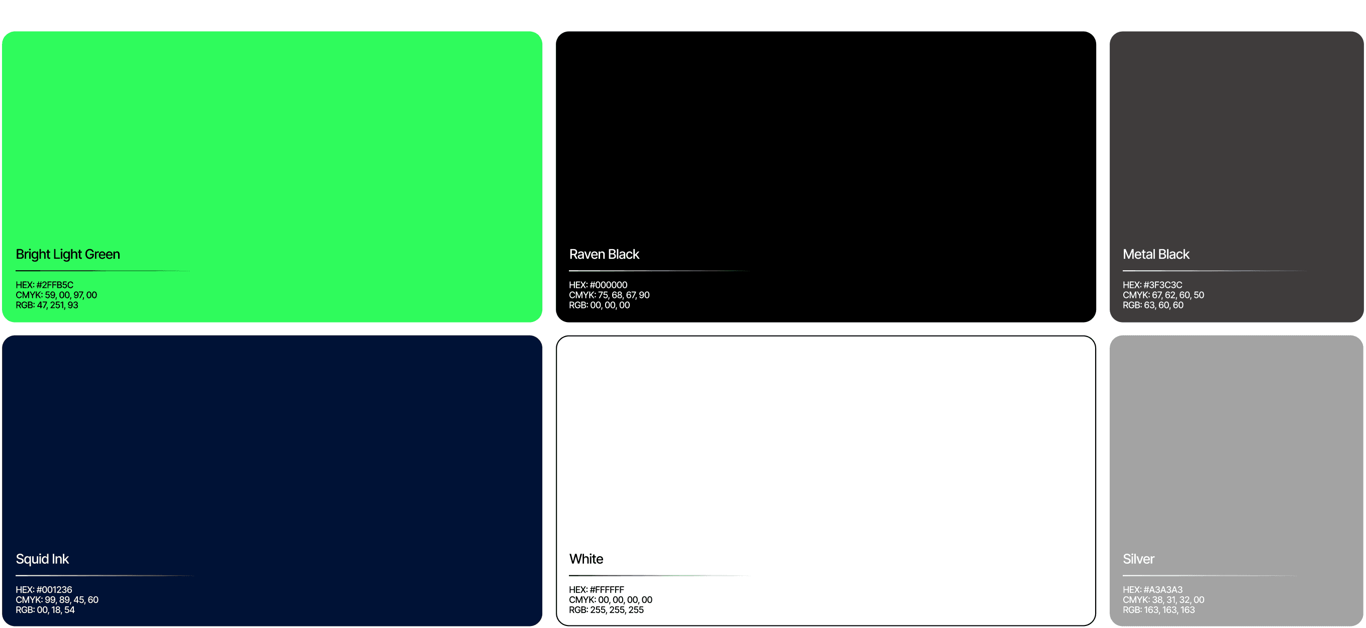
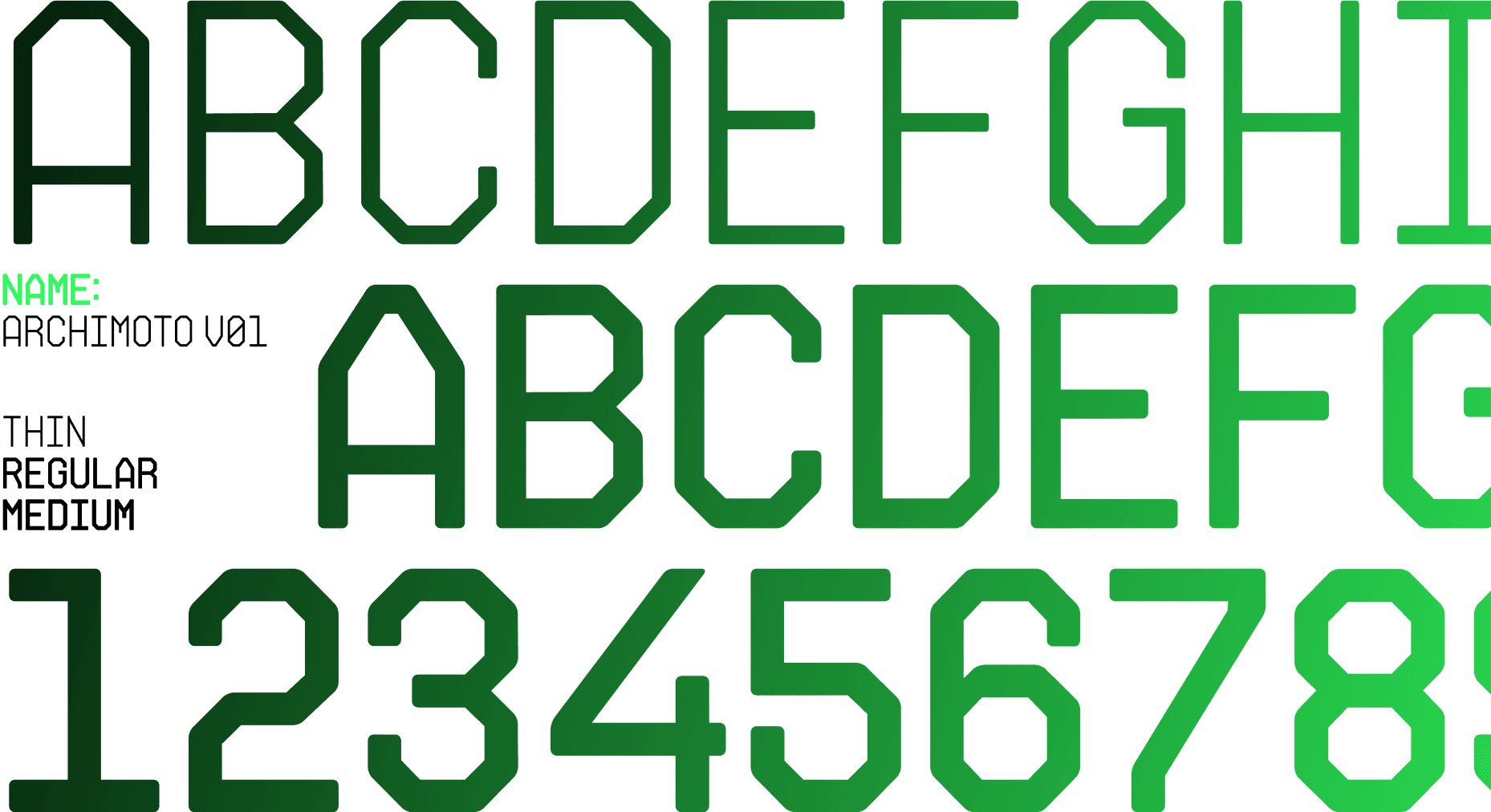
DeMoN’s visual system paired a high-contrast neon palette with a custom typographic language built to feel technical, digital and slightly confrontational - creating a brand expression that borrowed more from gaming interfaces, terminals and HUD systems than from the predictable aesthetics of blockchain finance.
DeMoN’s visual system paired a high-contrast neon palette with a custom typographic language built to feel technical, digital and slightly confrontational - creating a brand expression that borrowed more from gaming interfaces, terminals and HUD systems than from the predictable aesthetics of blockchain finance.
Most blockchain infrastructure brands look the same - clean, blue, geometric and designed to reassure investors. That language works in finance, but it doesn’t speak to gamers, developers or the Web3-native audiences DeMoN was built for.
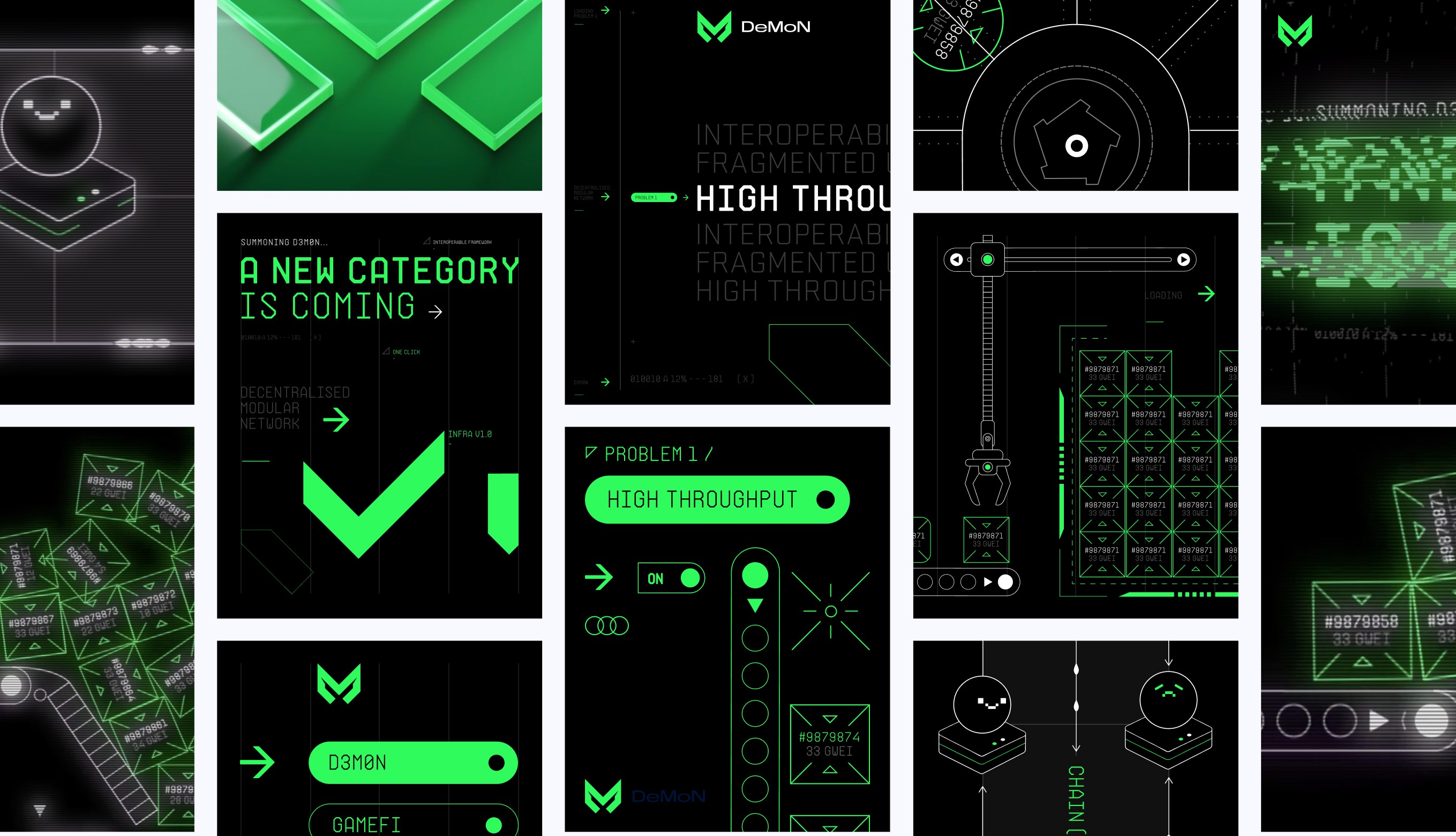
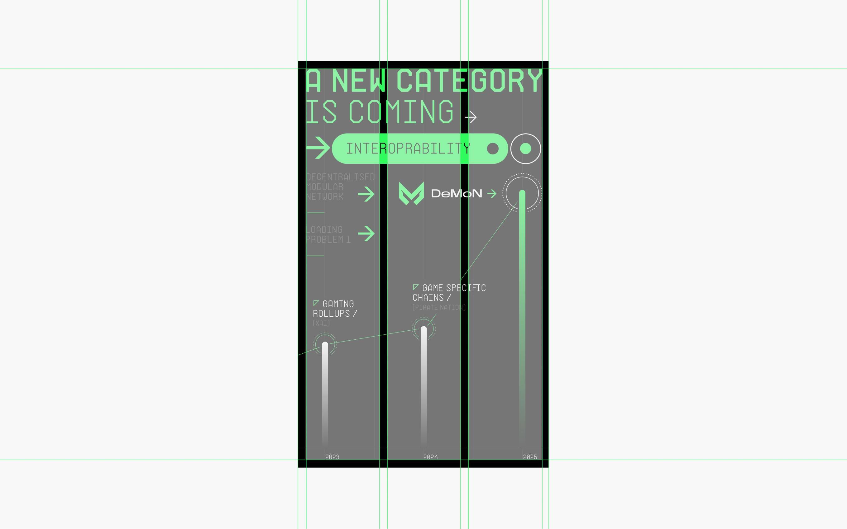
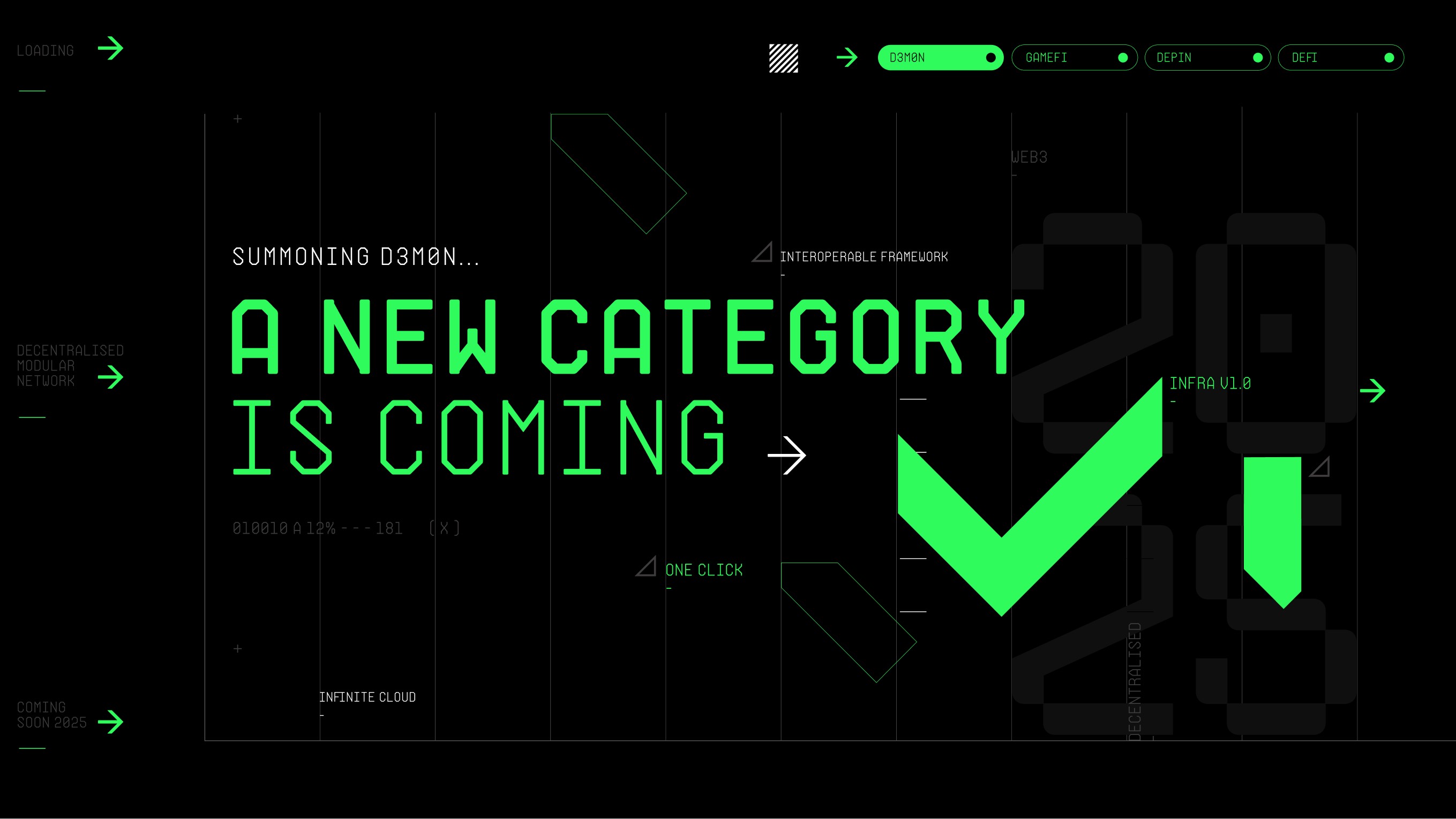
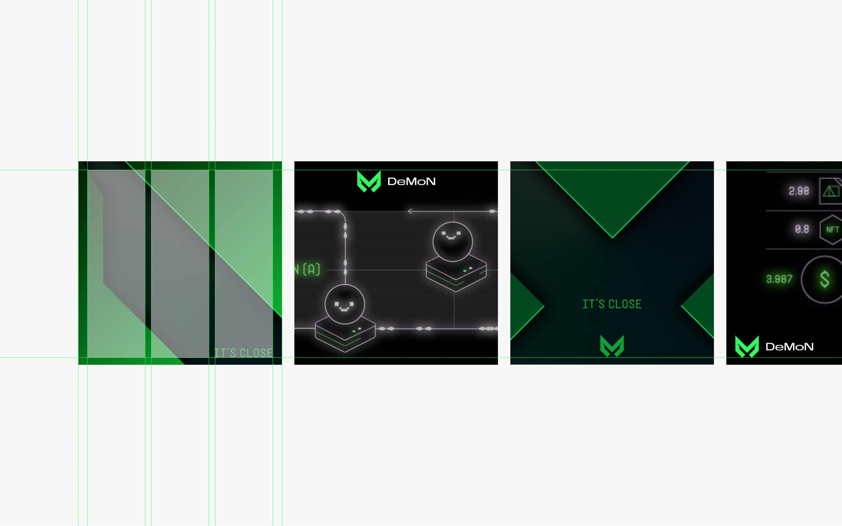
DeMoN’s visual language was extended into a pre-launch campaign system built around mystery, anticipation and technical intensity, using motion-led assets, teaser visuals and digital applications to position the brand less like infrastructure marketing and more like the arrival of a new gaming-native category.
DeMoN’s visual language was extended into a pre-launch campaign system built around mystery, anticipation and technical intensity, using motion-led assets, teaser visuals and digital applications to position the brand less like infrastructure marketing and more like the arrival of a new gaming-native category.
/ 3
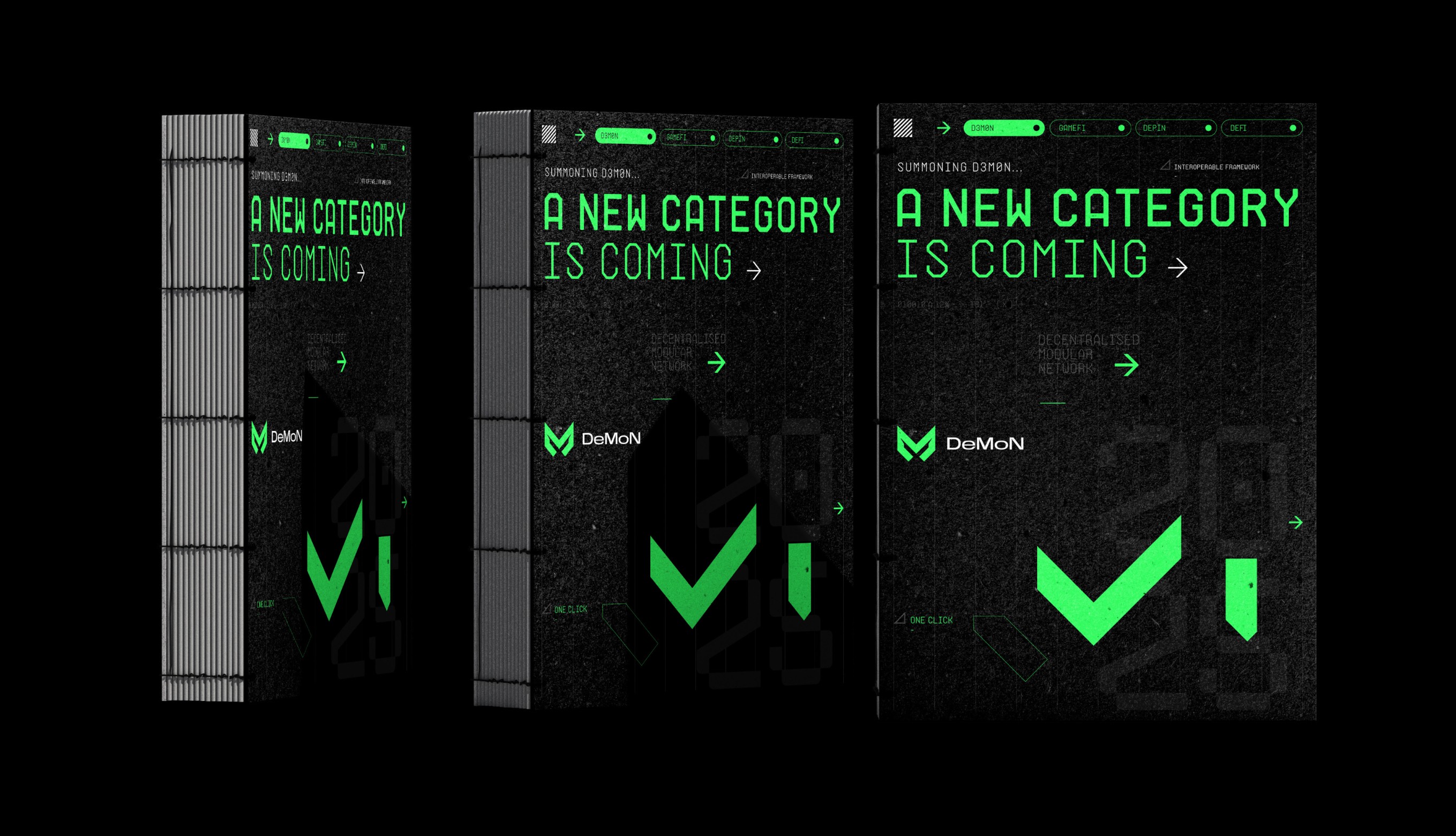
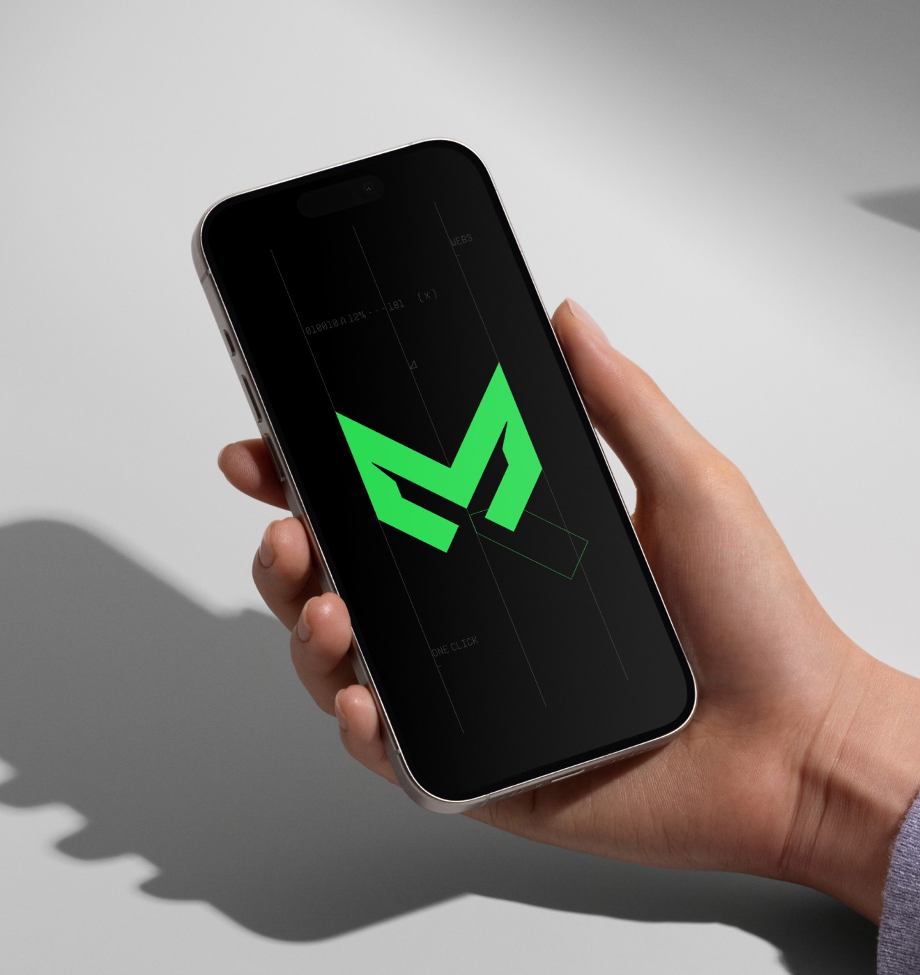
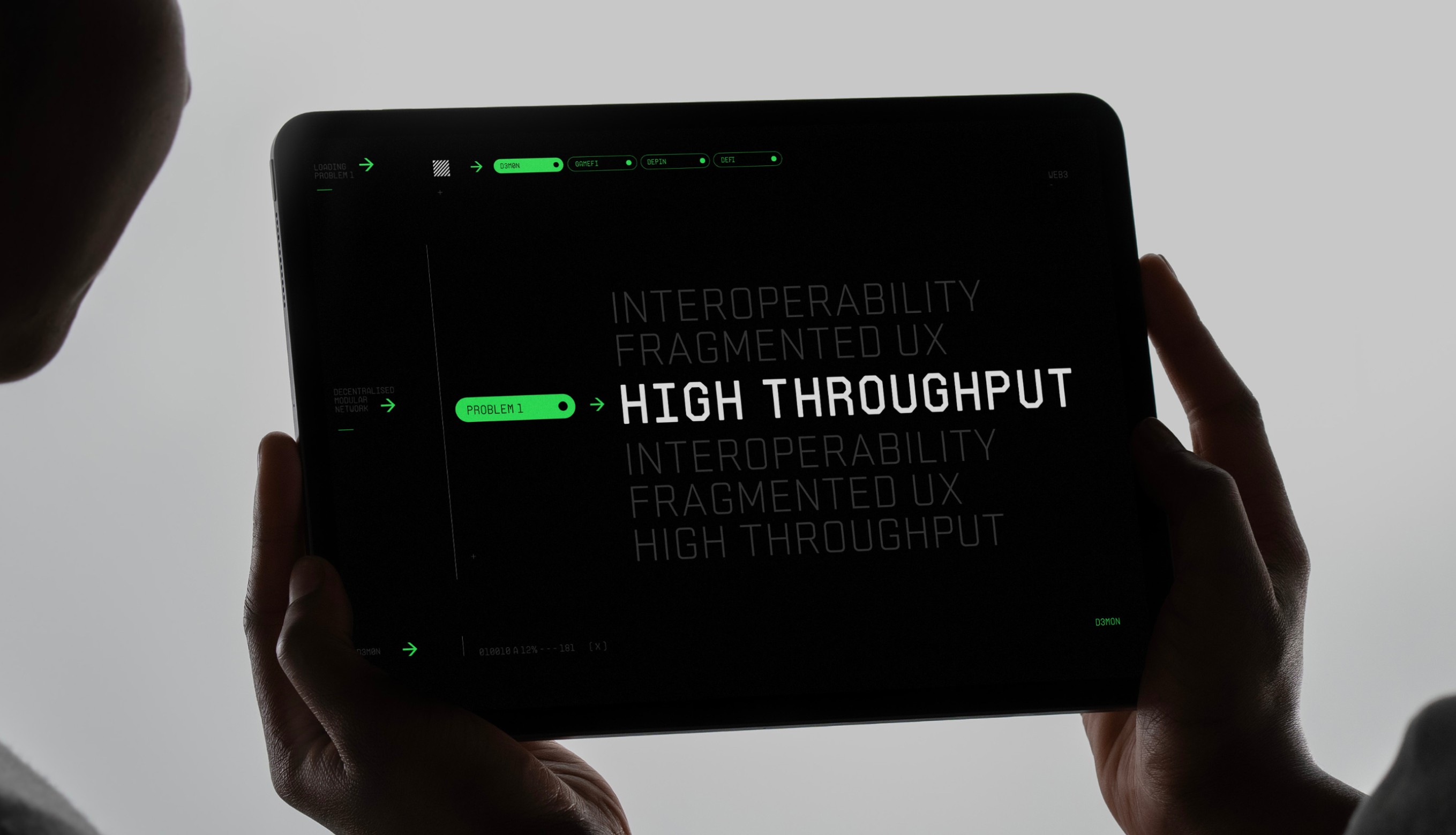
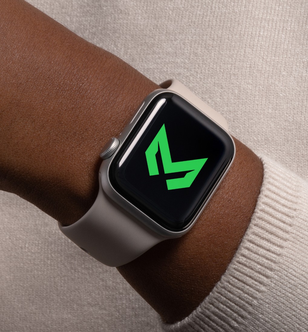
From device interfaces and digital product surfaces to immersive campaign applications, the DeMoN identity was built to feel native in motion - carrying its technical depth, visual energy and gamer-native character across experiences designed to be used, seen and remembered.
From device interfaces and digital product surfaces to immersive campaign applications, the DeMoN identity was built to feel native in motion - carrying its technical depth, visual energy and gamer-native character across experiences designed to be used, seen and remembered.
/ 4
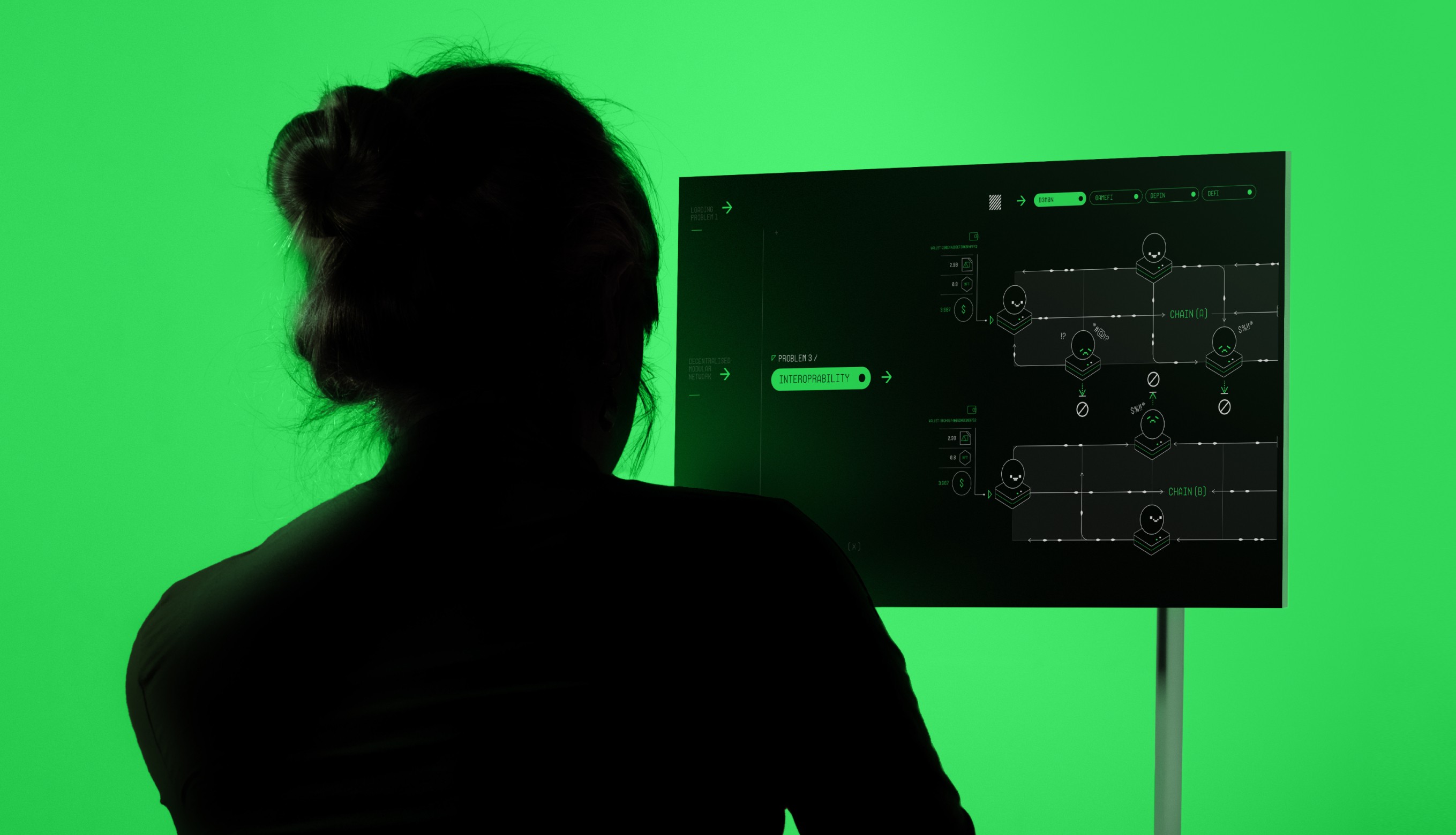
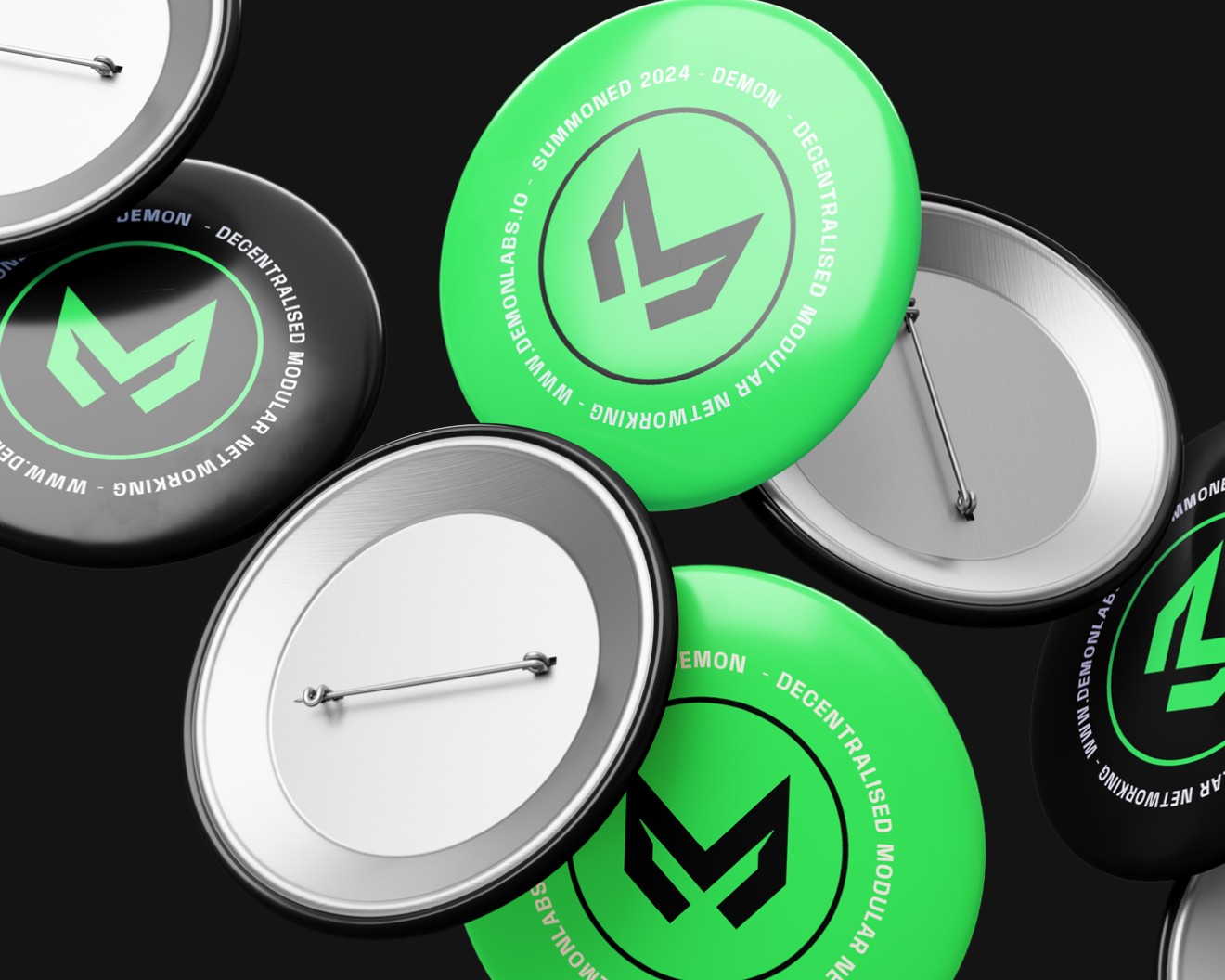
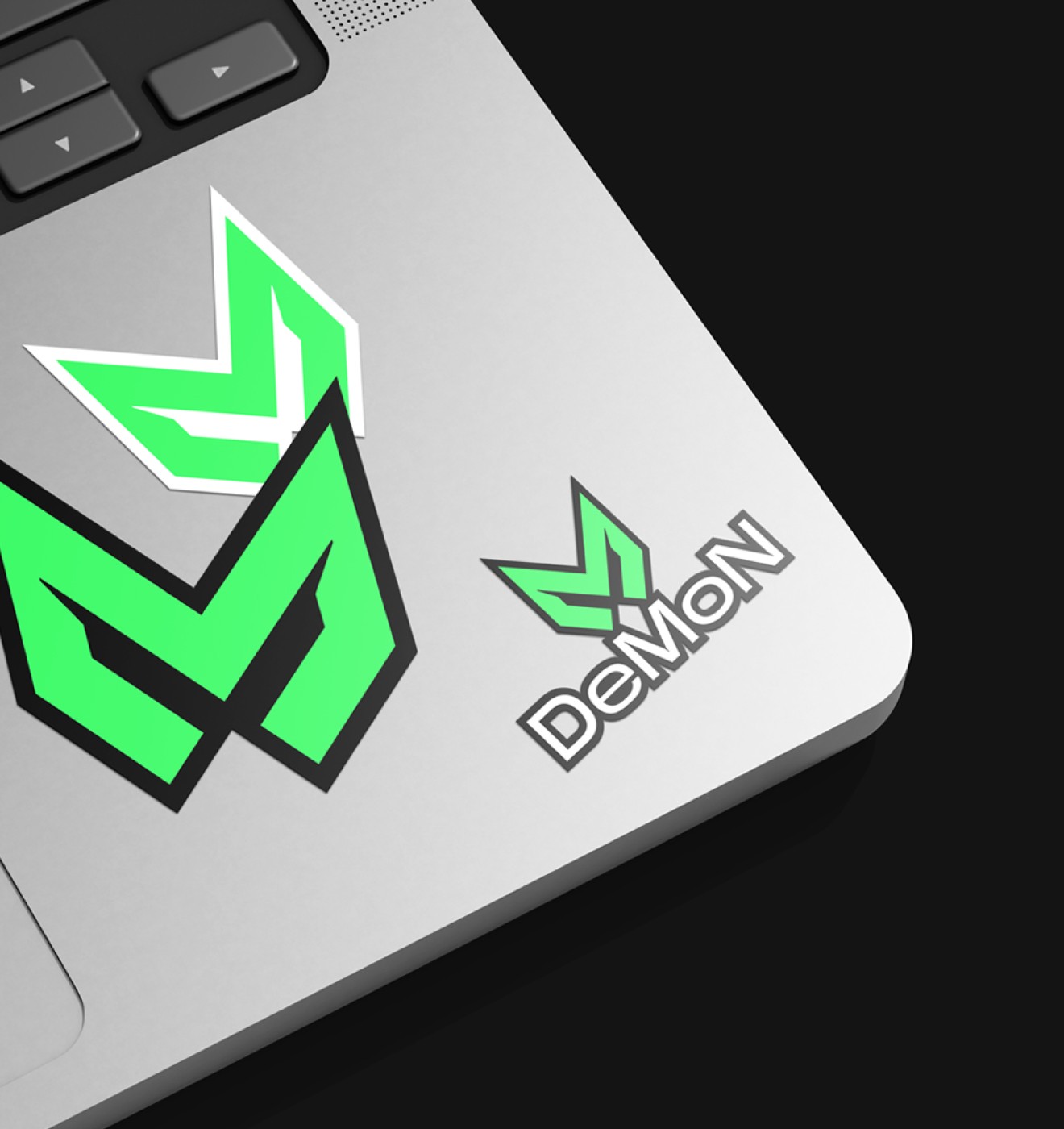
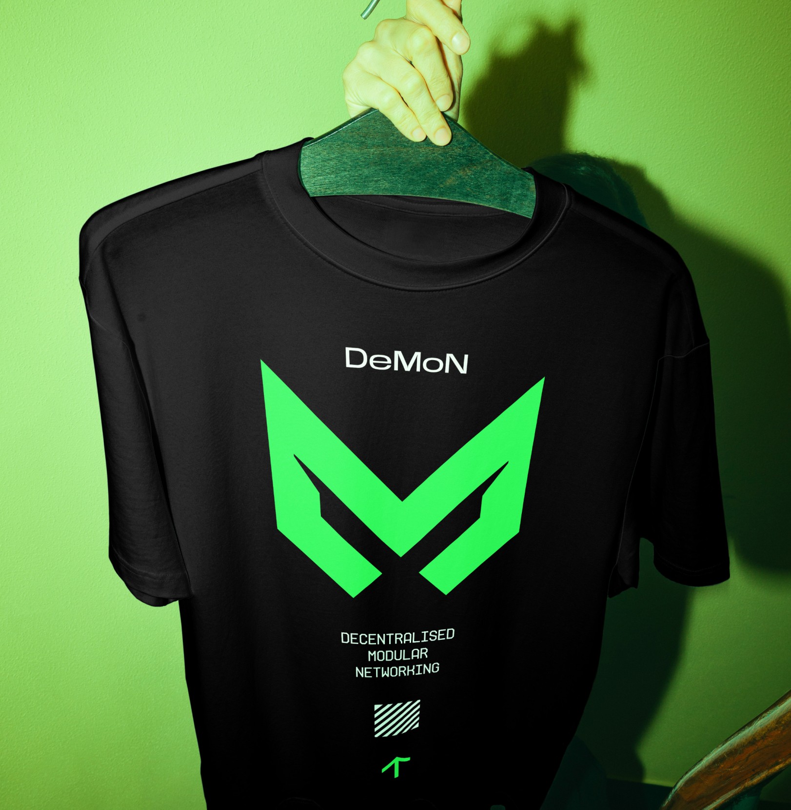
The DeMoN identity was designed to hold its presence across physical and environmental applications, translating the brand into signage, merchandise, branded objects and large-scale visual surfaces that reinforced its technical intensity beyond purely digital experiences.
The DeMoN identity was designed to hold its presence across physical and environmental applications, translating the brand into signage, merchandise, branded objects and large-scale visual surfaces that reinforced its technical intensity beyond purely digital experiences.

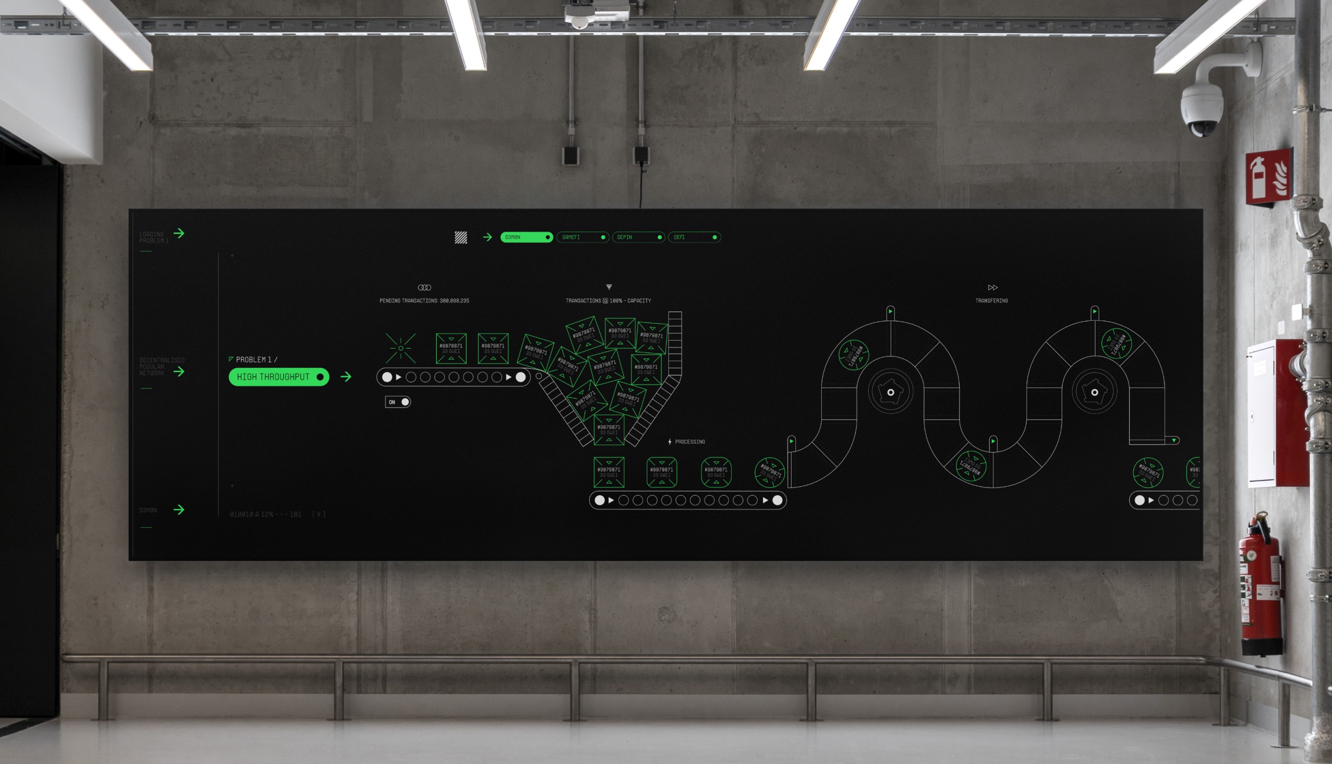
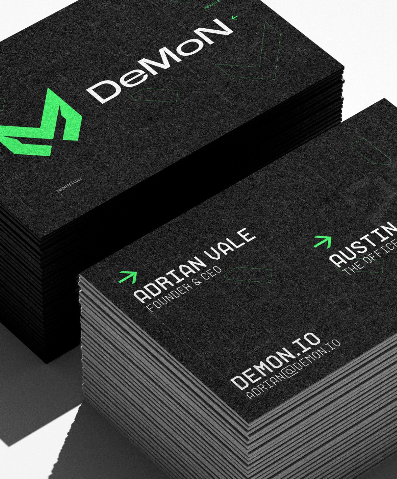
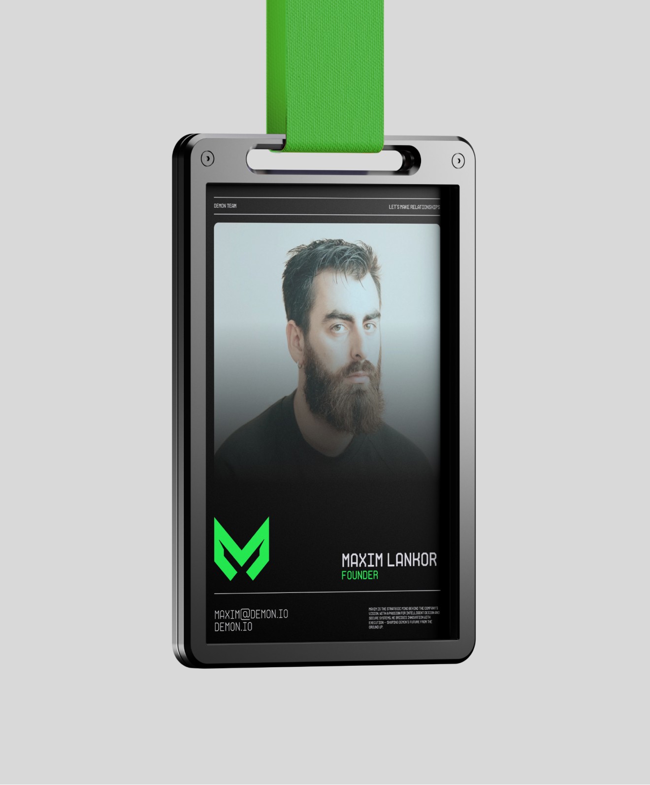
From business cards and presentation materials to branded documentation and launch assets, the DeMoN identity was designed as a scalable system - ensuring the same technical edge, visual consistency and category-defining character carried across every professional touchpoint.
/ 5
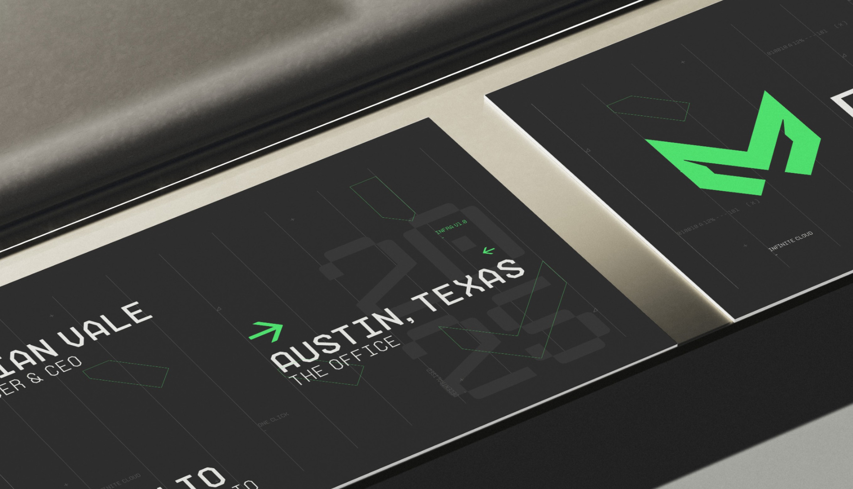
The DeMoN visual system carried its technical precision into brand collateral, documentation and internal business materials, creating a cohesive identity that could move from product and campaign environments into the everyday touchpoints that shape how a brand is experienced professionally.
The DeMoN visual system carried its technical precision into brand collateral, documentation and internal business materials, creating a cohesive identity that could move from product and campaign environments into the everyday touchpoints that shape how a brand is experienced professionally.
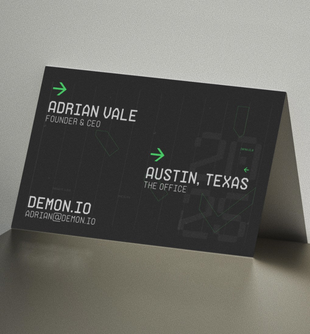
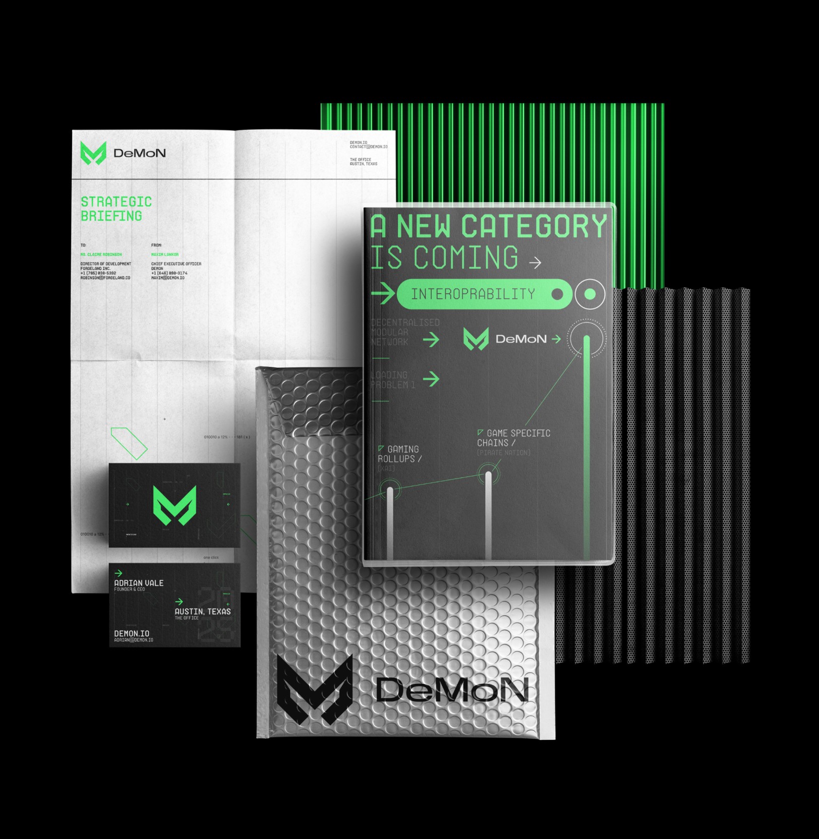
DeMoN was never designed as a static identity system. It was built as a flexible visual ecosystem capable of moving across product interfaces, digital experiences, campaign assets and physical brand applications while maintaining a clear and recognisable core language.
DeMoN was never designed as a static identity system. It was built as a flexible visual ecosystem capable of moving across product interfaces, digital experiences, campaign assets and physical brand applications while maintaining a clear and recognisable core language.
/ 6
DeMoN needed to sit in a different corner of the category: technically serious enough for engineers and ecosystem builders, but visually darker, sharper and culturally closer to gaming than banking. The challenge was to create a brand that could signal power, technical depth and originality without losing clarity or credibility.
DeMoN needed to sit in a different corner of the category: technically serious enough for engineers and ecosystem builders, but visually darker, sharper and culturally closer to gaming than banking. The challenge was to create a brand that could signal power, technical depth and originality without losing clarity or credibility.
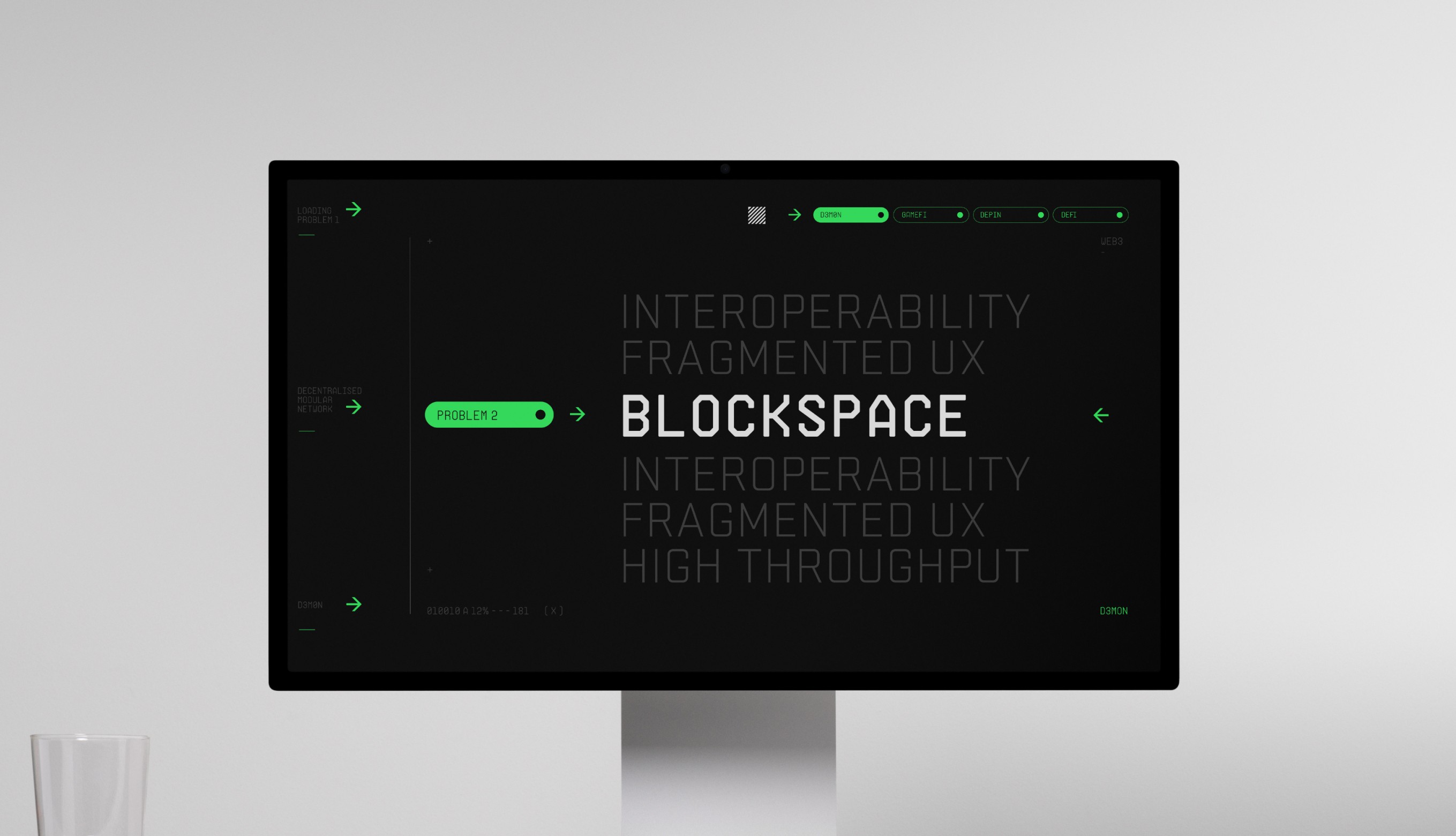
From screens and motion graphics to apparel, merchandise, signage and branded objects, every application reinforced the same technical depth, dark visual energy and gamer-native personality that defined the brand from the beginning.
From screens and motion graphics to apparel, merchandise, signage and branded objects, every application reinforced the same technical depth, dark visual energy and gamer-native personality that defined the brand from the beginning.
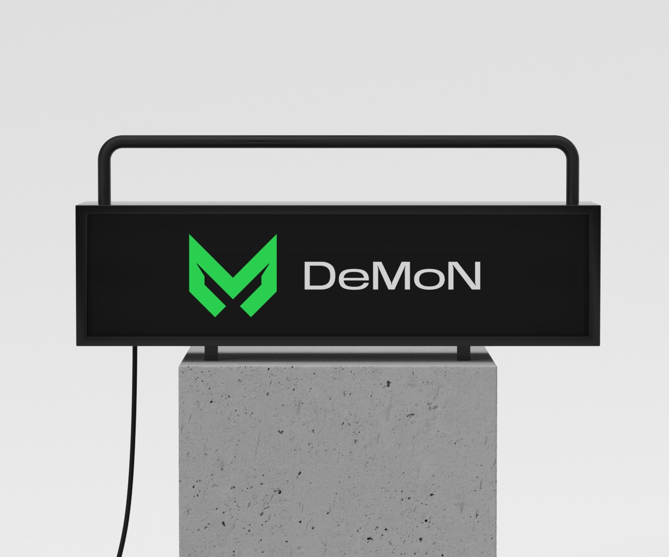
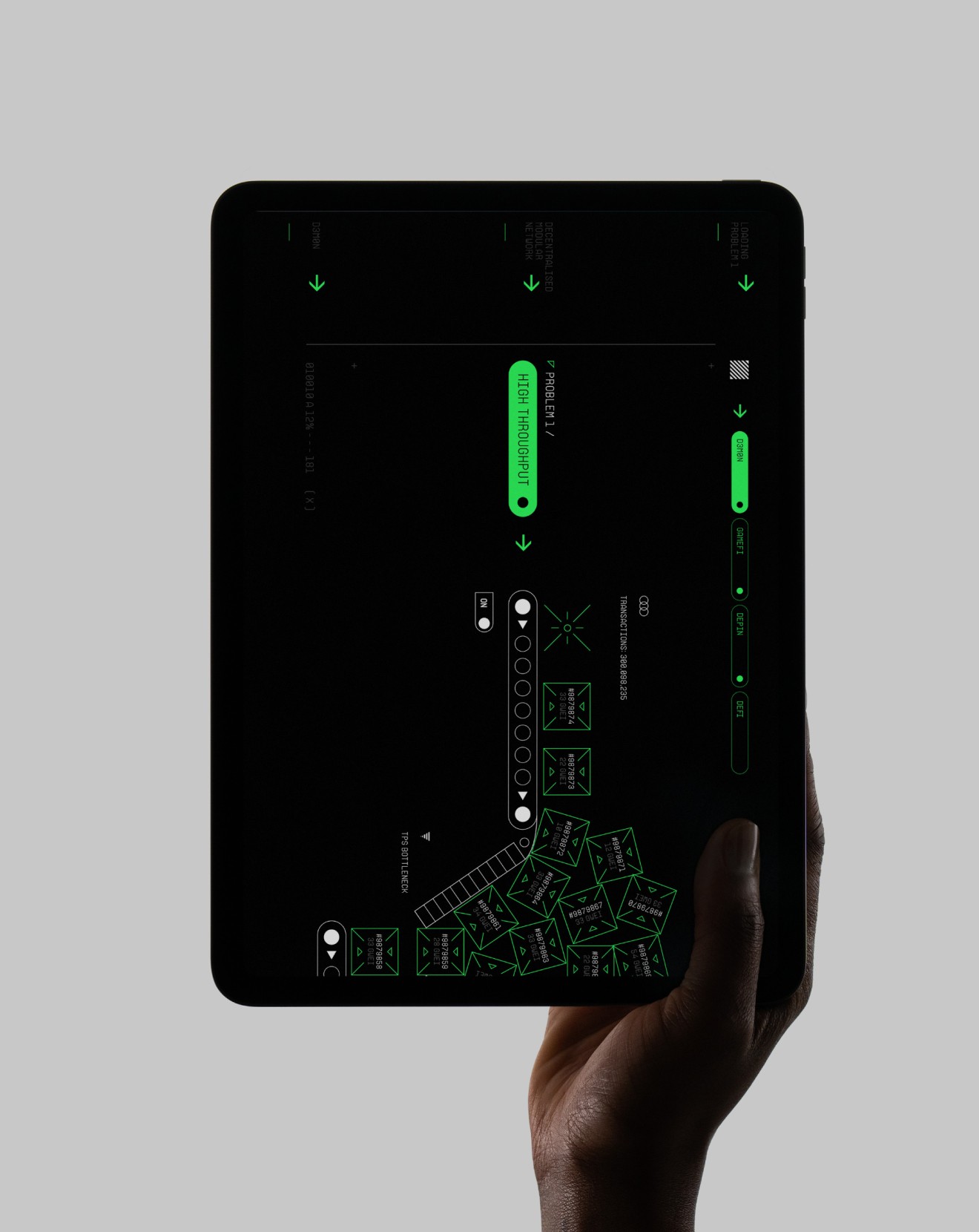
The result was a blockchain infrastructure identity that felt less like traditional Web3 branding and more like a category-native system - immersive, technically credible and built to live far beyond the logo itself.
The result was a blockchain infrastructure identity that felt less like traditional Web3 branding and more like a category-native system - immersive, technically credible and built to live far beyond the logo itself.
What began as a visual identity project became the public-facing signature for one of Web3 gaming’s more technically ambitious infrastructure plays - giving DeMoN a brand system that could communicate engineering depth, ecosystem credibility and cultural distinction in a category crowded with sameness. Rather than borrowing the visual language of finance, the work positioned DeMoN in a space much closer to gaming, systems architecture and digital-native culture, helping the brand feel more technically immersive, more ownable and more aligned with the audiences it was actually built to serve.
By translating DeMoN’s infrastructure complexity into a cohesive visual and narrative system, the brand gained stronger positioning within the XR One ecosystem and a clearer identity across product, campaign and developer-facing touchpoints. The result was a blockchain infrastructure brand that could operate as more than backend technology - becoming a recognisable, scalable and culturally differentiated presence capable of supporting launch, ecosystem growth and long-term category relevance.
What began as a visual identity project became the public-facing signature for one of Web3 gaming’s more technically ambitious infrastructure plays - giving DeMoN a brand system that could communicate engineering depth, ecosystem credibility and cultural distinction in a category crowded with sameness. Rather than borrowing the visual language of finance, the work positioned DeMoN in a space much closer to gaming, systems architecture and digital-native culture, helping the brand feel more technically immersive, more ownable and more aligned with the audiences it was actually built to serve.
By translating DeMoN’s infrastructure complexity into a cohesive visual and narrative system, the brand gained stronger positioning within the XR One ecosystem and a clearer identity across product, campaign and developer-facing touchpoints. The result was a blockchain infrastructure brand that could operate as more than backend technology - becoming a recognisable, scalable and culturally differentiated presence capable of supporting launch, ecosystem growth and long-term category relevance.
/ 7
Project impact
3+
3+
Game titles in development
30+
30+
Engineers across ecosystem
1
1
Arbitrum Orbit infrastructure layer
2024
2024
XR One launch year