'26
ASX needed to modernise the visual layer of its digital experience without losing the trust and authority expected of a national exchange. With millions of monthly visitors relying on the platform for market information, trading data and financial insights, the challenge was not simply aesthetic. The experience needed to improve readability, simplify complex information and create a more contemporary expression of the brand while maintaining the credibility, precision and confidence associated with one of the world’s leading financial marketplaces.
ASX needed to modernise the visual layer of its digital experience without losing the trust and authority expected of a national exchange. With millions of monthly visitors relying on the platform for market information, trading data and financial insights, the challenge was not simply aesthetic. The experience needed to improve readability, simplify complex information and create a more contemporary expression of the brand while maintaining the credibility, precision and confidence associated with one of the world’s leading financial marketplaces.
/ 1
The project focused on creating a visual language capable of supporting both institutional authority and modern digital usability. Complex datasets, charts and market information needed to be presented with greater clarity, while responsive interfaces, refined typography and a disciplined design system ensured consistency across every screen. The result was a digital experience that felt more progressive, more accessible and better aligned with the future-facing ambitions of the ASX brand.
The project focused on creating a visual language capable of supporting both institutional authority and modern digital usability. Complex datasets, charts and market information needed to be presented with greater clarity, while responsive interfaces, refined typography and a disciplined design system ensured consistency across every screen. The result was a digital experience that felt more progressive, more accessible and better aligned with the future-facing ambitions of the ASX brand.
/ 2


The visual system was built around clarity, trust and accessibility, creating a more refined digital experience capable of serving investors, listed companies, market participants and the broader financial community. Responsive layouts, simplified content structures and a disciplined design language helped transform complex market information into experiences that felt more intuitive, readable and approachable across every device.
The visual system was built around clarity, trust and accessibility, creating a more refined digital experience capable of serving investors, listed companies, market participants and the broader financial community. Responsive layouts, simplified content structures and a disciplined design language helped transform complex market information into experiences that felt more intuitive, readable and approachable across every device.


ASX needed to modernise the visual layer of its digital experience without losing the trust and authority expected of a national exchange. With millions of monthly visitors relying on the platform for market information, trading data and financial insights, the challenge was not simply aesthetic. The experience needed to improve readability, simplify complex information and create a more contemporary expression of the brand while maintaining the credibility, precision and confidence associated with one of the world’s leading financial marketplaces.

The ASX experience was designed around the realities of modern market behaviour, where investors, listed companies and market participants move seamlessly between desktop, tablet and mobile environments. Through a disciplined visual hierarchy, responsive interface patterns and simplified navigation structures, the platform delivered a more intuitive way to access market data, products, services and investment information while maintaining the authority expected of Australia’s leading securities exchange.
The ASX experience was designed around the realities of modern market behaviour, where investors, listed companies and market participants move seamlessly between desktop, tablet and mobile environments. Through a disciplined visual hierarchy, responsive interface patterns and simplified navigation structures, the platform delivered a more intuitive way to access market data, products, services and investment information while maintaining the authority expected of Australia’s leading securities exchange.
/ 3


Beyond the public website, the project established a unified visual framework capable of supporting the broader ASX digital ecosystem. From market data interfaces and financial products to dashboards, workspaces and member-facing tools, every component was designed around a common set of principles that prioritised readability, efficiency and trust. The result was a scalable design language that improved consistency across platforms while giving teams a clear foundation for future digital initiatives.
Beyond the public website, the project established a unified visual framework capable of supporting the broader ASX digital ecosystem. From market data interfaces and financial products to dashboards, workspaces and member-facing tools, every component was designed around a common set of principles that prioritised readability, efficiency and trust. The result was a scalable design language that improved consistency across platforms while giving teams a clear foundation for future digital initiatives.
/ 4


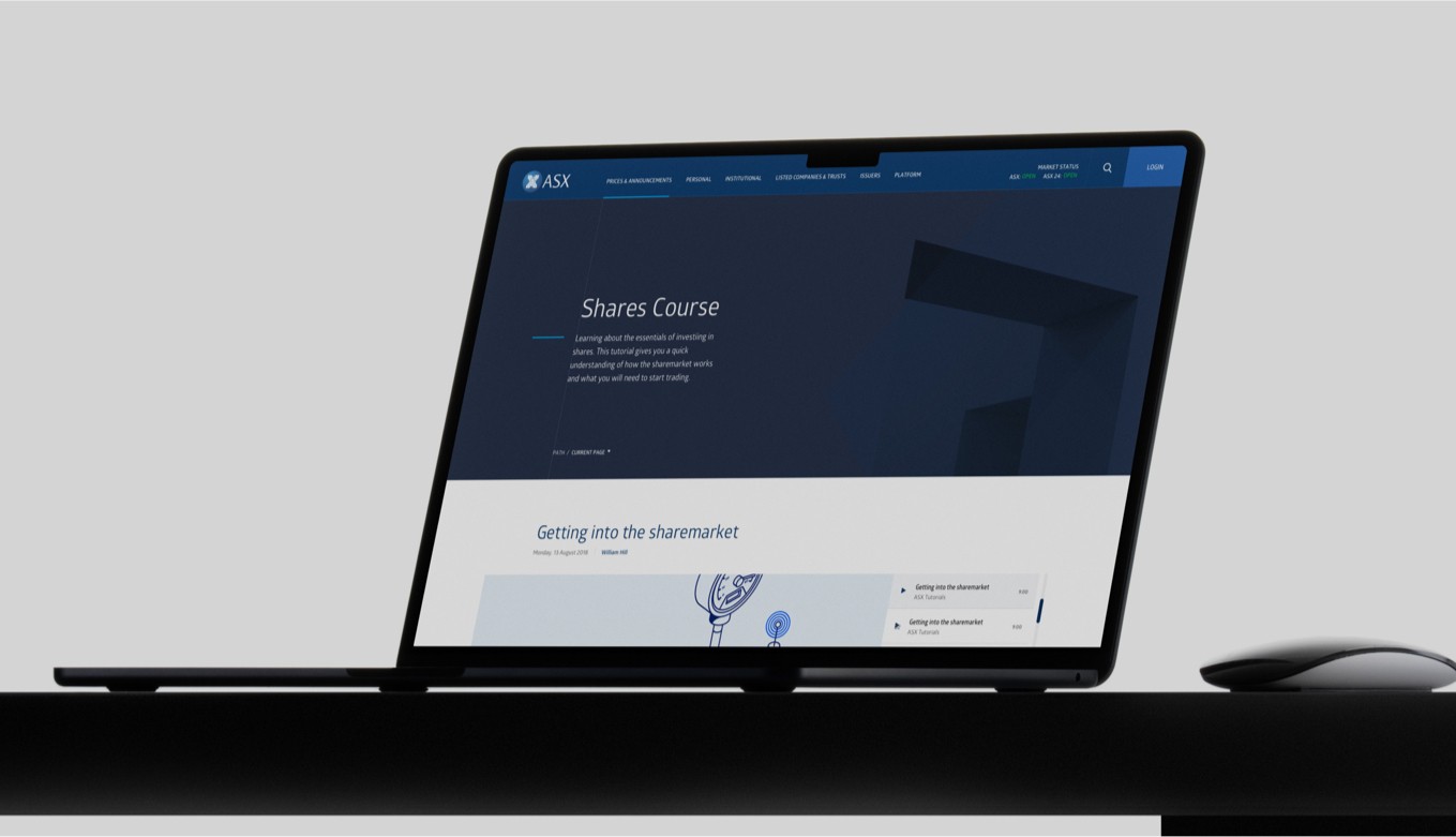


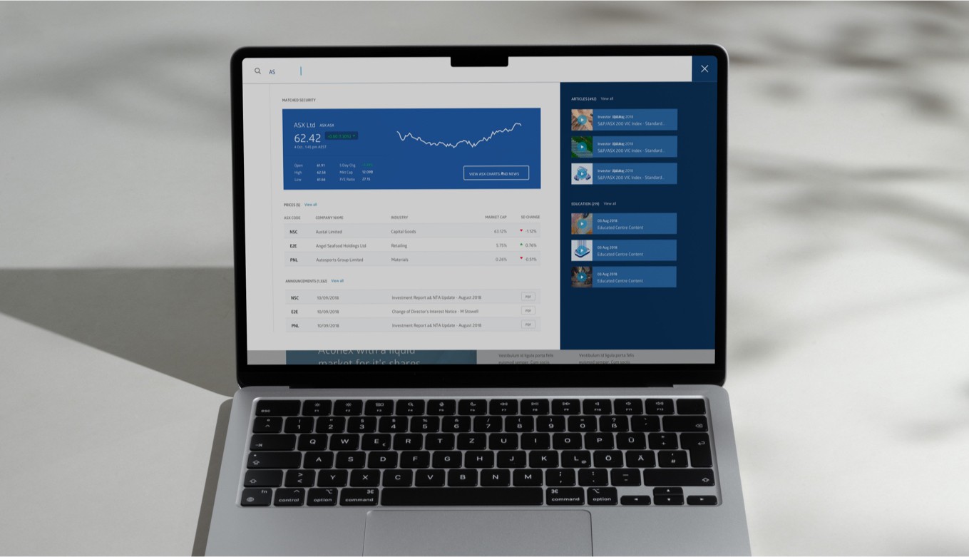
The ASX design system was built to extend far beyond a single website refresh. As the organisation continued to expand its digital products, services and market offerings, the platform needed a flexible foundation capable of supporting new functionality while maintaining consistency across every touchpoint. Scalability, clarity and long-term usability became central principles throughout the system.
/ 5

From data-heavy interfaces and member workspaces to product pages and institutional content, every experience was connected through a shared visual language and component framework. The result was a digital ecosystem that empowered internal teams to build faster, maintain quality more efficiently and deliver a more cohesive experience for the millions of users who rely on ASX every month.
From data-heavy interfaces and member workspaces to product pages and institutional content, every experience was connected through a shared visual language and component framework. The result was a digital ecosystem that empowered internal teams to build faster, maintain quality more efficiently and deliver a more cohesive experience for the millions of users who rely on ASX every month.


ASX serves a uniquely diverse audience, from retail investors and listed companies to market participants, analysts and financial institutions. The digital experience was designed to simplify access to critical market information, helping users navigate complex financial products, announcements and data through a more structured and intuitive interface.
ASX serves a uniquely diverse audience, from retail investors and listed companies to market participants, analysts and financial institutions. The digital experience was designed to simplify access to critical market information, helping users navigate complex financial products, announcements and data through a more structured and intuitive interface.
/ 6
The project focused on creating a visual language capable of supporting both institutional authority and modern digital usability. Complex datasets, charts and market information needed to be presented with greater clarity, while responsive interfaces, refined typography and a disciplined design system ensured consistency across every screen. The result was a digital experience that felt more progressive, more accessible and better aligned with the future-facing ambitions of the ASX brand.
The project focused on creating a visual language capable of supporting both institutional authority and modern digital usability. Complex datasets, charts and market information needed to be presented with greater clarity, while responsive interfaces, refined typography and a disciplined design system ensured consistency across every screen. The result was a digital experience that felt more progressive, more accessible and better aligned with the future-facing ambitions of the ASX brand.

Clear information architecture, responsive layouts and refined content hierarchies ensured that key insights could be accessed quickly across desktop, tablet and mobile environments. By reducing friction throughout the experience, the platform improved discoverability while maintaining the authority and precision expected from one of the world’s leading securities exchanges.
Clear information architecture, responsive layouts and refined content hierarchies ensured that key insights could be accessed quickly across desktop, tablet and mobile environments. By reducing friction throughout the experience, the platform improved discoverability while maintaining the authority and precision expected from one of the world’s leading securities exchanges.


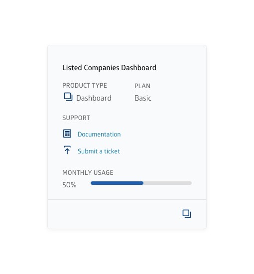
The result was a more cohesive digital ecosystem that balanced institutional credibility with modern usability. From market data and company information to investor resources and financial services, every touchpoint was designed to reinforce trust, improve readability and create a stronger connection between users and the information they depend on every day.
The result was a more cohesive digital ecosystem that balanced institutional credibility with modern usability. From market data and company information to investor resources and financial services, every touchpoint was designed to reinforce trust, improve readability and create a stronger connection between users and the information they depend on every day.

ASX successfully transformed the digital expression of one of Australia’s most important financial institutions, creating a visual system that balanced authority, trust and modern usability. By redesigning how market information, products and services were presented online, the platform delivered a clearer and more intuitive experience for millions of users while establishing a stronger foundation for future digital growth.
Rather than simply refreshing the interface, the project introduced a comprehensive digital design system capable of supporting every ASX touchpoint. Improved data visualisation, refined content hierarchies, responsive design principles and a disciplined visual language helped simplify complex financial information while maintaining the credibility expected of a national exchange. The result was a scalable ecosystem that improved consistency across products, strengthened the ASX brand and created a more effective experience for investors, listed companies and market participants alike.
ASX successfully transformed the digital expression of one of Australia’s most important financial institutions, creating a visual system that balanced authority, trust and modern usability. By redesigning how market information, products and services were presented online, the platform delivered a clearer and more intuitive experience for millions of users while establishing a stronger foundation for future digital growth.
Rather than simply refreshing the interface, the project introduced a comprehensive digital design system capable of supporting every ASX touchpoint. Improved data visualisation, refined content hierarchies, responsive design principles and a disciplined visual language helped simplify complex financial information while maintaining the credibility expected of a national exchange. The result was a scalable ecosystem that improved consistency across products, strengthened the ASX brand and created a more effective experience for investors, listed companies and market participants alike.
/ 7
Project impact
2M+
2M+
Monthly users served
Top 10
Top 10
Global securities exchange by market size
1
1
Unified visual system across all digital touchpoints