You almost never see the bit before. The figjam boards. The workshop notes. The directions we walked down for three weeks and abandoned. The dozens of marks that never made it past the page they were drawn on.
This is that bit.
The Solstice brand took four months to build. Eleven stages from a blank figjam board to a working system. Here's how the work actually got made.
Phase 1: Discovery
Who they're for. Who they're against. What they're trying to stand for.
1. Competitor research. A studio wall covered in DeFi brands. Banks, exchanges, stablecoins, infrastructure. Three hundred logos and you could barely tell two of them apart. The sea-of-sameness hits you when you put it on a wall, and that wall is what told us the brand had to do something the category couldn't pattern-match.
2. Brand workshop. Four hours in a figjam board with the founding team. We weren't asking what they wanted it to look like. We were asking who they were for, what they were against, and what they couldn't say yet. By hour two the board was full of post-its. By hour four, three words kept coming back: trust, openness, transparency.
3. Personas. Three audiences emerged. They read different signals from the same brand. The web3 retail investor. The sophisticated institutional buyer. The internal team building the thing. Each one needed something different from a single visual system. That tension shaped everything from there.
4. Brand strategy. Trust, openness and transparency became the spine. The positioning that followed: a brand inspired by the cycles of nature and the rhythm of markets, built to flex between retail warmth and institutional confidence. One identity. Two ends of the spectrum.
Within that, an architecture. Solstice as the parent brand uniting everything. Staking, YieldVault, and USX as sub-brands, each with a distinct function but inheriting the same look and feel. The strategic question every decision after that had to answer: can one system do both jobs without compromise?
Phase 2: Definition
How it sounds. How it feels. What it could look like.
5. Verbal identity. Tone of voice has to do the heavy lifting that assets can't. We landed Solstice's voice at the intersection of clarity and gravitas. Straightforward enough for retail, technical enough for institutional, never marketing-speak.
6. Moodboarding. Two moodboards. Not one. The first captured the Summer Solstice direction: warm gradients, sun-washed gold, optimism, the retail user falling in love. The second captured the Winter Solstice: deep navy, slate, gravitas, the institutional treasurer needing to be reassured. Together they became the foundation for a three-palette system. One palette for each brand in the family: Solstice & USX, Staking, YieldVault.
7. Reverse creative brief. Before any pixel got pushed for the final identity, we wrote it all down. Challenge, strategy, brand architecture, personality matrix (Solstice plotted between Apple and IBM, between Volvo and Red Bull, between HSBC and Revolut), typography directions, colour directions, image treatments. Forty years of reference brands mapped onto personality sliders. The document the whole team signed off before delivery began.
Phase 3: Delivery
The system gets built.
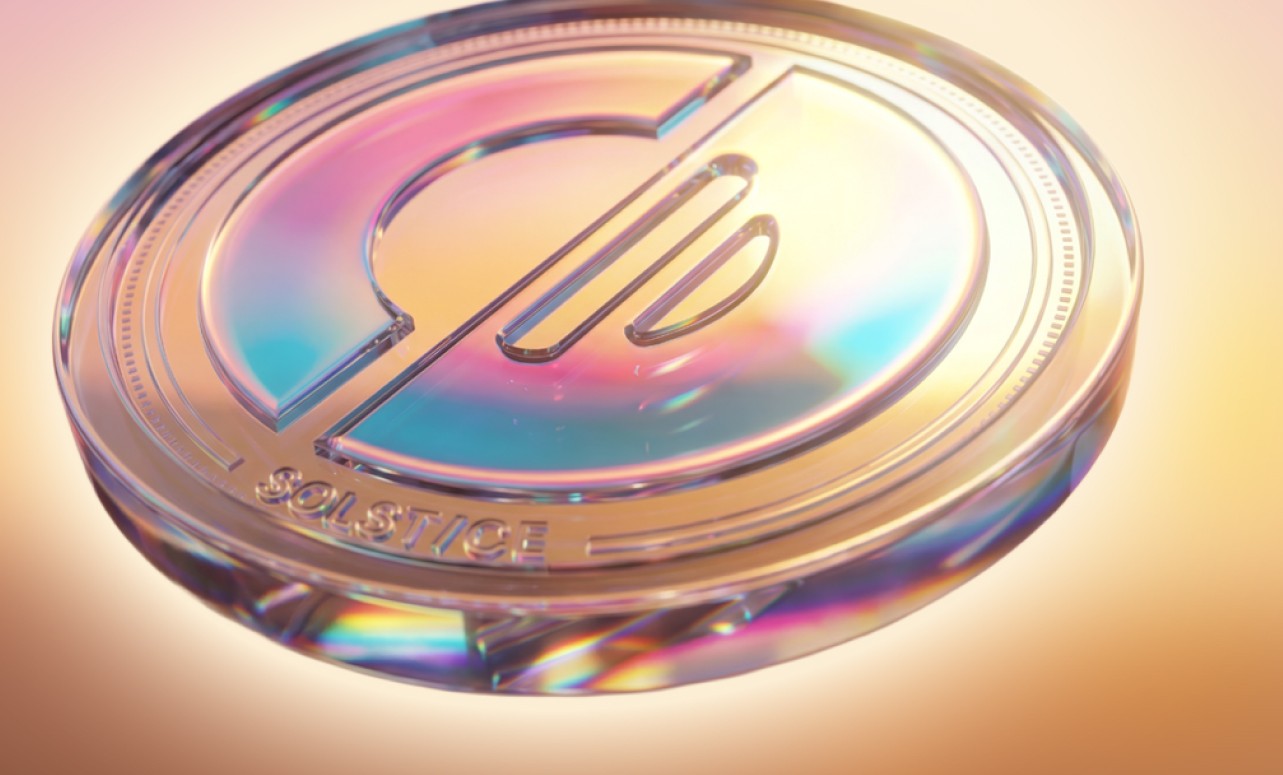
8. Visual identity. The mark is built on Earth's axial tilt: 23.5 degrees, the precise angle that creates every season we've ever had. The circle is the sun. The angled line cutting through it is the tilt itself. The two remaining lines alongside are the reflection of sunrise. A new era of financial stability, and the new opportunities that arrive with it.
The wordmark carries the same idea. Bold uppercase letterforms with rounded edges, drawn in a Suisse-inspired style. A slash through the type set at the same 23.5 degrees. The geometry that runs through the icon also runs through the wordmark, tying every Solstice mark together.
Once that angle was the spine, the entire visual language could follow from a single decision. Grid, gradients, motion, even how images cropped.
9. UI design. The Solstice team led product strategy, UX and build in-house. We led UI. The brand applied to the screens themselves. Dashboard, swap, yield vaults, rewards programme. The job was making the brand system flex from a large format print down to a 12-pixel chart label without breaking.
10. Design system. Components, tokens, type pairings. IBM Plex Serif paired with Teg. Editorial weight against geometric precision. A pattern library drawn from astronomical charts. Motion principles. Iconography. The thing that lets a new designer pick up the brand on Monday and ship something on-brand by Friday without breaking the system.
11. Brand guidelines. The whole system codified into one source of truth. So the team building product, the agency running campaigns, the developer wiring the dashboard could all work from the same document.
Into the world
From there, the brand went into market. The Solstice team, working with us throughout, translated the system into a website, a token, a community programme called Flares, a sponsorship calendar, merch worn at events, and a Formula 1 helmet livery.
Each of those works because the system underneath was built to flex.
The take
Eleven stages. Four months of strategy, sketching and refining. One reverse brief. Two moodboards that became a three-palette system. A 23.5° angle that started as a note in the margin and ended up as the spine of the brand.
A finished system that flexed across a website, a token, an institutional yield product and a Formula 1 helmet.
The version of Solstice you saw is the version that worked. The other forty-six are in the sketchbook.
If you're building a brand in crypto, or anywhere, and you want it to do this much work, get the strategy right before the first pixel. That's the bit that decides everything.
Otimo Studio works with founders building in this space. Two slots open in Q3.
Ian Howarth

May 25th, 2026
Most crypto brands aren't brands. They're expensive wallpaper.
